Graphically Speaking
Data Visualization with a focus on SAS ODS Graphics![Marker Symbols](https://blogs.sas.com/content/graphicallyspeaking/files/2015/01/Symbols_ColorOnly-702x336.png)
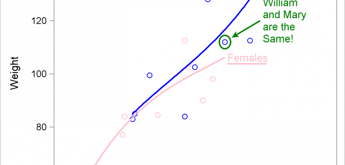
There has been much discussion on the SAS Communities page on usage of different symbols in a graph. The solutioin can vary based on the SAS release. New features have been added at SAS 9.4 releases to SG Procedures and GTL that make this very easy. With SAS 9.4M1, almost any combination is
![Custom Labels](https://blogs.sas.com/content/graphicallyspeaking/files/2015/01/Top.png)
Over the Christmas Holidays I saw an graph of agricultural exports to Russia in 2013. The part that caught my eye was the upper part of the graph, showing the breakdown of the trade with Russia as a horizontal stacked bar with custom labels. The value for each region / country
![Scatter Plot with Stacked Histograms](https://blogs.sas.com/content/graphicallyspeaking/files/2014/12/scatter_and_hist_border-702x336.png)
Last week a user expressed the need to create a graph like the one shown on the right using SAS. This seems eminently doable using GTL and I thought I would undertake making this graph using SAS 9.3. The source data required to create this graph is only the
![Dual Response Axis Graphs](https://blogs.sas.com/content/graphicallyspeaking/files/2014/12/ElectricPlot_SG-702x336.png)
Often we need graphs that display two or more responses by the same category values. In many cases it is useful to plot both responses on the same response (Y) axis. This can be helpful to understand the data and compare the magnitudes side by side. This works when the scales
![Graph Table](https://blogs.sas.com/content/graphicallyspeaking/files/2014/12/Table7.png)
A common scenario is where we have a table of multiple measures over time. Here we have a simple example of Frequency and Response by Day. The Response is a linear function of the Frequency, as shown in the table on the left below. The shape of the data is
![Fun with Bar Charts](https://blogs.sas.com/content/graphicallyspeaking/files/2014/11/Salary_2-500x336.jpg)
As Sheldon Cooper would say, this is the first episode of "Fun with Charts". I did not find a cool term like "Vexillology" and "Cartography" is taken by map making, so let us go with "Chartology". Yesterday, I saw a couple of interesting bar charts as shown on the right. I thought