Graphically Speaking
Data Visualization with a focus on SAS ODS Graphics
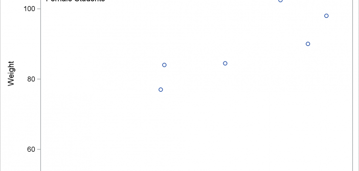
You can use PROC SGPLOT, BY variables, and a SG annotation data set together to put separate annotations into each BY group. However, you need two more steps to make it happen. This post shows all of the steps necessary to put different annotations into each graph when you have a BY variable.

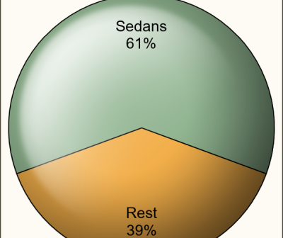
It seems only a few months back I posted an article on creating Pie Charts using a GTL based macro. Well, looking back, that was almost 6 years ago!! Recently, a colleague here at SAS needed to create Pie Charts in his report along with other plots created using SGPLOT

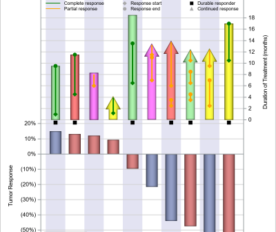
The PharmaSUG 2018 conference was held two weeks ago, with great enthusiasm and a record attendance. The highlight for me was the large spread on visual presentation of data, from papers to poster presentations. I will provide a more detailed report on all the exciting graphical presentations. One topic of

