Graphically Speaking
Data Visualization with a focus on SAS ODS Graphics
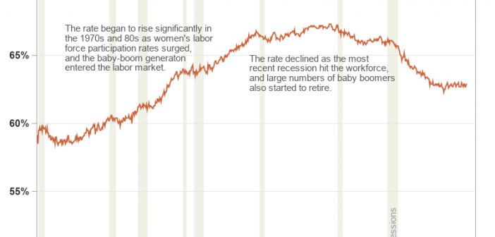
Plotting just your data often helps you gain insight into how it has changed over time. But what if you want to know why it changed? Although correlation does not always imply causation, it is often useful to graph multiple things together, that might logically be related. For example, recessions

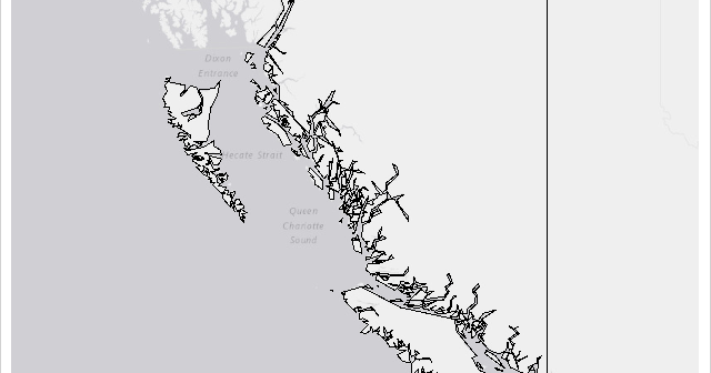
In the previous Graphically Speaking blog for PROC SGMAP, you used PROC GPROJECT so map regions would match OpenStreetMap and Esri background images. This time, the same British Columbia shapefile is used with: PROC GREMOVE to remove unwanted boundary lines PROC GREDUCE to reduce map data PROC GPROJECT to zoom

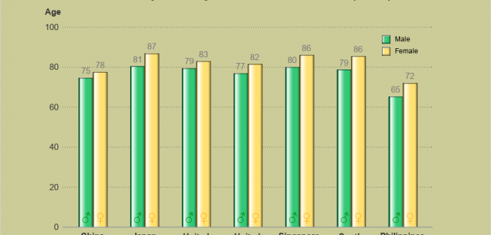
You might have noticed I've been trying out SAS ODS Graphics lately, whereas in the past I mainly used SAS/Graph for my samples. In this blog post I step you through my latest fancy SGplot graph - hopefully you'll learn some tips & techniques, as you follow along. (I don't

