Graphically Speaking
Data Visualization with a focus on SAS ODS Graphics
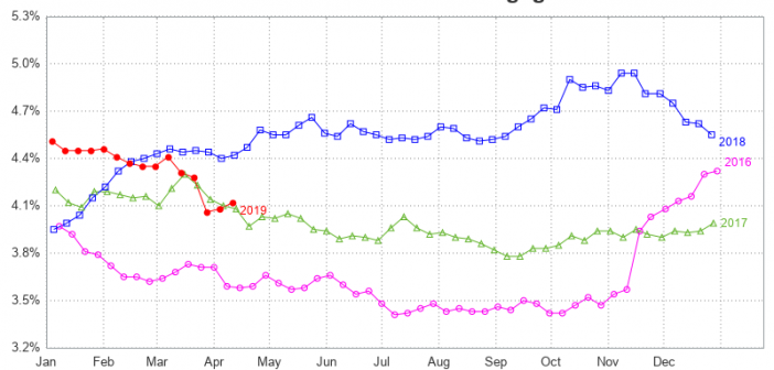
While we're on the topic of mortgage rates, let's explore another technique for plotting and comparing the rate data over several years. Last time, we plotted each year's data in a separate graph, and paneled them across the page. This time, let's overlay multiple years together in the same graph.

Did you recently lock in a mortgage rate of 3.5-5%, or perhaps even lower? How do today's rates compare to rates in the past? Let's dig a little deeper into this topic, with some graphs! But before we get started, here's a picture to get you into the mood for

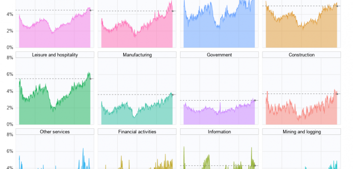
In the past, I created some graphs about our record low unemployment rate (US unemployment, and state-level unemployment), but does low unemployment also mean there are jobs available? Let's have a look at the data!... Existing Graphs I knew I couldn't be the only one interested in this kind of
