Graphically Speaking
Data Visualization with a focus on SAS ODS Graphics
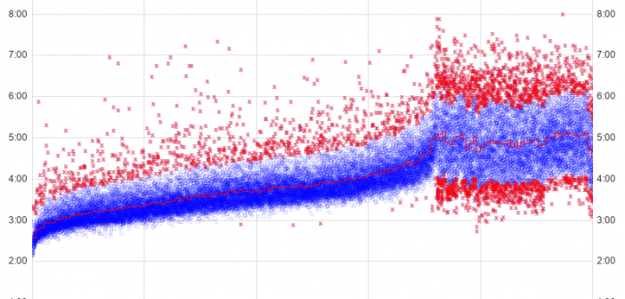
Marathons seem to be popular these days, therefore I decided to dive into some data and find a way to apply analytics. You might find this interesting if you're a fan of marathons - or if you like seeing the details behind cool graphing techniques! Before we get started, here's

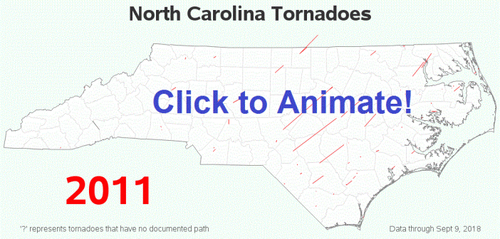
We recently had some severe storms come through North Carolina, which even spawned a tornado in Wake county (the county where I live and work). This got me wondering when and where we've had tornadoes in NC in the past ... and, of course, I had to create a map!

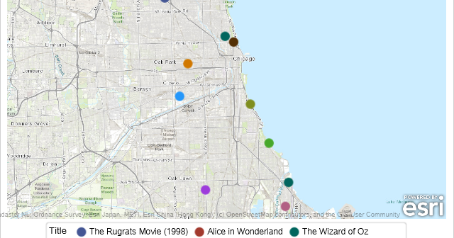
I met many SAS programmers at the 2019 SAS Global Forum who geocode addresses using ArcGIS. Did you know that street address locations and other things can be found using the SAS GEOCODE procedure? PROC GEOCODE gives you coordinates for address, ZIP codes, ZIP+4 codes and cities. You can even

