Graphically Speaking
Data Visualization with a focus on SAS ODS Graphics
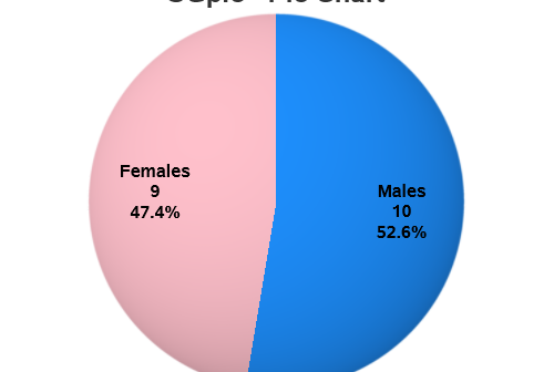
For my third 'Rosetta Graph' example, I will focus on a simple pie chart. Hopefully this example will show you how to convert your SAS/Graph Proc Gchart pies into almost-identical Proc SGpie pies. And speaking of almost-identical pies, here are two beautiful pies my friend Beth made - which one

You've probably heard of the famous Rosetta Stone. It had the same decree written on it in both ancient Egyptian and Greek, and was an essential key to help modern historians decipher and translate the ancient Egyptian hieroglyphs. To help the 'old timers' (like me) shift from using SAS/Graph to the

You've probably heard of the famous Rosetta Stone. It had the same decree written on it in both ancient Egyptian and Greek, and was an essential key to help modern historians decipher and translate the ancient Egyptian hieroglyphs. To help the 'old timers' (like me) shift from using SAS/Graph to
