Graphically Speaking
Data Visualization with a focus on SAS ODS Graphics
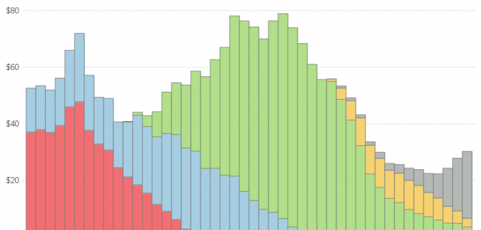
I recently saw in several social media posts that sales of vinyl records are forecast to be higher than sales of CDs this year (2019) for the first time since 1986. Two questions came to mind - 1) Is this true? and 2) Is this a big deal? Let's analyze

With all this sitting at a desk writing code, I have to do something to keep in shape. And for me, that something is paddling boats ... as fast as I can - and occasionally trying to race them. This past weekend I entered the race at Hunting Island, SC.

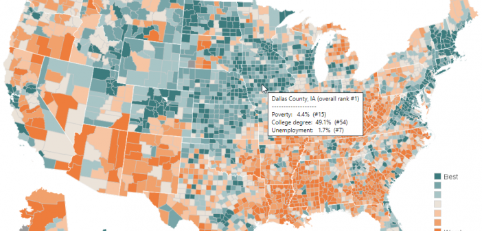
I was recently reading David Mintz's excellent SESUG 2018 conference paper on Five Crazy Good Visualizations and How to Plot Them, and saw a map that caught my eye. David showed how to create a similar map, but with completely different data - I decided to try creating a map
