Graphically Speaking
Data Visualization with a focus on SAS ODS Graphics
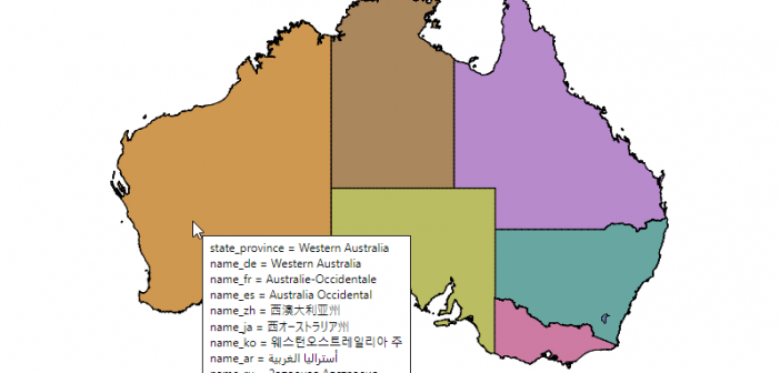
If you don't have a SAS/Graph license, then you're probably using the ODS Graphics 'sg' procedures that come with Base SAS to create your graphs and maps. And if you've tried plotting data on a map, you probably noticed that SGmap lets you overlay point-data on an OpenStreetmap, but you

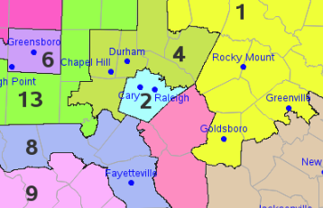
North Carolina recently re-drew the congressional district boundaries for the upcoming 2020 election. Here's a copy of the new map, from the ncleg.gov website: A couple of years ago, I created an enhanced version of the 2016/18 map, and I thought I'd do the same for the new 2020 map...

The English language can be a bit tough to learn. One reason is that sometimes words can have more than one meaning. For example, the word shady can mean "of doubtful honesty or legality," or it can mean "giving shade from sunlight." Which of those meanings am I thinking about,
