Graphically Speaking
Data Visualization with a focus on SAS ODS Graphics
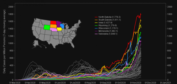
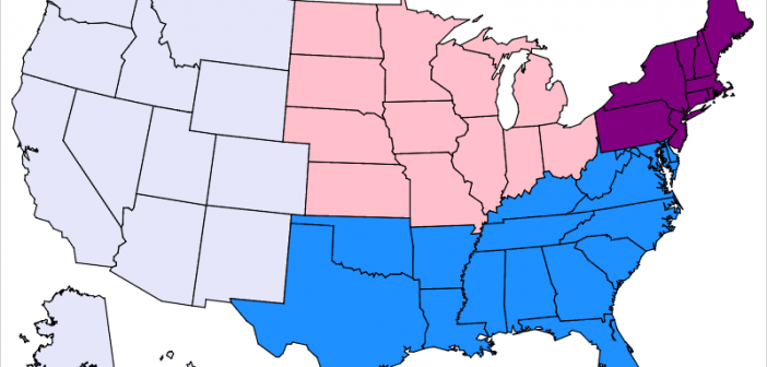
Now that we are many months into the COVID-19 pandemic, I've started going back and reexamining the data for lessons or trends (you might say hindsight is 20/20). This time, I want to explore how COVID-19 has been spreading around the US. I do this by using a graphical idea

When you get something new, the hope is that it will be better than the old thing it's replacing. As I often do, I asked my Facebook friends to provide a random picture for my blog - in this case, a picture of one of their new/recent purchases. My friend

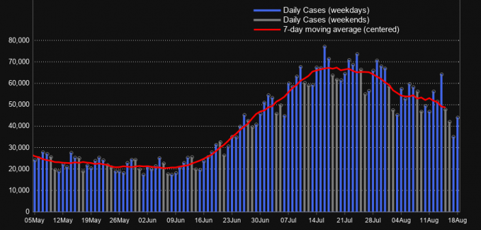
During the 2020 Coronavirus pandemic, you've probably formed a great appreciation for good, informative graphics. Good graphics can help you get a handle on thousands of individual data values, see the geographical distribution, or look for trends. In February, I wrote a blog post about creating a coronavirus dashboard with
