You might have seen in the news that US exports of natural gas to Europe are up 300%. And we recently crossed the threshold where we export more natural gas than we import. This seems like a momentous occasion, and worthy of a graph!
But first, let me make sure you know what 'gas' I'm talking about. This is natural gas, not gasoline. Natural gas is commonly used to heat your house, or heat your water, or dry your clothes. Here's a picture of the natural gas flame in the furnace that heats my house:

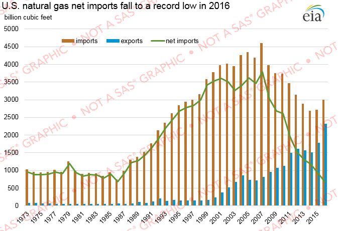
For information on this topic, I went to the Energy Information Administration (EIA) web page, and found the following graph. They represent the imports and exports as bars, and the difference as a line. Their graph is somewhat 'busy' and I'm not sure how it's going to work out once they update the data and the green line goes below the horizontal axis(?)
To create my own graph, I first had to get the data. I downloaded the exports and imports spreadsheets, imported them into SAS, and then combined them using SQL (converting the units to billions along the way), using the following code:
PROC IMPORT OUT=imports DATAFILE="NG_MOVE_IMPC_S1_A.xls" DBMS=XLS REPLACE;
RANGE="Data 1$A3:B0";
GETNAMES=YES;
RUN;
PROC IMPORT OUT=exports DATAFILE="NG_MOVE_EXPC_S1_A.xls" DBMS=XLS REPLACE;
RANGE="Data 1$A3:B0";
GETNAMES=YES;
RUN;
proc sql noprint;
create table my_data as
select unique
imports.date, year(imports.date) as year,
imports.var2/1000 as imports,
exports.var2/1000 as exports
from imports left join exports
on imports.date=exports.date;
quit; run;
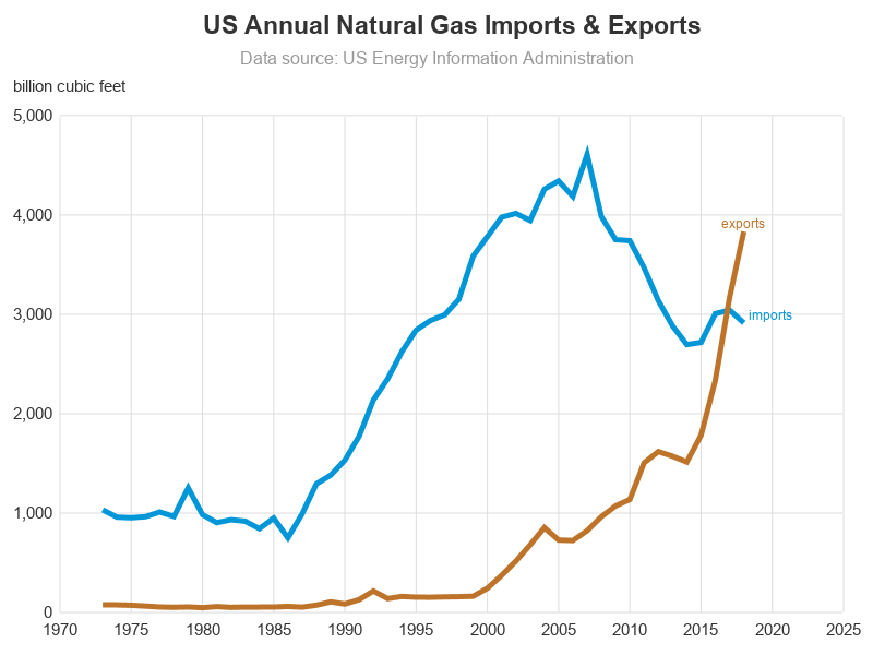
For my graph, I decided to go with something a bit simpler than what the EIA used. I use simple lines - one for imports, and one for exports (and when the lines cross, you can easily see that exports have surpassed imports). Here's a shortened version of the code I used to plot the data (click here to see the full code).
proc sgplot data=my_data noautolegend;
series y=imports x=year / lineattrs=(thickness=5 color=cx0096d7)
curvelabel curvelabelpos=end;
series y=exports x=year / lineattrs=(thickness=5 color=cxbd732a)
curvelabel curvelabelpos=end;
xaxis display=(noline noticks nolabel) values=(1970 to 2025 by 5)
grid gridattrs=(color=graydd);
yaxis display=(noline noticks) label='billion cubic feet' labelpos=top values=(0 to 5000 by 1000)
grid gridattrs=(color=graydd);
run;
Which produces a nice clean graph, that's easy to read:
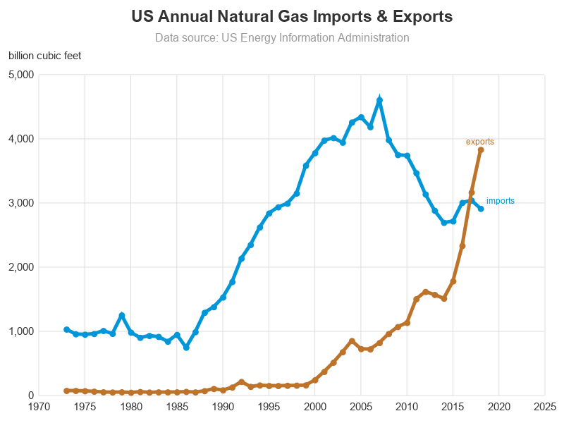
Some would say "leave well enough alone!" But I always feel compelled to improve graphs, therefore I created one more version, with markers at each data point. This way it's more intuitive what the time units are (yearly, rather than monthly or daily). And you can also tell more about the rate of change - for example you can more easily tell whether a period of increase happened in 1 year, or 3 years. The graph looks a little more cluttered, but it's "useful clutter."
I added the following options to the 'series' statements:
markers markerattrs=(color=cx0096d7 symbol=circlefilled size=7pt)
markers markerattrs=(color=cxbd732a symbol=circlefilled size=7pt)
So, which graph do you like best - the EIA graph, my first graph (with just the lines), or my second graph (with the markers added)? What are your thoughts on the future of natural gas? Feel free to discuss in the comments section!


5 Comments
Hi Robert,
Your graphs are really cool.
It seems to make good use of Sgplot, annotation is important (sganno=anno_title2) ;
Where can I get some good step by step tutorial on annotation with sgplot?
Regards,
Qui
I don't know of any step-by-step tutorials on sg annotation.
Hopefully a combination of the Graphically Speaking blogs, and the SAS documentation, will help.
If you have questions you can't figure out, I'd recommend posting them in the Graphics Programming section of the SAS Communities forum... https://communities.sas.com/
You might find this paper I did some years ago to be helpful: https://support.sas.com/resources/papers/proceedings11/277-2011.pdf
The graph might look more attractive if the markers were circles and slightly smaller than the line width. This would give a line of uniform width with white dots in it, instead of the blobby one you have. Is this possible in SAS?
Hmm ... I might have to give that a try! (yes, it's definitely possible in SAS!)