Graphically Speaking
Data Visualization with a focus on SAS ODS Graphics
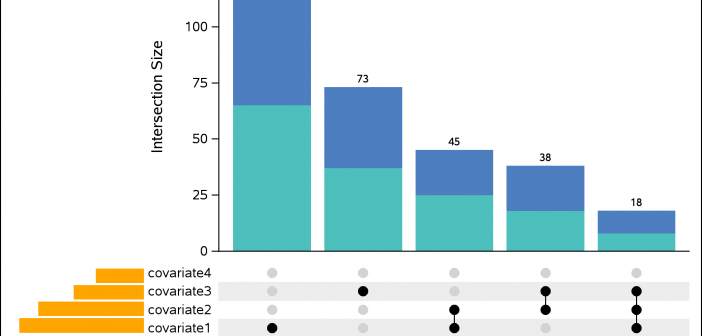
An UpSet plot is used to visualize intersections of sets. In this post, we will illustrate techniques to create this plot using the Graph Template Language (GTL). We assume that you are familiar with GTL. From the point of view of construction, we leverage the LATTICE layout available in GTL

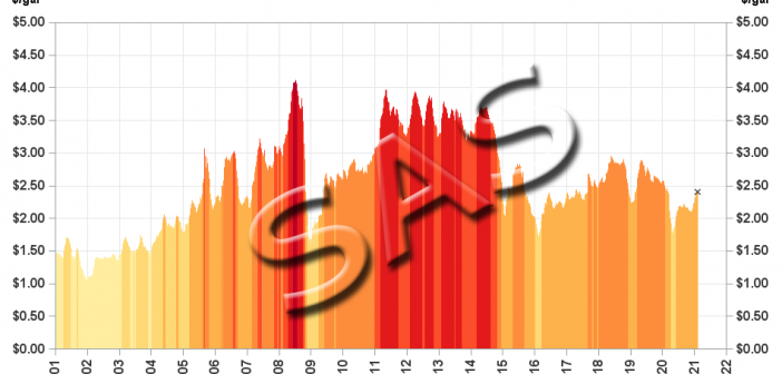
This is another in my series of blogs where I take a deep dive into converting a customized R graph into a SAS ODS Graphics graph. This time the example is a needle plot (that's essentially like a bar plot, with lots of tiny bars, plotted along a continuous xaxis).

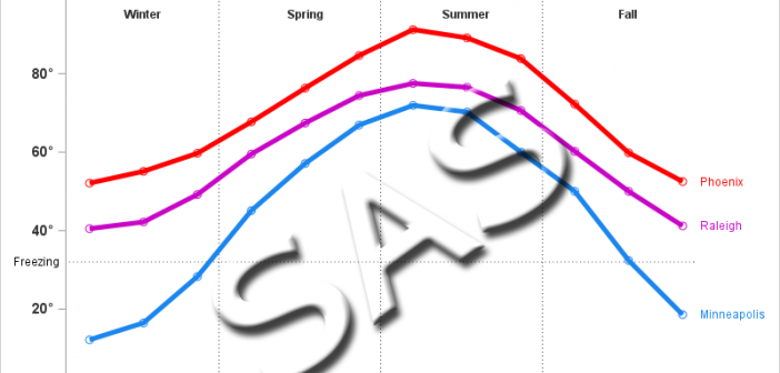
In the past, Sanjay showed how to create several basic graphs using both R and SAS ODS Graphics code. I'm going to take a bit of a "deeper dive" and focus a series of blog posts on highly customized graphs. Hopefully the code for these customizations will provide you with

