Graphically Speaking
Data Visualization with a focus on SAS ODS Graphics
Lake Superior is the largest freshwater lake (by surface area) in the world. And its largest island is Isle Royale. And its largest lake is Lake Siskiwit. And its largest island is Ryan Island. Ryan Island's largest (seasonal) pond is called Moose Flats. And it contains an 'island' (or a

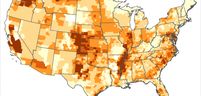
I think one of the great uses of analytics and graphics is to show things like cancer clusters on a map. There are many factors that can lead to a higher incidence of diseases in geographical areas, and chemicals are often the culprit. For example, paraquat has been potentially linked

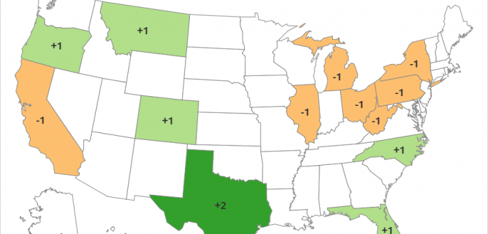
Every 10 years the United States conducts a Census where we count all the people. This week the 2020 Census population totals for each state were released. And how might these numbers affect you? ... One thing the Census numbers are used for is to determine how many of the
