This blog post is mostly just a bunch of fun maps ... maps that are labeled (or mislabeled) in various ways, using fun/interesting data. I focus on the 'fun' part, but if you're not careful you might also learn a little about the various ways to add labels to maps in SAS! 🙂
Short Names
This one's designed after a map I saw on twitter. We often have to shorten or abbreviate state or city names to get them to fit on a map, but this example simply shortens the names by deleting the first character. So, technically this map is mislabeled, but in a fun/intentional way. And for some reason, some of the names tickle my funny bone, so I thought I'd share...
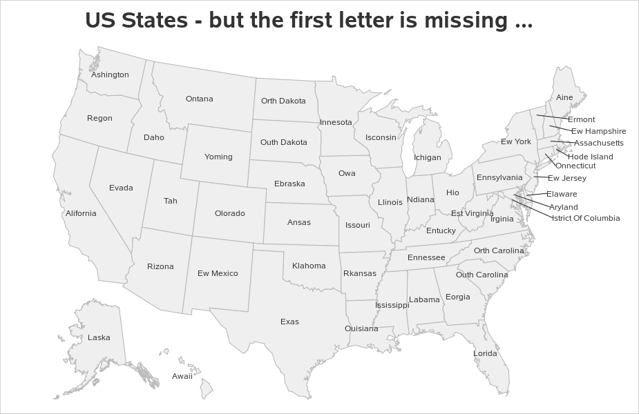
This map was created by using Proc SGmap, and overlaying the names using a text statement (and getting the x/y positions from mapsgfk.uscenter). The lines connecting the label to the center of the states, for the labels in the ocean, were a little trickier - mapsgfk.uscenter provides a coordinate for the state center, and also for the text location in the water ... and I used a series statement to overlay the short line segments). Here's the full code.
text x=land_x_text y=land_y_text text=statename / position=center textattrs=(color=gray33 size=9pt);
text x=water_x_text y=water_y_text text=statename / position=right textattrs=(color=gray33 size=9pt) contributeoffsets=none;
series x=x_line y=y_line / lineattrs=(color=gray33);
Largest Land Animals
What's the largest land animal in each state? That was a popular topic in a previous blog post. And if you look really closely, you'll notice that it uses almost the exact same map as the one above ... I just add colors, and split long text in this example.

I also added the splitchar=( -) option, so the words of the long text would be split onto separate lines (this helps the long text fit on the states better, without extending left/right into other states). That's the beauty of SAS - you can often reuse essentially the same code, to create output that looks completely different! Here's the full code.
text x=land_x_text y=land_y_text text=animal / position=center textattrs=(color=gray33 size=8pt) tip=none splitchar=' -';
You Know You're From {statename} if ...
Sometimes you've got so much text, that there's no way you can print it on the actual map. In those cases, you can use mouse over text instead. This example shows several statements about each state, in the spirit of "You know you're from {statename} if ...". The screen-capture below shows the mouse over for Wyoming. Click here to see the interactive map, so you can see the text for each state!
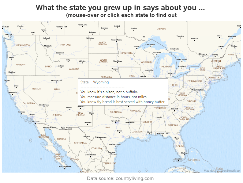 In SGmap, you use the tip= option to specify the variable(s) you want to see in the mouse over text. In this case, I specify just one variable: tip=(my_tip), but that one variable has several lines of long text with carriage returns ('0d'x) between each line. I used this trickier/indirect technique, so I don't have a {label}= in front of each line. Here's a link to the full code.
my_tip=
trim(left(state_name))||'0d'x||
'------------------------------'||'0d'x||
trim(left(fact1))||'0d'x||
trim(left(fact2))||'0d'x||
trim(left(fact3));
Upside Down
In a previous blog post, I showed how to flip maps upside down, for special cases where you needed to look at things a little differently. Good thing I added labels, or you might not recognize the countries! Hold onto your brain, when you view this map ...
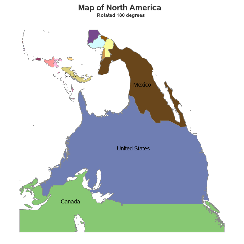
SAS provides a dataset with the centers of US states (mapsgfk.uscenter), but not for other countries, and definitely not for arbitrary/custom maps like this one. But you can use the %centroid macro to estimate the x/y coordinates for the center of each map polygon, and then overlay labels on SGmaps at those coordinates using the text statement. Click here to see the full code.
%annomac;
%centroid(namerica,namerica_labels,id idname,segonly=1);
Top Secret!
Sometimes when you create a map, you might want to add a 'watermark' by overlaying some semi-transparent text. For example, something like "Proof of Concept" or "Top Secret" (which is always fun to do, even it it's not top secret stuff!)
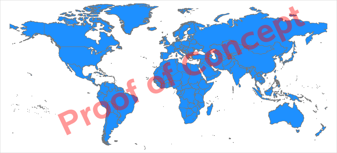
You can do this in Proc SGmap by using a text statement to overlay some rotated transparent text. Note that if it's a projected choropleth map (like the one above), you have to use the projected x/y values (rather than unprojected lat/long) for the position of the text. Click here to see the full code.
data text_data;
text_x=-17500;
text_y=4800;
my_text="Proof of Concept";
run;
proc sgmap maprespdata=my_data mapdata=my_map plotdata=text_data noautolegend;
styleattrs datacolors=(dodgerblue);
choromap placeholder / mapid=id lineattrs=(thickness=1 color=gray77) tips=none;
text x=text_x y=text_y text=my_text / textattrs=(weight=bold color=red size=80pt)
rotate=25 contributeoffsets=none transparency=.6;
run;
Special Characters
Living in the US, I tend to think of text in a US-centric way. But, many countries use characters that we don't typically work with here in the US. This SGmap shows one way you can handle such characters:
In this example, I used brute force, and coded the Unicode character codes directly into my SAS job, and then used the SGmap text statement to overlay the names on the map. Below is the code for Russia. Click here to see the full code for all the countries.
country_us='Russia';
country_native="^{unicode '0420'x}^{unicode '043e'x}^{unicode '0441'x}^{unicode '0441'x}^{unicode '0438'x}^{unicode '044f'x}";
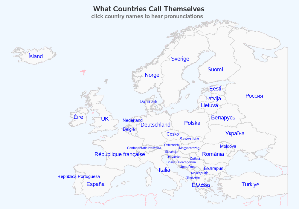
Country Names
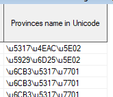
Programming-in all those Unicode character codes in the previous example is a lot of work (and tedious & error-prone). And for the special case of country names, there's another alternative which I described in this blog post. For example, here's a map of China, labeled with the province names ... in Chinese!
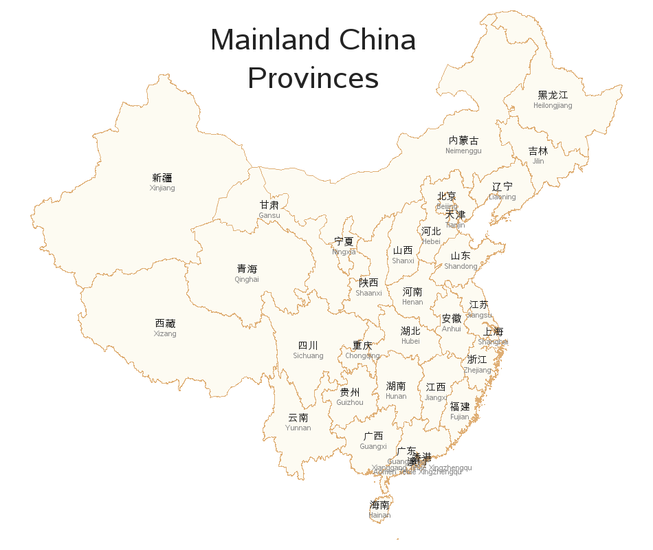
For each of our SAS country maps (such as mapsgfk.china), we have an attribute file with the names of all the map areas (mapsgfk.china_attr). In the China map, the English text version of the province names is stored in id1name, and the country-specific Unicode characters stored in the id1nameu variable. But we wanted people to be able to use the china_attr dataset from either a non-utf8 SAS session or a utf8 SAS session ... therefore we couldn't store the utf8 characters directly in the dataset. Instead, we store them in a special encoded way using the $uesc format. The encoded text looks something like this:
And then to utilize that encoded text, users would launch a SAS session with utf8 encoding, and then apply the $uesc format to the encoded values (see the example code below), to get the actual characters. In this particular case, I was using Proc Gmap, and I therefore annotated the text values on the map. Click here to see the full code.
text=trim(left(input(id1nameu, $uesc500.)));
State GDP = Country GDP?
This was an idea I saw on bigthink.com. It's kind of interesting to see that a US state can have the same GDP as an entire country, eh? If you live in the US, how did your state do? If you're from another country, is yours one of the 50 used in this map?

This map might look similar to the US maps above, but it was created with Proc Gmap (rather than SGmap), and the text and lines are annotated (rather than using text and series statements). There are always several ways to do things in SAS! The text uses the annotate 'label' annotate function, and the lines to the labels in the ocean use the 'move' and 'draw' functions. Click here to see the full code.
Languages
What's the most commonly spoken language in each US state, other than English or Spanish? This map was inspired by an example on slate.com, and I got the data from the US Census website. I'm from North Carolina, so I guess I can ask you to "Pardon my French!" 😉
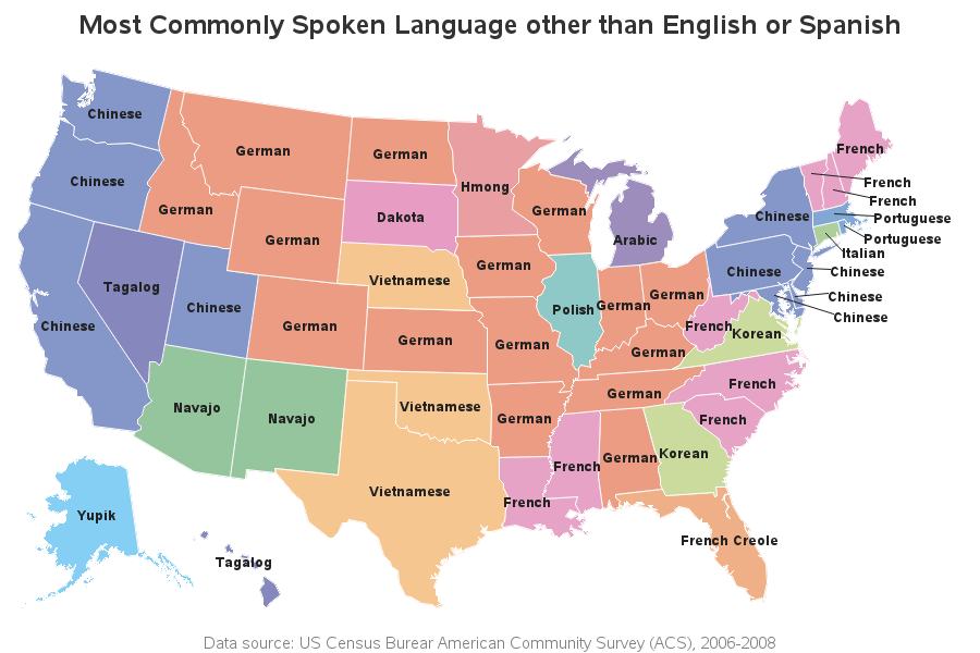
This is another Proc Gmap, with annotated text & lines (very similar to the one above). Click here to see the full code.
Napoleon's March
This is an example I included in a blog post quite some time ago. It show's Minard's famous "Napoleon's March" path visualization, plotted on a modern map. The map shows the current country borders (rather then the borders from ~1812 when the march occurred), and I added names of certain countries to help provide modern context.
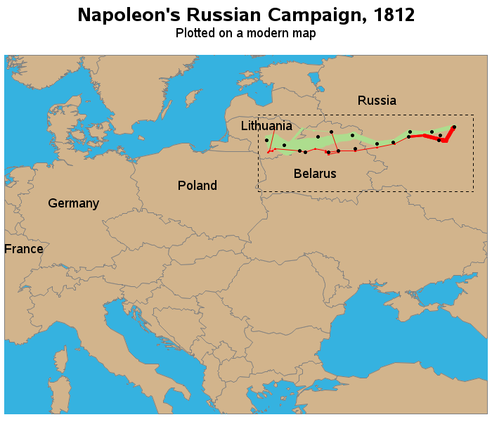
I added these country names a little differently than all the previous examples. Rather than using pre-calculated x/y values from a table like mapsgfk.uscenter, or using the %centroid macro to estimate the center x/y of the countries, I coded the desired lat/long coordinates in a data step, combined it with the map, and then used Proc Gproject to get the projected x/y that would line up with the map (and plotted it using Proc Gmap and annotate). Here's a link to the full code.
data names;
input long lat country_name $ 11-31;
datalines;
32.0 57.5 Russia
6.4 48.8 France
10.0 51.5 Germany
19.0 52.5 Poland
27.5 53.2 Belarus
24.0 56.0 Lithuania
;
run;
proc gproject data=combined out=combined dupok latlong eastlong degrees project=cylindri
latmax=60 latmin=39 longmin=5 longmax=40;
id country;
run;
Mislabeled Fish
I suppose this map fits in with my theme of (mis)labeled maps ... It shows data about mislabeled fish! (see what I did there!) Have you ever suspected the fish you received was not the fish you paid for? How can you really even tell, without a DNA test? This map shows evidence of the problem, but not the solution.
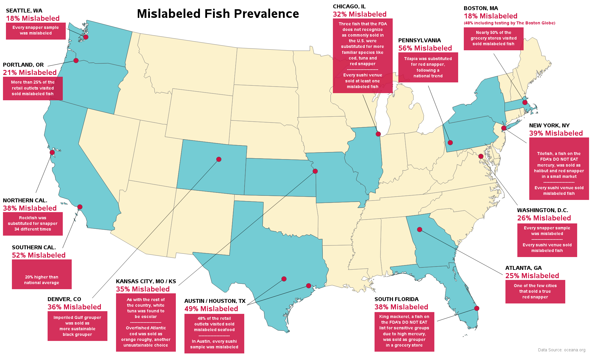
This is another labeling example created with Gmap with annotate. I used the annotate 'bar' function to draw the red background box, and the annotate 'label' function to overlay the text on the red box. It's quite a bit of trial-and-error to come up with good x/y coordinates to position and size the boxes 'pleasingly' - but it shows that a determined programmer can do it! 🙂 Below is an example of some of the code I used to build the annotate dataset. Click here to see the full code.
x_bottom_center=6.0; y_bottom_center=89;
function='move'; x=x_bottom_center-5; y=y_bottom_center; output;
function='bar'; x=x_bottom_center+5; y=y_bottom_center+4.7; line=0; style='solid'; color="&tred"; output;
function='label'; style=''; size=1.2;
color="white"; position='5'; x=x_bottom_center;
y=y_bottom_center+2.0; text='was mislabeled'; output;
y=y+1.6; text='Every snapper sample'; output;
color="&sred"; position='6'; size=2.1; x=x_bottom_center-5;
y=y_bottom_center+6.4; text='18% Mislabeled'; output;
color="black"; position='6'; size=1.5; x=x_bottom_center-5;
y=y+2; text='SEATTLE, WA'; output;
A picture is worth a thousand words
Rather than labeling a map with text, sometimes it's preferable to label the map with images (such as logos that the user will instantly recognize). In this little example I was experimenting with, I labeled a map using hockey team logos. I think people will recognize their team logos much quicker than trying to read dozens of text labels.
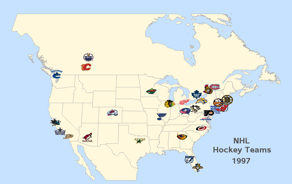
I created this one using Proc GMap, and annotated images. Note that the images are rectangular, but have transparent backgrounds, so that the end result doesn't look like a bunch of rectangular images. I merged in the lat/long from a city table to know where to position each image (if I were to create this map today, I would use the now-available Proc Geocode to estimate the lat/long for the cities). And below is the code I used to create the annotate dataset. Click here to see the full code.
data logo_anno; set logo_anno (keep = x y x_offset y_offset country city Teamname logo);
length function $8 html $1000;
hsys='3'; when='a';
xsys='2'; ysys='2'; function='move'; output;
xsys='9'; ysys='9'; function='move';
x=-2.0+x_offset; y=-2.5+y_offset; output;
x=2.0*2; y=2.5*2; function='image'; imgpath=logo; style='fit'; output;
run;
Hopefully you found these maps 'fun' ... and also learned a few techniques for labeling maps in SAS! 🙂


