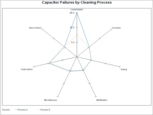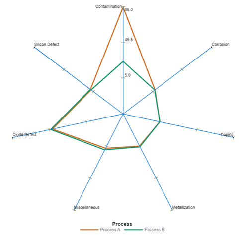
In the second of a two-part series, SAS' Cindy Wang reveals how to create a custom graph template in SAS Graph Builder that can be rendered as a radar chart in SAS Visual Analytics.
Author
In the first of a two-part series, SAS' Cindy Wang shows you how to create a radar chart in SAS Visual Analytics using custom graph capabilities.
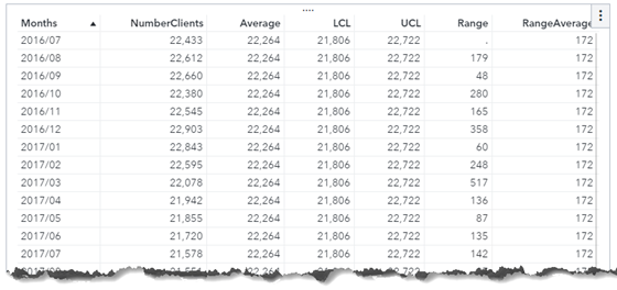
SAS' Cindy Wang, inspired by a SAS Support Community post, reveals how to perform dynamic calculations for an xmr control chart.
In my previous blog Programmatically export a Visual Analytics report to PDF - SAS Users, I use the SAS Visual Analytics SDK to export a report to PDF, which is quite simple if we have basic knowledge with JavaScript programming. It works for both the latest version of SAS Viya
SAS' Cindy Wang shows you how to create a swimmer plot using SAS Visual Analytics.
SAS' Cindy Wang uses SAS Visual Analytics to explore how people around the world spend their days.
Cindy Wang's curiosity about the Mandelbrot set led her to draw one using SAS Visual Analytics.
Readers of my earlier post Discover Visual Analytics Report Paths with REST APIs asked for ways to export SAS Visual Analytics (VA) report content programmatically. I know this is a topic of interest from many VA report designers. So, I think it’s better to write something on this and I
There are three types of visualization APIs defined in the SAS Viya REST API reference documetation: Reports, Report Images and Report Transforms. You may have seen the posts on how to use Reports and Report Images. In this post, I'm going to show you how to use the Report Transforms
SAS Viya is an open analytics platform accessible from interfaces or various coding languages. REST API is one of the widely used interfaces. Multiple resources exist on how to access SAS Visual Analytics reports using SAS Viya REST API. For example Programmatically listing data sources in SAS Visual Analytics by
Time-series decomposition is an important technique for time series analysis, especially for seasonal adjustment and trend strength measurement. Decomposition deconstructs a time series into several components, with each representing a certain pattern or characteristic. This post shows you how to use SAS® Visual Analytics to visually show the decomposition of
Moving Average (MA) is a common indicator in stocks, securities and futures trading in financial markets to gauge momentum and confirm trends. MA is often used to smooth out short-term fluctuations and show long-term trends. But most MA indicators have big lags in signaling a changing trend. To be faster
Visualization of data density estimation, which is often used in statistical analysis and machine learning, will show the data’s characteristics like distribution, skewness and modality, etc. Commonly-used data density visualizations include boxplot, histogram, kernel density estimates, and some other plots. This blog post visualizes the kernel density estimates superimposing on histogram using SAS Visual Analytics.
Gradient boosting is one of the most widely used machine learning models in practice. See how to use gradient boosting model for classification in SAS Visual Data Mining and Machine Learning.
Every year in early October, the eyes of the world turn to Sweden and Norway, where the Nobel Prize winners are announced to the world. The Nobel Prize is considered the world's most prestigious award. Since 1901, the Prize has been presented to individuals and organizations that have made significant
As a practitioner of visual analytics, I read the featured blog of ‘Visualizations: Comparing Tableau, SPSS, R, Excel, Matlab, JS, Python, SAS’ last year with great interest. In the post, the blogger Tim Matteson asked the readers to guess which software was used to create his 18 graphs. My buddy,