All Posts


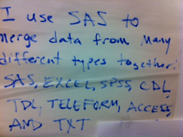
~Contributed by Martin L. Olesen I began using SAS 6.04 in 1992 for my own projects and as a teaching assistant. Professionally, I have worked in SAS since 1997, after graduation. I use Base SAS, SAS/STAT and SAS/OR. I work in an Icelandic bank doing credit risk analysis and rating

Often we have the need to display multiple columns of data in a graph, and we want to introduce some separation into their placement in the graph. Or, we want to display a bar chart of multiple response variables, and place the values side-by-side, like in a grouped bar chart. For both
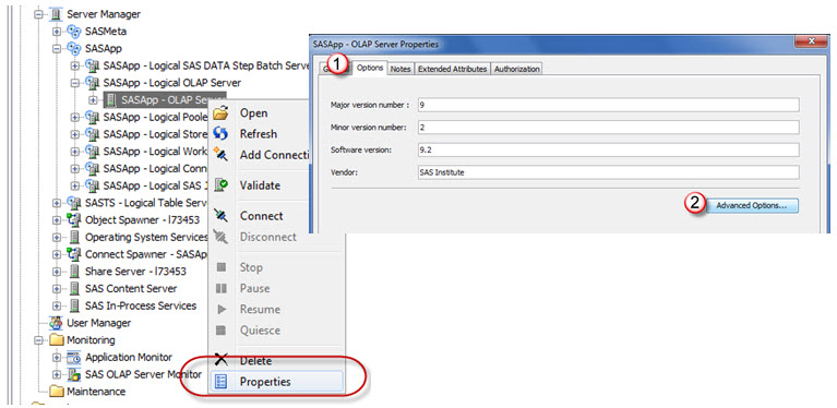

Drill-through to detail is the ability to right click within a cell of a web report or OLAP viewer and request the detail source records that make up that specific cell's measure. The maximum number of records, by default, is set to 300,000. Feasibly the report user could download all


Winter is still 6 weeks away, but already parts of the US are under feet, that’s right FEET, of snow. All of the reports I have read say that there is no correlation between this early activity and how brutal the winter will be. I wonder if there is any

Celebrity fame (I'm told) is overrated. Do you really want hordes of people to recognize you in the shopping mall or while you wait at a red light? Of course you don't. And that's why I advise you to never win the American Idol competition (nor should you lose with

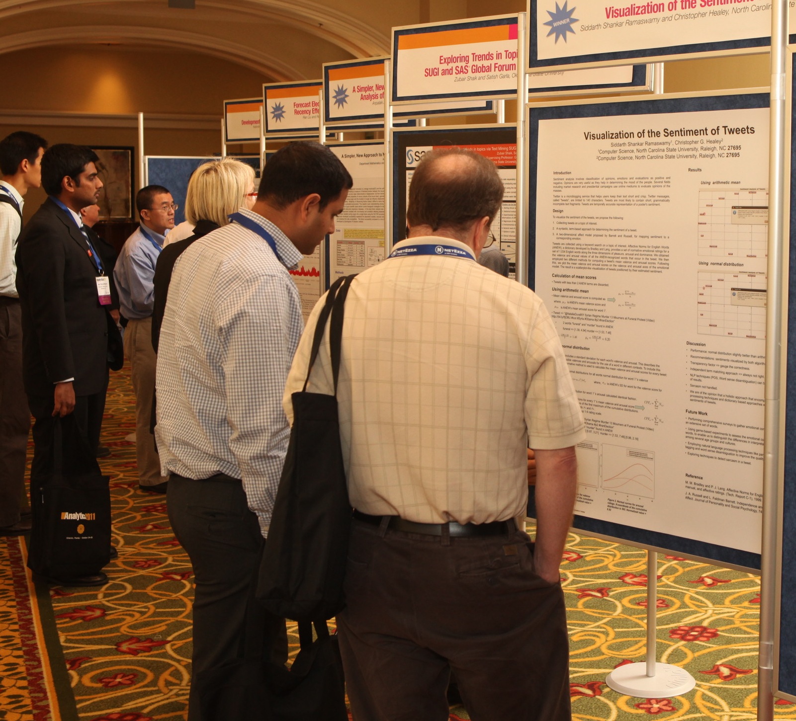
JSM, Miami Beach, FL, July 31–August 3 Miami Beach in August is hot. Ridiculously hot. Almost as hot as our preview copies at this show. Conference goers were extremely excited about a number of our upcoming statistics titles, including Customer Segmentation and Clustering Using SAS® Enterprise Miner™, Second Edition, by

In a production environment, where dozens of SAS programs are run in sequence, often monthly or quarterly, and where logs can span thousands of lines, it’s easy to overlook the small stuff that can cause data hangovers. Recognize any of these? A temporary data set finds its way into subsequent
Welcome to this new blog on data visualization at SAS. Our goal is to engage with you on a discussion about analytical and business graphics for reporting and interactive applications. Our primary focus will be on ODS Graphics and related topics, but we look forward to a lively discussion on all things


On September 10, 2001, I was attending a law enforcement conference in Atlantic City, NJ. While I have attended hundreds of similar meetings, this conference stands out for several reasons. First, and most obvious, it was the eve of the day where most of our lives were indelibly altered. Second,
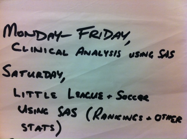
Now this is the way you sports fans should be thinking of using SAS! Of course there are no real specifics here, but you guys are pretty smart. Here's an older story about using SAS for sports, and I'm sure you've all seen Money Ball by now. Today's series entrant is

This blog post is a "mashup" of a couple of my previous posts, combining the lessons to create something brand new that I hope you will find useful. First, let's review what we know: SAS Enterprise Guide supports a scriptable object model, which allows you to write scripts or programs
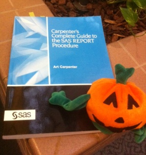

This week's featured tip is from master SAS user Art Carpenter and his classic book Carpenter's Complete Guide to the SAS REPORT Procedure. In his review for the book, Rick Mitchell-senior systems analyst at Westat-said "I am green with envy for the newest generation of SAS programmers because I wish that I had had this book in
Writing is usually very easy for me - I close the door and concentrate on the task at hand. But today, my mind is wandering. Maybe it's the changing season (it's fall in the US) that makes me think of all of the SAS users who might be reading my posts:
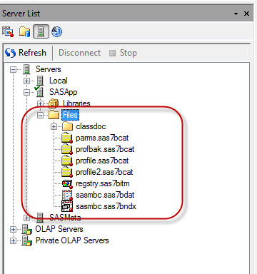
Years ago and a seemingly far galaxy away, I wrote about how to modify 9.1.3 to start Enterprise Guide users in a different location for the File folder. By default, the user only can access their personal SAS Temporary File. Why change this? I would prefer to use a central

For the past year, I’ve had the pleasure of serving on the communications team of the National Collaborative for Bio-Preparedness (NCB-P), of which SAS is a partner and the analytics provider. That experience was heavy on my mind as I recently watched the film Contagion. I may drop some minor