All Posts


In the blink of an eye, summer is gone, fall is slipping by and winter is quickly approaching. Though hopes of snow flurries enter our minds, we often think of winter as a season of germs. Your annual flu shot and regular hand washing are a great start to preventing

Wow did the summer fly by! Now that grad school is over, it’s about time to resume the “it’s all about the data” series. In the last several posts, I tried to lay a foundation for understanding how SAS stores and manages data for use in business intelligence and analytic
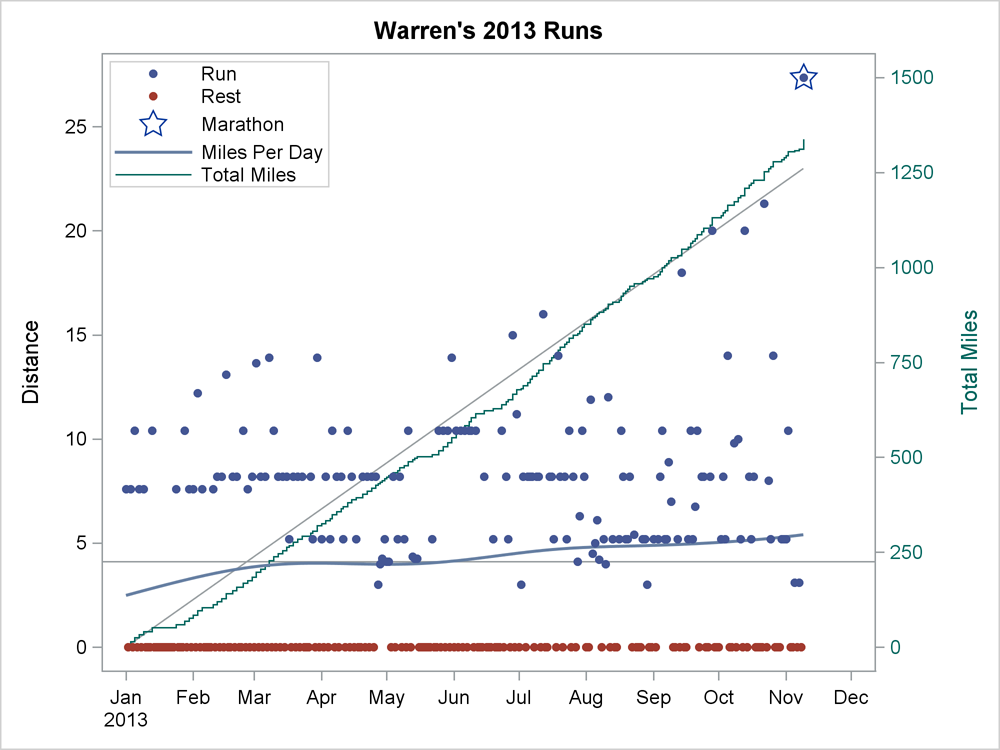

I decided this year to get serious about my running. I started recording my distance for every run. I made a SAS data set and generated simple reports. After a few weeks, I set a goal of averaging one marathon a week (3.8 miles per day, 26.2 miles per week,
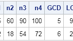

My daughter's middle school math class recently reviewed how to compute the greatest common factor (GCF) and the least common multiple (LCM) of a set of integers. (The GCF is sometimes called the greatest common divisor, or GCD.) Both algorithms require factoring integers into a product of primes. While helping

Working at SAS, I consider myself fortunate to have the best employee benefits in the industry. That is one of the factors placing SAS as one of the best companies to work for worldwide, and often THE best company to work for in USA. Given that, I was curious to know the kind


Data. Google uses ours every day, and most people aren't concerned. When our government is looking over our shoulders, however, tensions rise quickly. On the one end lies the recent scandals with the National Security Agency (NSA), which is apparently spying on you, me, and Angela Merkel. On the other lies case after case


I enjoyed SESUG 2013 this year and not just because I love hanging out in St. Pete Beach soaking in the sun but also because I was able to “geek out’ with some of my favorite SAS folks. Andrea Zimmerman and Mira Shapiro did an awesome job with the conference.


Microsoft Windows 8 has been with us for a year, and its first major update -- Windows 8.1 -- has just arrived. So how does SAS support these Windows 8 platforms? The answer can be found on support.sas.com in SAS Note 46876. I'll summarize it here: SAS 9.3 and SAS
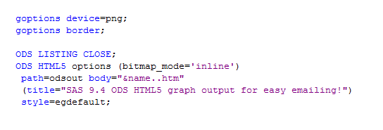

SAS 9.4 allows you to create html5 output with your graph inline (as part of the html), providing a great way to email your SAS/Graph output! Previously, if you used ods html and dev=png to create graphs, you had to deal with two files -- a png file (containing the graph)
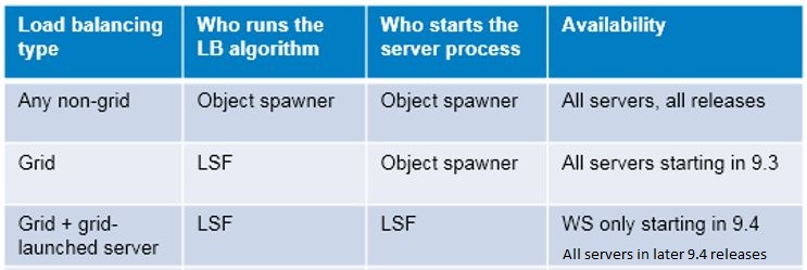

SAS 9.4 has been out for some time now, and all SAS grid computing enthusiasts know that one of the new features is that SAS Workspace Server processes can be directly launched on the grid. (See The Top Four User-Requested Grid Features Delivered with SAS® Grid Manager 9.4.) What does

Before that headline really scares you, let me clarify - there hasn't been a single fraud scheme that managed to pull off a $2 trillion haul (yet). However, the fact remains that as rising scams, schemes, the gray market, work under the table and good old tax evasion escalate, as
A couple of weeks back I described q way to create a Schedule Chart using the SGPLOT procedure. In that case, I used the HIGHLOW plot to draw bar segments, both for a single and grouped case. A natural extension is to create one with links between each segment. So,
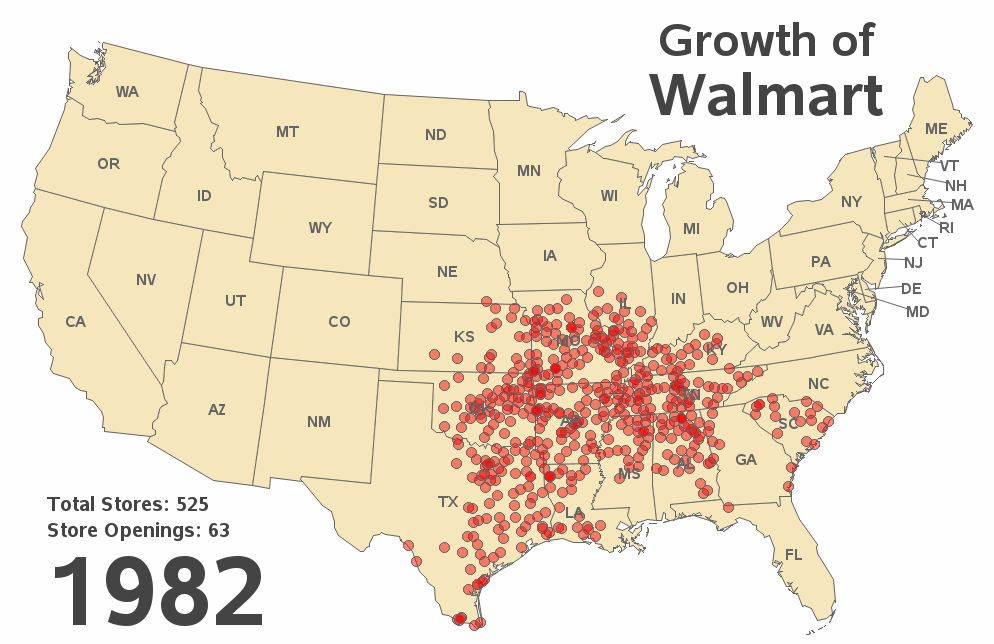
SAS has been used to track the spread of many things, such as wild animals, tornadoes, and money launderers -- but this time I'm using it to track the spread of Walmart stores across the U.S. over time! Since its start in the 1960s, Walmart has grown to be the largest
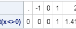
I was looking at someone else's SAS/IML program when I saw this line of code: y = sqrt(x<>0); The statement uses the element maximum operator (<>) in the SAS/IML language to make sure that negative value are never passed to the square root function. This little trick is a real
Okay, given the title of this article, I might be overselling the content a bit. Read on to see if your life will be transformed. I've just returned from SESUG, and this question came up during one of the presentations. While this tip might seem basic, it was news to