All Posts
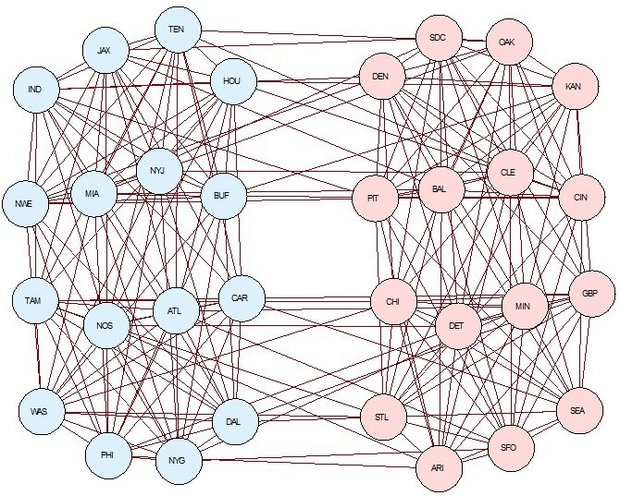
Super Bowl 50 (L?) is this Sunday, so it's time for another (American) football-related post. Steven Miller, a mathematics professor at Rutgers University, recently noted that the 2015 NFL schedule allowed a competitive advantage for some teams (including the Carolina Panthers). This figure he generated displays the 2015 regular season


Love includes a range of strong and positive emotional and mental states, from the highest virtue to the simplest pleasure. An example of such a wide range of meanings is the fact that the love of a mother is different from the love of a spouse, which, in turn, is


Here is the first in a series of guest blog posts you can expect to see every Friday throughout February as part of the Work/Life Relationship Series. Our first guest blogger is Laurie Watson, Director of Awakenings Center for Intimacy and Sexuality. Finding the Love You Need If you’re single
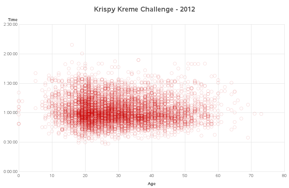

Eating donuts, burning calories, and raising money for a good cause -- that's what the annual Krispy Kreme Challenge is all about. If this intrigues you, read on to find out more... But first, here's a picture of me eating a donut, preparing for a race. I bet you didn't


In my last post, we touched on the importance of data migration in an overall data strategy. The reason I wanted to do this is because so many organizations see the migration of data as a technical challenge that can be outsourced and largely ignored by their internal teams. I contend


El 2016 será un año trascendental para el futuro de las empresas en Colombia, no cabe duda. Los datos nos están mostrando que crecer este año será difícil y que aumentar las ventas será toda una odisea. Pero que el país esté pensando en un crecimiento del 3% este año debe

TL;DR The next time that you find yourself writing a PROC SORT step, verify that you're working with the SAS Base engine and not a database. If your data is in a database, skip the SORT! The details: When to skip the PROC SORT step Many SAS procedures allow you

Programming loops are a staple of any computer programming language. In essence, loops are what make programming languages so powerful. In all programming loops, a group of statements is executed repeatedly based on the value of an index variable that changes from one iteration to another. The iterations are continued

In the previous article on managing legends, I described the way to include items in a legend that may not exist in the data. This is done by defining a Discrete Attribute Map, and then requesting that all the values defined in the map should be displayed in the legend. In


Living in a society where the pressure to succeed is on as early as preschool and time moves so fast it sometimes feels hard to breathe, I’ve found meditation to be cheap therapy for my generally order-driven, perfectionist self. It’s during this time, I quiet the chatter, nurture my spirituality,


In my last post, I discussed some practical steps you can take to collect the right information for justifying why your business should design and implement a data strategy. Having identified weaknesses in your environment that could impede business success, your next step is to drill down deeper to determine where there may be
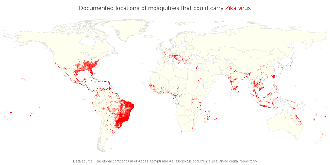
The World Health Organization recently declared the Zika virus a global public health emergency. This virus is spread by certain mosquitoes, and therefore if we know where those mosquitoes are located, then we've got a pretty good idea of where the virus might spread. Before we get to the numbers, here


Last week I showed how to use PROC EXPAND to compute moving averages and other rolling statistics in SAS. Unfortunately, PROC EXPAND is part of SAS/ETS software and not every SAS site has a license for SAS/ETS. For simple moving averages, you can write a DATA step program, as discussed
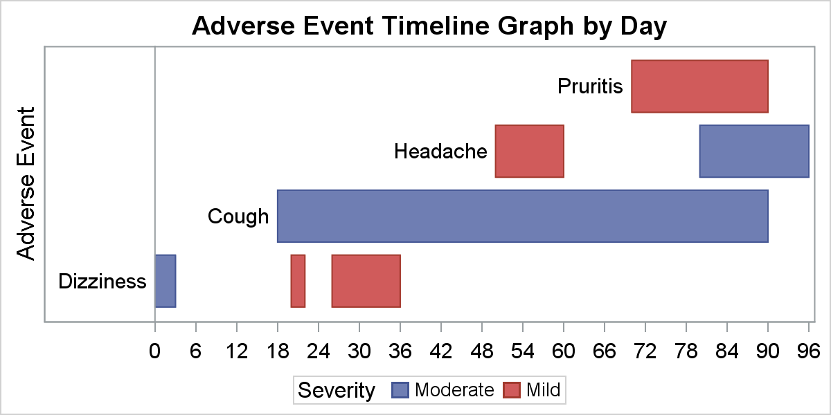
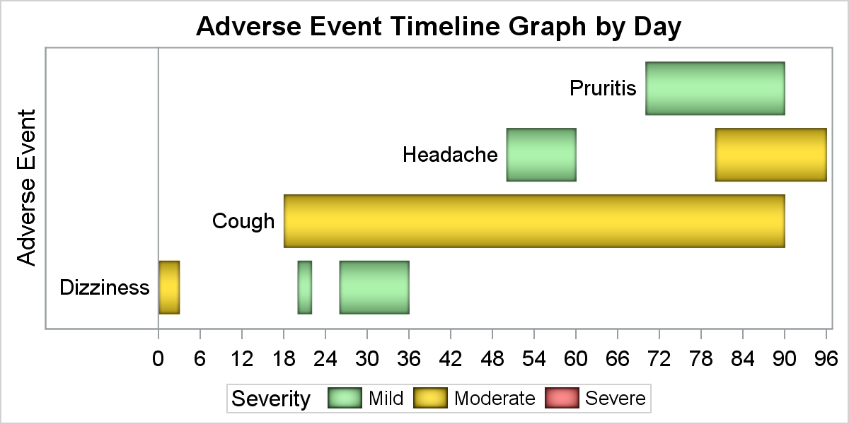
Entries in a legend are populated automatically based on the data. When creating a graph with group classification, the display attributes for each bar are derived from the GraphData1-12 style elements from the active style. The graph on the right shows you the result of creating an adverse event timeline

It is said that everything is big in Texas, and that includes big data. During my recent trip to Austin I had the privilege of being a judge in the final round of the Texata Big Data World Championship, a fantastic example of big data competitions. It felt fitting that