All Posts


David Loshin explains 4 struggles of syndicating master data across the enterprise.
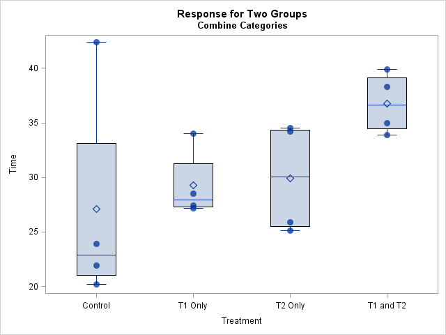

There are several ways to visualize data in a two-way ANOVA model. Most visualizations show a statistical summary of the response variable for each category. However, for small data sets, it can be useful to overlay the raw data. This article shows a simple trick that you can use to
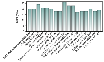

Fitting of long category values on a x-axis is usually a challenge. With SAS 9.4, the SGPLOT procedure tries to fit the values by first splitting the values at white space to see if the values will fit in the space available. This normally works well for a small number
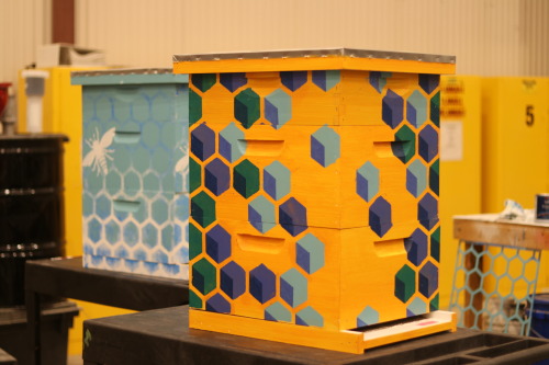

30,000 new employees start work today in one of SAS’ sweetest acquisitions to date. Bee Downtown, a North Carolina-based company using businesses in cities to help save honey bee populations, will install two hives on SAS world headquarters campus, bringing with them 30,000 - 40,000 new honey bees. Bee Downtown-sponsored

You've got a database containing the addresses of all your customers ... but how can you plot them on a map or analyze them spatially? First, you'll need to convert the address into a numeric coordinate (latitude & longitude). SAS can do that ... with Proc Geocode! But before we

When using the SAS® system to email graphics output, a common request is to use SAS to send an email in which the graphics output is embedded in the body of the email. This functionality is not available until the second maintenance release for SAS® 9.4 (TS1M2). If you are
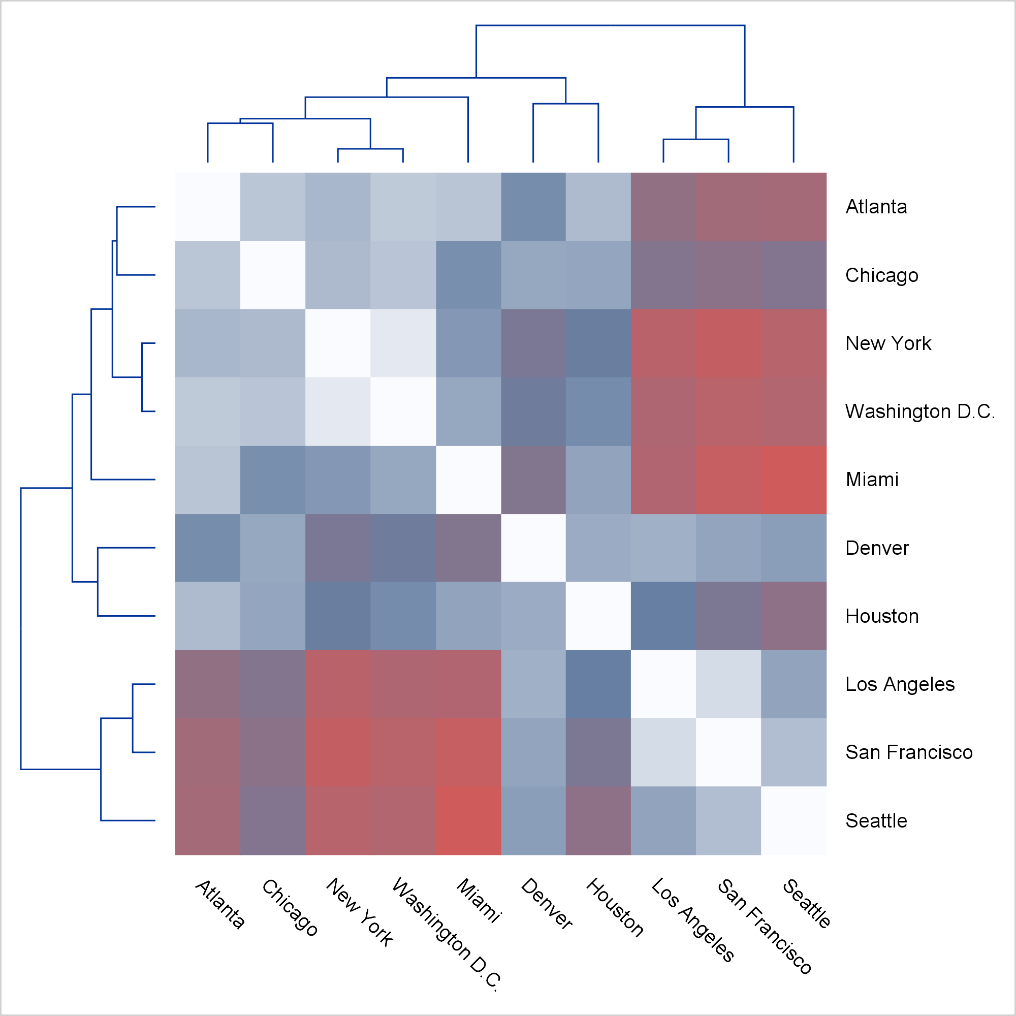

Today, I focus on the steps needed to make a graph that is composed of multiple heterogeneous components (in this case, dendrograms and a heat map).


Leaders in the education industry understand that when people at all levels have timely access to the right data and reports, they can generate trusted knowledge and insights that help transform programs, curriculums, student outcomes and more. That's how the industry's leaders deliver desired results faster to further student success.


지구는 여전히 많은 화산이 활동중인 ‘폭발적인 행성’입니다. 미국 워싱턴 D.C. 기반의 학술 협회 ‘스미소니언 인스티튜션(Smithsonian Institution)’은 전 세계의 화산 활동을 추적하고 데이터화하고 있는데요. 글로벌 화산 활동 프로그램(GVP; Global Volcanism Program) 데이터는 지난 10,000년 동안의 화산 및 분화 역사를 보관하고 있으며, GVP 데이터베이스는 1,500개가 넘는 화산의 명칭, 위치, 유형, 특징을 상세하게 기록하고 있습니다. 오늘은


Día a día, todas las empresas recolectan grandes cantidades de información proveniente de textos en diferentes lenguajes como: retroalimentación de los clientes, emails, documentos web, encuestas, reclamaciones de garantía, estudios de investigación, feeds de redes sociales, etc. Realmente nadie tiene el tiempo de leer toda esta información y mucho menos
You're sitting in a line of cars at the intersection, waiting for the light to change - when it finally turns green, the 2nd car just sits there for several seconds until someone honks at them, and then they scoot through the light ... but everyone behind them has to


Let’s face it, we’re all ridiculously busy...and tired. Did I mention tired?? So, one of the last things we look forward to after a long work day is spending an hour or more in the kitchen.

Restricted cubic splines are a powerful technique for modeling nonlinear relationships by using linear regression models. I have attended multiple SAS Global Forum presentations that show how to use restricted cubic splines in SAS regression procedures. However, the presenters have all used the %RCSPLINE macro (Frank Harrell, 1988) to generate


Data-driven businesses outperform competitors. Matt Magne says SAS Data Governance and SAS MDM can help you get there.