All Posts


No time to prepare healthy meals during the week? Find yourself eating out more often than you’d like or skipping meals altogether because you don’t have food in the fridge? Wondering how to make eating real, whole food easier? Batch cooking is your new secret weapon!
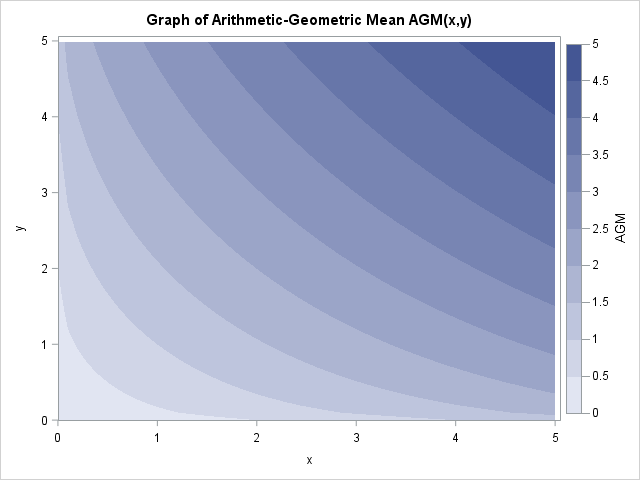

All statisticians are familiar with the classical arithmetic mean. Some statisticians are also familiar with the geometric mean. Whereas the arithmetic mean of n numbers is the sum divided by n, the geometric mean of n nonnegative numbers is the n_th root of the product of the numbers. The geometric


“어떤 알고리즘을 사용해야 할까요?” 수많은 종류의 머신러닝 알고리즘을 맞닥뜨린 초급자 분들이 가장 많이 물어보는 전형적인 질문인데요. 사실 이 질문에 대한 답변은 하단 내용을 비롯한 수많은 요인에 따라 달라집니다. 데이터의 크기, 품질, 특성 가용 연산(계산) 시간 작업의 긴급성 데이터를 이용해 하고 싶은 것 그렇기에 숙련된 데이터 과학자(Data scientist)조차도 여러 알고리즘을 직접


World Wildlife Fund (WWF) invests in education and training to create the next generation of conservation leaders from around the world. These leaders go on to have a powerful influence on the fate of the world’s most biodiverse and vulnerable places. While scores of leaders benefit from WWF’s support, many


The stored compiled macro facility enables you to compile and save your macro definition in a permanent catalog in a library that you specify. The macro is compiled only once. When you call the macro in the current and subsequent SAS® sessions, SAS executes the compiled code from the macro


Get on with your day faster by taking a self-service approach to data preparation.


Hopefully if you're viewing the eclipse today, you'll be using one of the safe methods that won't harm your eyes! ... But if you're somewhat of a trickster, here's an optical illusion you can send your friends after the eclipse, that might make them wonder (just for a second) if
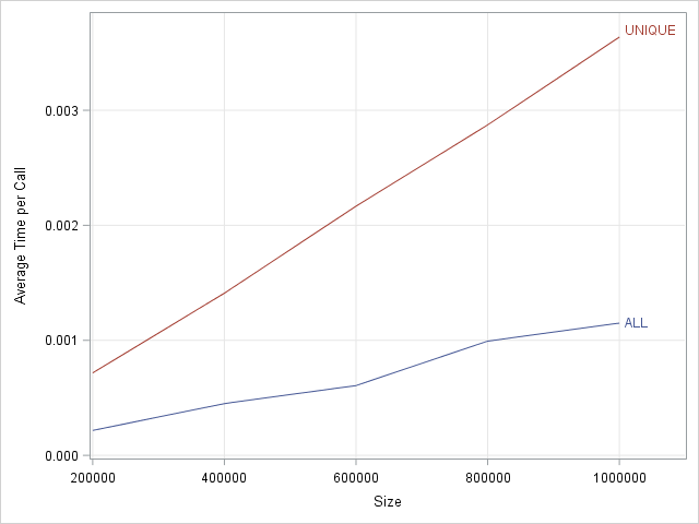
When you implement a statistical algorithm in a vector-matrix language such as SAS/IML, R, or MATLAB, you should measure the performance of your implementation, which means that you should time how long a program takes to analyze data of varying sizes and characteristics. There are some general tips that can


Motivated by Ted Conway's post on creating a sequence of graphs showing the Solar Eclipse, I thought it would be fun to extend his code and create a gif animation. I used a frame count to 81, and used the printerpath feature to create the animation using SGPLOT with BY

SAS programmers have high expectations for their coding environment, and why shouldn't they? Companies have a huge investment in their SAS code base, and it's important to have tools that help you understand that code and track changes over time. Few things are more satisfying as a SAS program that
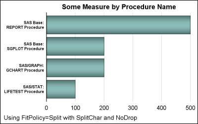
Long category values occur frequently in real world use cases. This can happen with graphs for analysis of clinical research data, and also for graphs showing survey data where the question asked may be long (even a paragraph). Managing such long categories on the x or y axis is always
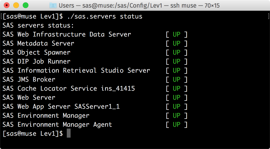

This blog post provides the steps for applying color and an easy-to-read layout to make the sas.servers script look cute and even fun!


The revised EU Payment Services Directive (PSD2) has been a focal point for the financial services industry over the last couple of years and its adoption is set to revolutionise the payment ecosystem in Europe. New entrants, innovative technologies and increased regulation are already posing major challenges to traditional banks


SAS Viya deployments use credentials for accessing databases and other third-party products that require authentication. In this blog post, I will look at how this sharing of credentials is implemented in SAS Environment Manager. In SAS Viya, domains are used to store the: Credentials required to access external data sources. Identities


Next week I will be facing two major milestones in my life. I turn 55 ...and the next day I take my only son to college. These simultaneous occurrences have led me to some soul searching. At times like this I often turn to my favorite authors/speakers for insight and