All Posts

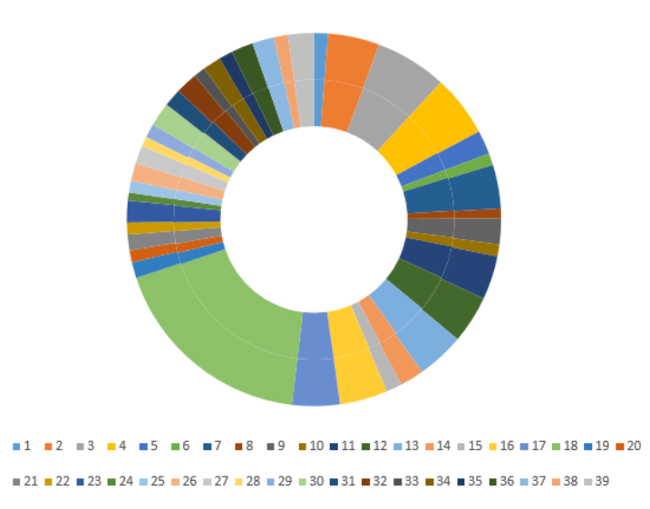
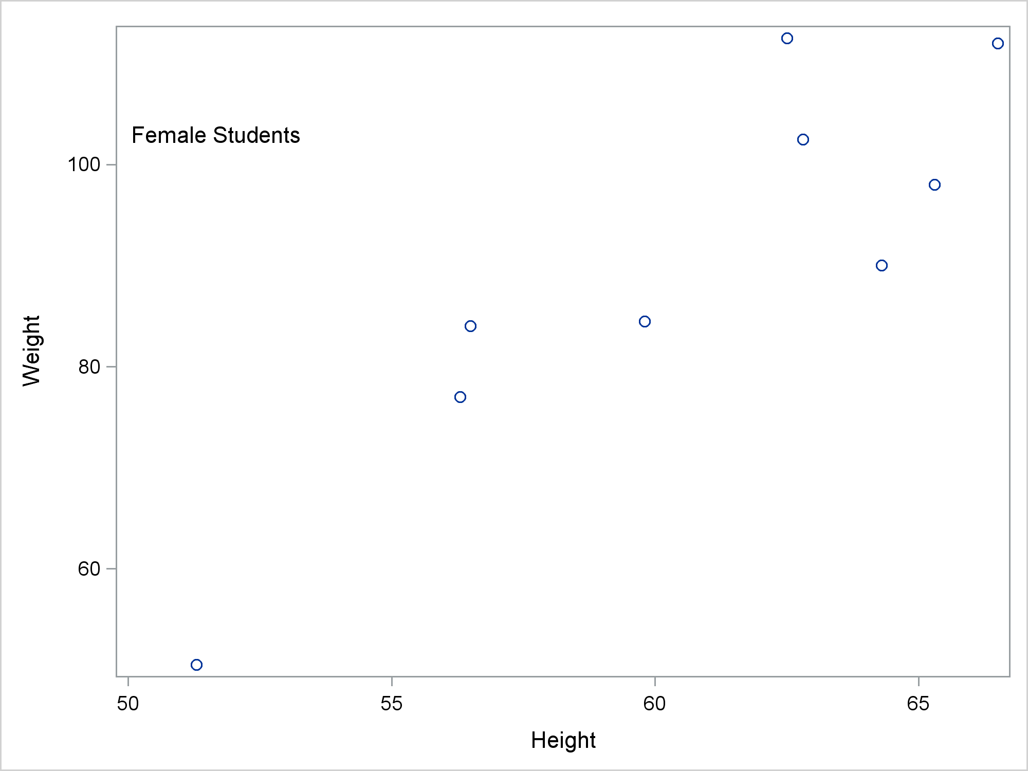
Which character variables have the highest frequency count? You can easily determine this using a variety of procedures that calculate frequency count. For example, the FREQ Procedure or the MEANS Procedure. This blog post illustrates this process through two examples.


La Cuarta Revolución Industrial, el Internet de las Cosas y la Inteligencia Artificial son conceptos que hacen parte de la transformación digital, y tienen el poder de cambiar los modelos de negocios de una organización. Para que esta era ayude a que las empresas sigan el ritmo de las demandas

See how to sample unstructured (text) data using SAS Viya and CAS actions. This post includes complete code to cluster the text documents via k-means, and treats the cluster memberships as strata for analysis.
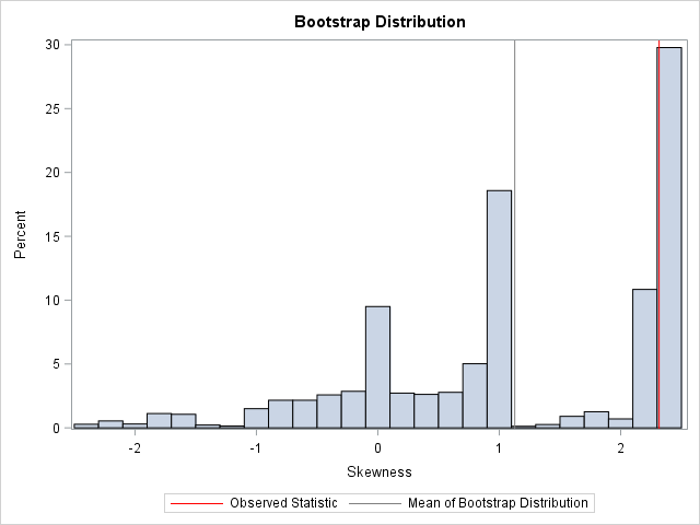

This article shows how to implement balanced bootstrap sampling in SAS. The basic bootstrap samples with replacement from the original data (N observations) to obtain B new samples. This is called "uniform" resampling because each observation has a uniform probability of 1/N of being selected at each step of the


텍스트 분석과 자연어처리(NLP; Natural Language Processing)는 소비자의 감성을 분석하는 방법으로 널리 알려져 있습니다. 실제 많은 기업이 비정형 데이터 분석 기술을 이용해 소셜 미디어(SNS) 상의 고객 불만이나 댓글을 분석하고 적절히 대응하고 있는데요. 오늘날 전체 데이터의 90% 이상은 텍스트, 음성, 이미지, 영상 등 구조화되어 있지 않은 비정형 데이터입니다. 수동 분석만으로 이 모든


SAS batch jobs can generate many log files that accumulate over time. In this post, we present a SAS program that cleans up old log files on your system.


The Base SAS DATA step has been a powerful tool for many years for SAS programmers. But as data sets grow and programmers work with massively parallel processing (MPP) computing environments such as Teradata, Hadoop or the SAS High-Performance Analytics grid, the data step remains stubbornly single-threaded. Welcome DS2 –


Like hiking without GPS directions, Jim Harris says businesses that don't use streaming data analytics will be lost in a crowd of competitors.


What’s the key to progressing your career? If you ask Manish Desai, a Sr. Director of Consulting, SAS Asia Pacific, based in India, it’s conquering the fear of failure and embracing opportunity – with a great mentor by your side. I sat down with Manish to hear more about his
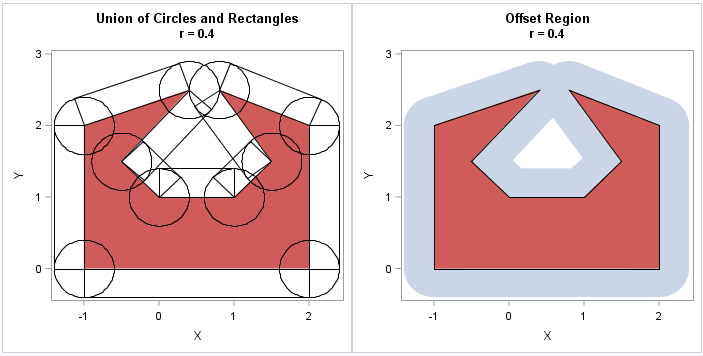
My colleague Robert Allison recently blogged about using the diameter of Texas as a unit of measurement. The largest distance across Texas is about 801 miles, so Robert wanted to find the set of all points such that the distance from the point to Texas is less than or equal

You can use PROC SGPLOT, BY variables, and a SG annotation data set together to put separate annotations into each BY group. However, you need two more steps to make it happen. This post shows all of the steps necessary to put different annotations into each graph when you have a BY variable.


One of the biggest challenges we’ve been hearing from customers lately is that they need help operationalizing analytics to extend the value of their modeling efforts. In many cases, they’ve hired smart data analysts who can transform data and create sophisticated models, but their work is used for a single


SAS Visual Analytics on SAS Viya(以降VA)の次期版8.3に搭載予定の新機能をダイジェストで紹介します。 レポート作成効率の向上 レポート表示能力の拡張 表形式オブジェクトの機能拡張 SAS Mobile SDK 1.レポート作成効率の向上 レポート作成や設定は1度だけ、後はこれを再利用し、レポート作成の効率を向上 1-1.レポートデータビュー 従来からVAではレポート作成・編集時、左側に表示される「データ」リスト画面内で、必要な階層項目や計算項目の作成、カスタムカテゴリーの作成、不要な項目の非表示、などを設定し、このデータビューに基づいてレポートを作成してきました。 VA8.3では、同じデータソースに基づく複数の異なるデータビューを定義し、これを異なるレポート間、ユーザー間で共有し、再利用することができるようになります。 同じデータソースに基づく、異なるレポートを作成する際の効率が大幅に向上します。 1-2.共通フィルター 従来は、オブジェクトごとに右画面内で設定できるフィルター(オブジェクトフィルター)を使用する場合、例えば、レポート内に3つのチャートオブジェクト(円グラフ、クロス表、棒グラフ)があり、円グラフと棒グラフにだけ同じ条件で絞り込みをかけたい場合は、円グラフと棒グラフの両オブジェクトにそれぞれ同じフィルターを設定する必要がありました。 VA8.3では、作成したフィルター定義を複数の異なるオブジェクトに再適用することが可能になります。さらに、このフィルター定義は共通フィルターとしてデータビューに保存し、「1-1.」項で紹介したように、レポート間、ユーザー間でも共有し、再利用が可能になります。 1-3.絞り込み条件保持 従来、レポート参照者がレポートを表示し、好みの条件を選択し、レポート表示内容を変更した場合、そのレポートを一旦閉じた後、再度同じ内容を参照したい場合は、再度同じ作業を繰り返す必要がありました。 しかし、VA8.3では、レポート参照時にレポートに対して行った最終操作結果状態を保持することが可能となり、レポート再表示時に、同じ作業を繰り返す必要が無くなります。 1-4.格子ガイド利用 VA8.3では、レポート作成・編集時に、背景にグリッドを表示し、レポートページ内のお好みの位置に、オブジェクトを正確かつ素早く配置することが可能になります。 2.レポート表示能力の拡張 レポートが、あなたに、ストーリーを語ります。 2-1.再生可能ダッシュボード 再生可能なダッシュボードを使用することで、レポート参照者は、静的ではなく動的なダッシュボードをフルスクリーンで体験することができます。 会議の場などで、PowerPointのスライドショーのように、BIレポートを効果的に表示することも可能です。 あなたが設定したタイミングで、設定した順序で、レポートページ単位やページ内オブジェクト単位で、ダッシュボード内容が自動再生されます。 2-2.レポート自動リフレッシュ機能拡張 従来のVAでは、レポート全体を最短1分間隔で自動リフレッシュすることが可能でしたが、VA8.3では、レポートのページ単位、ページ内のオブジェクト単位に、最短1秒間隔で自動リフレッシュが可能になります。 これによって、リアルタイムBIレポートモニタリングが実現されます。 例えば、ページ内の折れ線グラフは1秒間隔で、リアルタイムなデータの変動を表示し、棒グラフは2分間隔で、別のデータの更新状況を表示する、といったことが可能になります。 3.表形式オブジェクトの機能拡張 そのままでは、数値の羅列で、ビジネス状況を直感的に捉えるのは難しいリスト表やクロス集計表の表現力が拡張されます。 3-1.表のセル内にグラフ表示 表のセル内に、数値だけでなく、棒グラフやヒートマップなどを表示することができます。 このビジュアライゼーションによって、問題点を迅速に特定し、データの傾向を直感的に捉えることが可能になります。 3-2.数値の表示桁数短縮 表のセル内に表示する数値の桁数が多い場合に、ワンタッチで短縮形表示に変更することが可能になります。これによって、表示スペースを節約して、表を読み易くできます。 4.SAS Mobile SDK iOS用SAS SDKおよびAndroid用SAS SDKを使用して、SAS Viyaサーバ上のコンテンツにアクセスするための強力なモバイルアプリを作成することが可能です。
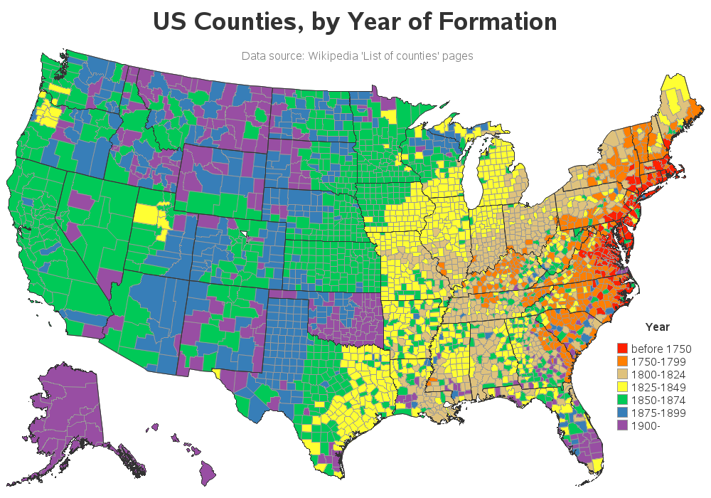

The United States declared independence in 1776, and we celebrate it on July 4th every year. But the land areas that make up the United States today weren't necessarily the same as they were back then. So I thought it would be interesting to create a map showing when each
Word Mover's Distance (WMD) is a distance metric used to measure the dissimilarity between two documents, and its application in text analytics was introduced by a research group from Washington University in 2015. The group's paper, From Word Embeddings To Document Distances, was published on the 32nd International Conference on Machine