Data Visualization

Get the right information, with visual impact, to the people who need it
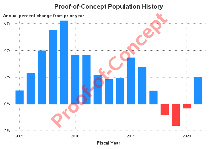
Data Visualization
Sanjay Matange 0
Doing more with nbsp

A few weeks ago I wrote an article on using the non breaking space character to prevent stripping of leading and trailing blanks in a string.   Since then, I have discovered a few more instances where the nbsp can be a useful tool for creating graphs. One such instance came up last week

Data Visualization
Sanjay Matange 0
How about some pie?

Pie charts have been the subject of some criticism when they are used to compare measures across multiple categories.  It is generally accepted that comparison of magnitudes represented as angular measures from varying baselines is not effective. However here are some use cases where a pie chart does quite well. When it comes

Data Visualization
Sanjay Matange 0
Compact Scatter Plot Matrix

The Scatter Plot Matrix is a great tool that provides a quick visual of potential associations between variables.  This may provide the analyst some hints on how to proceed with the analysis. Matrix of lab values for liver function tests are commonly used in clinical research.  The SGSCATTER procedure provides an easy way

Data Visualization
Sanjay Matange 0
Non-breaking space

Forest plots come in many flavors.   An example of a Forest plot using GTL is available on the SAS support web site.  Simple forest plots can also be created using SGPLOT procedure by using the SCATTER statement with MARKERCHAR to display data aligned with the plot by study names. One issue

Data Visualization
Sanjay Matange 0
Extended Bands

In the Clinical Research domain, there is often the need to display lab values by treatment or test and it is often useful to view this data along with reference lines showing the normal ranges.  The obvious way is to use reference lines to denote the normal ranges. SGPLOT Code: proc sgplot data=band; scatter x=x y=y

Data Visualization
Sanjay Matange 0
Butterfly plots

When comparing results by category and group,  putting the items to be compared close together usually leads to a graph that is easier to decode.  Take the case of the data (simulated) shown below. Here we have population by age group and sex.  To compare the population by sex, it is

Data Visualization
Sanjay Matange 0
Spark lines made easy

Spark lines, made popular by Edward Tufte, provide a way to visualize trends in a concise space, often inline with the rest of the narrative or data. Previously, I posted an article on Spark Plots in which I created different plot types, some of which included multiple graphs and data in each row.  For such

Advanced Analytics | Data Visualization | Programming Tips
Angela Hall 0
And the difference between Business Intelligence and Business Analytics is ...

After some discussion with SAS Product Marketing yesterday, we devised this response to everyone's question about the Business Analytic differentiator that SAS provides. ********************************************************************************************************* Business Intelligence is one of the key components from SAS that ties into a suite of analytic techniques, information handling and performance infrastructures needed to deliver

Data Visualization
Sanjay Matange 0
LFT Panels

CTSPedia.org is a website of Knowledge Base for Clinical and Translational Research.  On this site you can find sample graphs for statistical analysis of safety data for Clinical Research.  Graphs included in this resource have been submitted by contributors, and include a graph for Liver Function for different tests by treatment.

1 53 54 55 56 57 60

Back to Top