A frequently asked question about the Survival Plot is: "How can I display the 'At Risk' data outside the plot area?". The survival plot rendered by the LIFETEST procedure displays the at risk data inside the plot data area. The reason for this is the potential for varying number of treatment groups. Here is a program from the procedure samples. The full program is shown here: SurvivalPlot
ods graphics / width=5in height=3.5in; proc lifetest data=BMT plots=survival(atrisk=0 to 2500 by 500); time T * Status(0); strata Group / test=logrank adjust=sidak; run; |
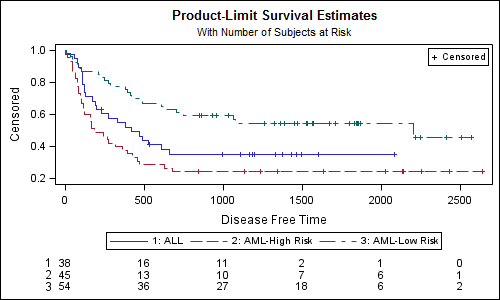
The graph created is showm below:
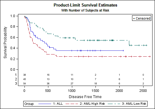
As you can see in the graph above, the "At Risk" table is displayed inside the plot data are. This graph is created by the ProductLimitSurvival template for the LIFETEST procedure. This template uses a LAYOUT OVERLAY to plot the curves, and displays the at risk table in the Inner Margin at the bottom of the overlay container.
For a specific use case where you know the numbe of treatment groups, you can create a GTL program to display the data outside the plot area using data saved from the LIFETEST procedure as shown below.
Step 1: Run the LIFETEST procedure and save the survival plot data to a data set using the ODS OUTPUT statement:
ods output Survivalplot=SurvivalPlotData; proc lifetest data=BMT plots=survival(atrisk=0 to 2500 by 500); time T * Status(0); strata Group / test=logrank adjust=sidak; run; |
Step 2: Now we define a GTL template called survival that uses a LAYOUT LATTICE with two rows and one column. Row weights of 85% for upper cell and 15% for lower cell are specified. For a different number of treatment groups you may want to adjust these values. ColumnDataRange=union is specified to ensure the x-axes of the two cells are uniform. This (incomplete) code snippet is shown below.
proc template; define statgraph survival; begingraph; entrytitle 'Product-Limit Survival Estimates'; entrytitle 'With Number of Subjects at Risk' / textattrs=graphfootnote; layout lattice / rows=2 rowweights=(0.85 0.15) columndatarange=union rowgutter=10; endlayout; endgraph; end; run; |
Now, we add two cells inside the LAYOUT LATTICE, each defined by a LAYOUT OVERLAY block. The upper cell has the graphical plots of the data, and the lower cell has the "At Risk" data shown as a table using the BLOCKPLOT statement.
      layout overlay;
        stepplot x=time y=survival / group=stratum name='a';
        scatterplot x=time y=censored / name='b' markerattrs=(symbol=plus);
        scatterplot x=time y=censored / group=stratum markerattrs=(symbol=plus);
        discretelegend 'a';
	discretelegend 'b' / location=inside halign=right valign=top border=true;
      endlayout;

       layout overlay / walldisplay=none xaxisopts=(display=none);
	 blockplot x=tatrisk block=atrisk / display=(label values)
                   class=stratumnum valuehalign=start;
endlayout; |
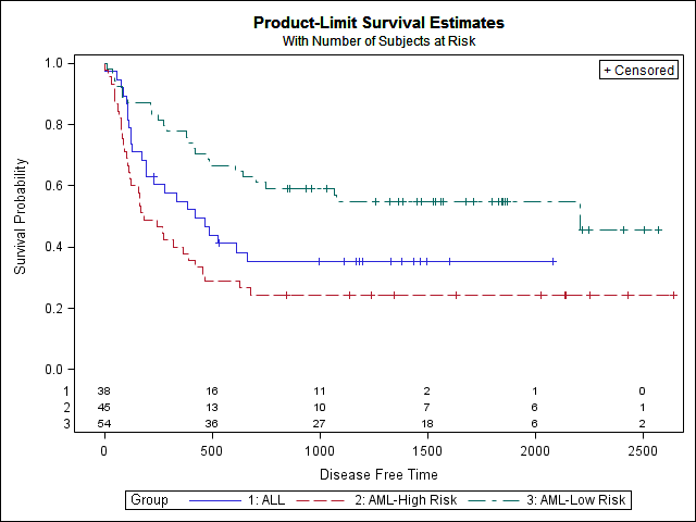
The resulting graph is shown below. The full code is shown here: SurvivalPlot_OutsideTable
Any update of the ProductLimitSurvival template for the LIFETEST procedure should be done with great care. This is a complex template that supports many different use cases.


19 Comments
Thanks for the post Sanjay!.
Do you know if there is a way to incorporate this in the default Survival Plot template?
If you want the variable names rather than the numbers in the table you can change the code slightly, from class=stratumnum to class=stratum in the blockplot statement of the template.
You still end up with the numbers though :(.
Yes, you can use "class=stratum" on the BlockPlot statement. Then, the labels for each treatment on the left of the values will be the full names, not just "1", "2" and "3".
After speaking with the the procedure writer, it was clear why the "at risk" table in the LIFETEST procedure template is not positioned outside. This template is designed to handle variable numbe of treatment groups. So, it is not feasible to set fixed row weights like I did in my example. In a specific use case where you know the number of treatment groups you can use this feature. I updated the post to reflect this information.
Very nice! I remember doing this with SPLUS at a previous job, which required taking results data from SAS to SPLUS and could get fiddly; this is so much easier.
How would one go about changing the colour/thickness of the lines in the template? I can't seem to find an example anywhere when the group option is used (such as this example).
Thanks
Use:
stepplot x=time y=survival / group=stratum name='a' lineattrs=(thickness=2);
Hello,
Thank you for the post, very usefull.
I would like to print a header "At risk: " just above the at risk table, how can I do this ?
Thanks again for your assistance.
That depends on which method you are using to get the Survival Plot. If using the graph from proc LIFETEST, you will need to update the appropriate template and add an ENTRY statement just above the at risk table.
To add the header to the graph I showed, add an ENTRY statement with LOCATION=OUTSIDE in the lower LAYOUT OVERLAY. You will also need to provide more space for the lower cell. See code below.
proc template;
define statgraph survival2;
begingraph;
entrytitle 'Product-Limit Survival Estimates';
entrytitle 'With Number of Subjects at Risk' / textattrs=graphfootnote;
layout lattice / rows=2 rowweights=(0.8 0.2)
columndatarange=union rowgutter=10;
layout overlay;
stepplot x=time y=survival / group=stratum name='a';
scatterplot x=time y=censored / name='b'
markerattrs=(symbol=plus);
scatterplot x=time y=censored / group=stratum
markerattrs=(symbol=plus);
discretelegend 'a';
discretelegend 'b' / location=inside halign=right
valign=top border=true;
endlayout;
layout overlay / walldisplay=none xaxisopts=(display=none);
entry halign=left "Number of Subjects at risk" / location=outside valign=top;
blockplot x=tatrisk block=atrisk / display=(label values)
class=stratumnum valuehalign=start;
endlayout;
endlayout;
endgraph;
end;
run;
proc sgrender data=SurvivalPlotData template=survival2;
run;
Thank you very much Sanjay. That's great !
Dear Sanjay,
How may I print the "Log-rank" p-value with this template ?
Thank you so much.
Best
You cannot directly use my template, but you can use the ideas presented to update the template used by the LIFETEST procedure to modify the graph.
Important caveat: I am not an expert in proc LIFETEST, so the following is only a general guideline.
The name of the template used by the LIFETEST procedure is "Stat.Lifetest.Graphics.ProductLimitSurvival". The code block under the "if (PLOTATRISK)" seems to add the at risk table in the plot space in a bottom INNERMARGIN. Instead of using the inner margin, you will need to add a second LAYOUT OVERLAY and put the code I used. The variable names may differ, see the ones in the official template.
Be careful not to overwrite the original template. Save the new one with the same name in SASUSER, and it will be used by default till it is removed.
I really appreciate your effort putting the code on this blog. Very helpful!!
One other questions. I wanted to customized the line color and pattern for grouped data and I tried to include some codes to define my style (see below), not sure what I was missing but I can't make that happen. Can you please give me some ideas? Thanks.
code:
PROC TEMPLATE;
define style Styles.MyDefault;
parent=Styles.Default;
style GraphData1 from GraphData1 / color=black LineStyle=1;
style GraphData2 from GraphData2 / color=red LineStyle=2;
end;
define statgraph survival;
...
..
end;
RUN;
ods listing style=MyDefault;
PROC SGRENDER data=mydata template=survival;
RUN;
Setting GraphData attributes will work if you have a grouped plot for survival curves. You should set the contrastcolor instead of color. Linestyle should work.
Hello how do I keep the y axis (0, 1 ) ?
The after plot is (.2, 1)
Thanks!
The YAXIS min=0 should work. I probably added the wrong graph.
Hello,
thank you for this code.
I have a question I apply this template but I have some missing values in my atrisk patients....
Especially at the time when value of atrisk patient is the same than the previous value.
Example at somes terms if 12 have to be repeated 4 times I will only get the first 12 and the 3 others will be missing in the atrisk table.
I guess the problem is inside the lower layout overlay but I did not find an issue to this matter.
thank you for your help.
Hi,
Thanks a lot for sharing this code. This is very useful especially for clinical trials outputs.
Hi,
How do you edit the text size of the axes and labels? Also, how do you specify the position of the censor/Log-Rank test box? The syntax from proc gplot doesn't apply to KM plots and I can't edit the axes text or positioning in the graph editor.
These graphs are created using GTL, not GPLOT. Axis value and label text attributes can be specified in the options on the Layout Overlay statement. Legend details are set in the DISCRETELEGEND statement.