Sound Healing with Binaural Beats

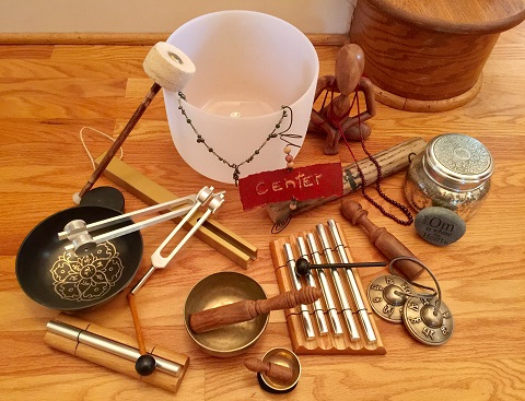
Sound has a long history as a healing modality. In ancient Greece there is documentation that it was used for mental health and other cultures such as Tibet and Australia have used sound healing instruments for over 40,000 years. Sound therapy, which it is often called today, uses varied musical instruments