Graphically Speaking
Data Visualization with a focus on SAS ODS Graphics
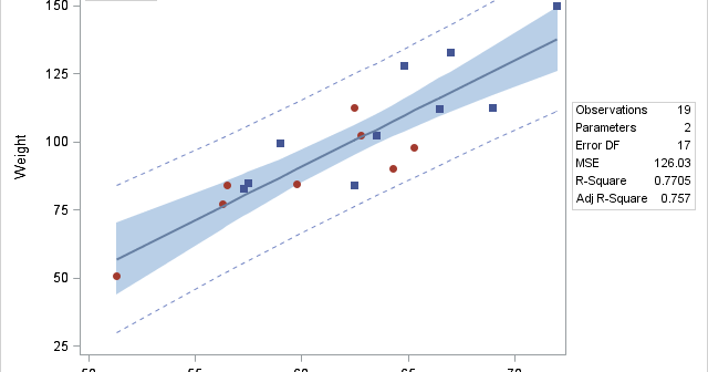
A customer wants to use PROC REG to fit a simple regression model but display in the fit plot markers that differentiate groups of individuals. Click on a graph to enlarge. Before we see how to do that, let's look at some simpler examples. The following step fits a linear

Let us start the new year by taking a trip back in history to SAS 9.2, first released in 2008, and the first SAS release that included the new ODS Graphics software including GTL and SG procedures. While we have recently released the third maintenance on SAS 9.4 (SAS 9.40M3),

An interesting question came up recently, where a colleague wanted to create a bar line chart with Revenue on the Y axis and Profit on the Y2 axis. The Revenues were all positive, but the Profit had positive and negative values. Some data I generated is shown on the right. Creating this

