Graphically Speaking
Data Visualization with a focus on SAS ODS Graphics
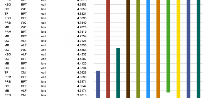
Introducing the new SAS/STAT lines plot
In PROC GLM and most other procedures that compute LS-means, mean comparisons are now displayed graphically. This makes comparisons between a large number of groups easier to interpret.

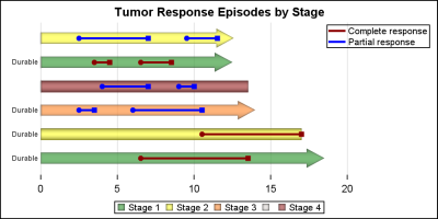
Getting started with SGPLOT - Part 8 - Horizontal HighLow Plot
On a recent visit to an In-House Users Group meeting at a Pharmaceutical company, I presented a 1/2 day seminar on creating Clinical Graphs using SG Procedures. Polling the audience for their experience with these procedures indicated that many SAS users are not familiar with these new ways to create graphs. So,

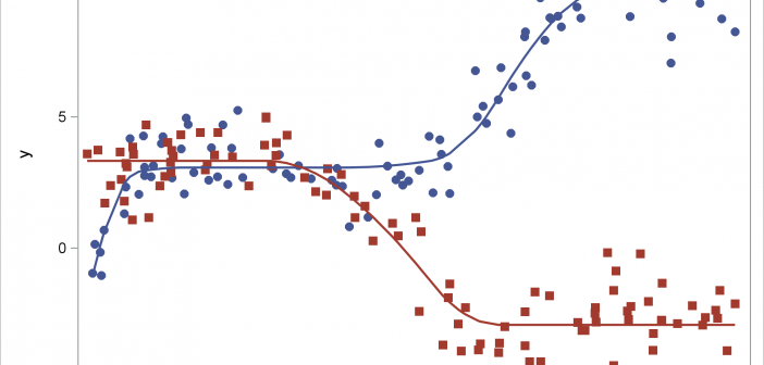
Advanced ODS Graphics: Monotonic functions
This post shows how to use PROC SGPLOT together with PROC TRANSREG to fit monotonically increasing or decreasing functions through a scatter plot.

