Graphically Speaking
Data Visualization with a focus on SAS ODS Graphics
The SG procedures and GTL statements do a lot of work for us to display the data using the specified statements. This includes setting many details such as arrow heads, line patterns etc, including caps. Often, such details have a fixed design according to what seems reasonable for most use

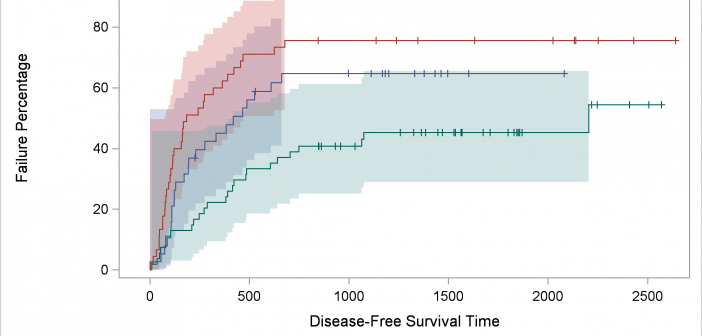
We'll take a deeper dive into understanding item stores--the files in which compiled templates are stored--and ways in which you can access them. At the end, I will show you one of my new examples: displaying percentages in the Kaplan-Meier failure plot.

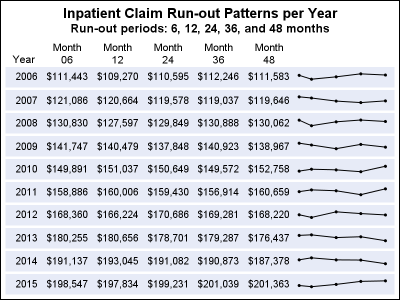
In the previous post, I discussed creating a 2D grid of spark lines by Year and Claim Type. This graph was presented in the SESUG conference held last week on SAS campus in the paper ""Methods for creating Sparklines using SAS" by Rick Andrews. This grid of sparklines was actually the

