Graphically Speaking
Data Visualization with a focus on SAS ODS GraphicsThe SGPLOT procedures includes features to add annotations to your graph in many different ways. Annotations provide you a flexible way to add features to your graph that are not available through the standard plot statements. Recently, I saw this graph on the web that caught my attention. Clearly, this looks like
PharmaSUG 2015 in Orlando was held at the Renaissance had a record breaking attendance of over 650. Weather was great, except for a huge downpour on the evening of the last day. All the popular presenters were in attendance including Art Carpenter, Kirk Lafler, Arthur Li and many others. Presentations
SGF 2015 was a blast with a focus on Visual Analytics, SAS Studio, Hadoop and more. Graphs were everywhere, and it was a banner year for ODS Graphics with over 15 papers and presentations by users on creating graphs using SG Procedures, GTL and Designer. Dan Heath, Prashant Hebbar, Scott
A very common type of graph contains two series plot, where the user is expected to evaluate the difference visually. I saw one such plot on the web today shown on the right. This graph has two curves, one for malpractice premiums and one for claims, with a shaded band
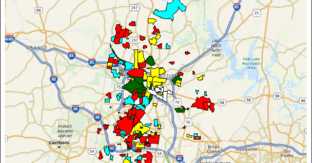
MicroMaps are a powerful way to display data where the display includes small, lightweight maps to provide geographical information regarding the data. This geographical information gives clues to the relationship between the data that could lead to more insight. The SAS SG Procedures and GTL do not currently have built-in
Back in late 2012 I discussed a technique for Conditional Highlighting, where additional attributes can be displayed in a graph. In the previous article the goal was to display a graph of Response by Year by Drug. We used a cluster grouped bar chart to create the bar chart. We