Graphically Speaking
Data Visualization with a focus on SAS ODS Graphics
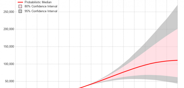
During the year 2020, many countries and areas will be conducting their decennial census, and making projections to estimate what their population will be in the future. Therefore I decided to dust off one of my old SAS/Graph samples based on the 2010 census, and rewrite it using more modern

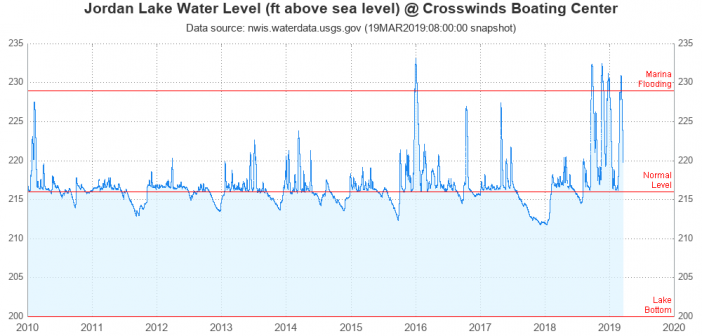
Flooding has been in the news the past few days, and that makes me want to analyze some data! I hang out at Jordan Lake (here in central North Carolina) a lot, so I decided to download the data for that lake, and do a graphical analysis. If you're interested

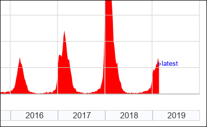
Here in the US, there's a lot of talk about the flu each year. First, people discuss whether or not to get the flu shot. Then there are discussions about whether or not you or your friends have the flu (or something else). Then the discussions about what strain of
