Graphically Speaking
Data Visualization with a focus on SAS ODS Graphics
The past few years, I've created maps showing things you might visit and do during the big SAS Global Forum (SASGF) conference. This year the conference is in Dallas, and ... you guessed it ... I've created a Dallas map! If you're familiar with my previous maps, you know that

SAS Global Forum 2019 (SGF) is rapidly approaching - and which of the hundreds of presentations are you planning to attend? Well, no matter what types of analyses you perform with SAS software, you'll most likely want to present your findings in a really nice/informative graph! Therefore I highly recommend

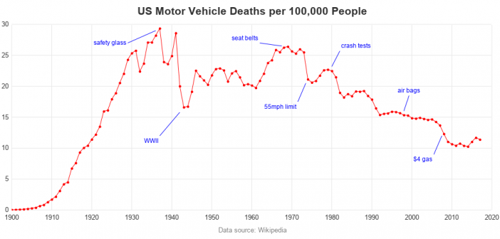
I recently saw an interesting graph that showed the number of motor vehicle crash deaths has been going down. The graph showed deaths per mile. That's a good statistic, but I wondered whether there were other ways to look at the data? An Interesting Graph Here's the graph, from an
