Graphically Speaking
Data Visualization with a focus on SAS ODS Graphics
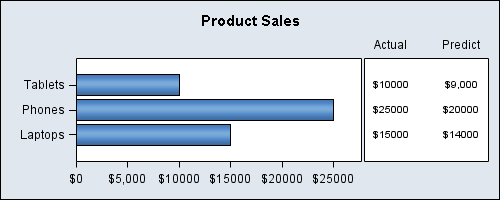
Following up on the theme of graphs commonly used in many applications, here is another one that displays a horizontal bar chart with multiple data columns aligned with the bars. Recently at WUSS, a user stopped by asking how to create just such a graph. While this user wanted something more complex

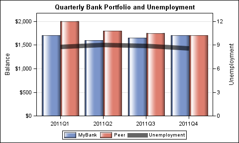
Let us ring in the new year with something simple and useful. A recent question by a user over the holidays motivated this article on what is likely a commonly used graph. We want to compare the preformance of two categories along with a third measure. This could be something like "How

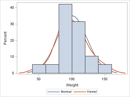
When I give presentations on using the SG procedures, I try to describe how you can take simple plots and layer them to create more complex graphs. I also emphasize how you must consider the output of each plot type so that, as you overlay them, you do not obscure

