Graphically Speaking
Data Visualization with a focus on SAS ODS Graphics
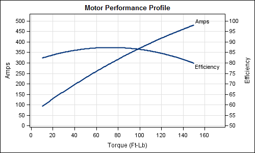
Often it is useful to view multiple responses by a common independent variable all in the same plot. SGPLOT procedure and GTL support the ability to view two responses, one each on the Y and Y2 axes by one independent variable (X) in one graph. Yes, you can also have X

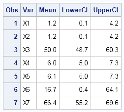
Recently a user posted a question on the SAS/GRAPH and ODS Graphics Forum about drawing a plot with custom confidence intervals . The user has a simple data set with category, response (mean) and custom lower and upper confidence intervals. The data looks like this: Robert Allison provided the code (proc gplot +

A recent post on the SAS website shows the SAS Annual Revenue History. It would be interesting to see how we could create such a graph using SG procedures, and how we could add more information and interest in the presentation. So, I started with the basic informaiton on the annual revenues provided,
