Graphically Speaking
Data Visualization with a focus on SAS ODS Graphics
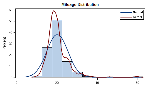
Recently a user posted a question on the SAS/GRAPH and ODS Graphics Communities page on how to plot the normal density curves for two classification levels in the same graph. We have often seen examples of a distribution plot of one variable using a histogram with normal and kernel density curves. Here is a simple example: Code Snippet:

In December of last year, the book "Statistical Graphics Procedures by Example" co-authored by Dan Heath and I was published. On the back cover, it proclaims "Free Code on the Web". Now, who can resist such an offer? Since most of the examples in the book have very short syntax,

Recently, I had a discussion with a user concerning the volume of imagemap data generated for an interactive, web-based visual contain a large number of graphs. The large amount of imagemap data was causing problems with the current version of their web browser. The graphs consisted of either bar charts

