Graphically Speaking
Data Visualization with a focus on SAS ODS Graphics
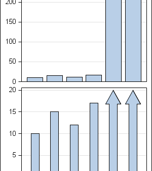
In the previous post on Broken Y-Axis, I reviewed different ways to display data as a Bar Chart, where the response values for some categories are many orders of magnitude larger than the other values. These tall bars force the display of other values to be squeezed down thus making it harder to compare

Often we want to display data as a bar chart where a few observations have large values compared to the rest. Comparison between the smaller values becomes hard as the small bars are squeezed by the tall bars. Here is an example data, and a bar chart showing the data. The large values

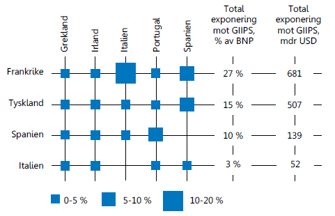
Recently, I came across an interesting graph showing Euro contries bank exposuro to GIIPS countries, as percent of GNP. Here is the graph: I thought I would see how far I can get in making a similar graph using SAS. I made up some data with response values for a Product x
