Graphically Speaking
Data Visualization with a focus on SAS ODS Graphics
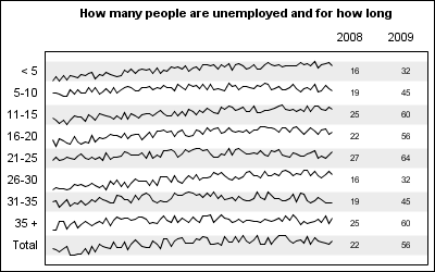
Spark lines, made popular by Edward Tufte, provide a way to visualize trends in a concise space, often inline with the rest of the narrative or data. Previously, I posted an article on Spark Plots in which I created different plot types, some of which included multiple graphs and data in each row. For such

The Swiss army knife is known for its versatility, with a variety of tools and blades to help you complete the task at hand. When you are creating graphics, you sometimes have a special feature you want to add, but you can't seem to find the right syntax "tool" to

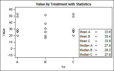
Statistical graphs often include display of derived statistics along with the raw data. Often these statistics are presented in a tabular format inside the graph. With SGPLOT procedure, a table of statistics can be added to the graph as an inset table, as shown below. Using a Stat Table: SGPLOT code:

