Graphically Speaking
Data Visualization with a focus on SAS ODS Graphics
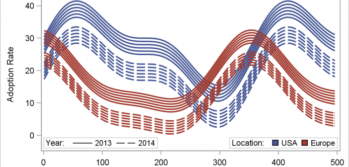
In her article Creating Spaghetti Plots Just got Easy, Lelia McConnell has provided us a glimpse into some new useful features in the SAS 9.4M2 release. The term Spaghetti plots generally refers to cases where time series plots have to be identified by multiple group classifications. The support for the

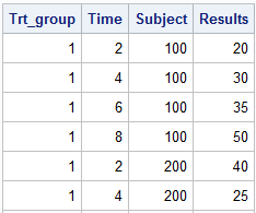
This article is by guest contributor Lelia McConnell, SAS Tech Support. Creating Spaghetti Plots Just Got Easy Sample 38076: “Response by patient and treatment group” illustrates how to generate a spaghetti plot using the SGPLOT procedure. Sample 40255: “Plot of study results by treatment group” illustrates how to generate a

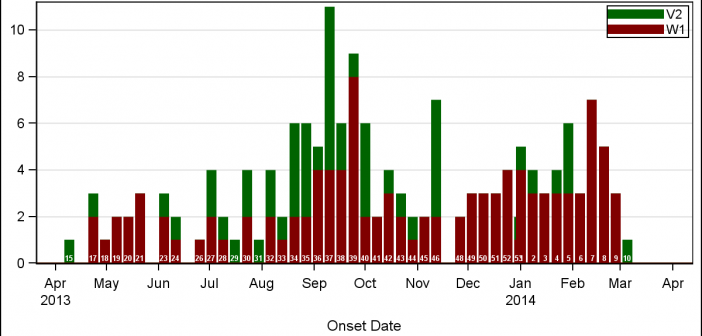
A few weeks back I wrote an article on Grouped Timeline for creating a stacked timeline for onset of different virus. The idea in that article was to display a stacked needle on a time axis using a HighLow plot. Such graphs are also referred to as EPI or Epidemic Curve
