Graphically Speaking
Data Visualization with a focus on SAS ODS Graphics
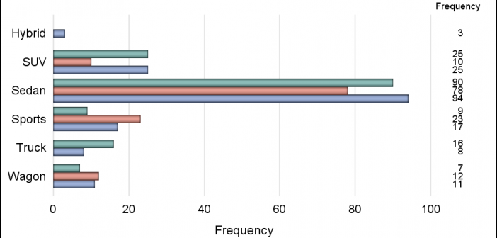
One of the key benefits of using a horizontal bar chart is the ability to display statistics for each bar. This is a popular feature for the HBAR statement with the SAS/GRAPH GCHART procedure. So, let us review the options available to us to create such graphs using SGPLOT. The

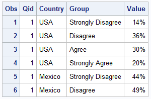
Just this morning I received a request for a brief survey from Apple on my feedback about the new iPhone6+. Yes, I finally got one, dead last in the family. The survey followed the usual format, with a number of questions on what I like or dislike about it, with

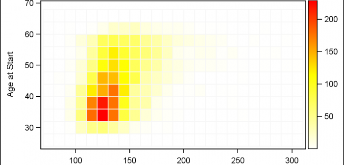
Heat maps are a great way to visualize the bi-variate distribution of data. Traditionally, a heat may may have two numeric variables, placed along the X and Y dimension. Each variable range is sub divided into equal size bins to create a rectangular grid of bins. The number of observations
