Graphically Speaking
Data Visualization with a focus on SAS ODS Graphics
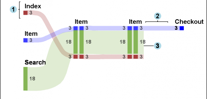
Sankey Diagrams have found increasing favor for visualization of data. This visualization tool has been around for a long time, traditionally used to visualize the flow of energy, or materials. . Now to be sure, GTL does have a statement design for a Sankey Diagram which was implemented only in Flex for use

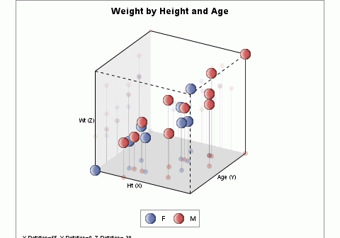
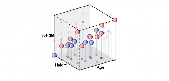
In the previous article, I described the process to create a 3D Scatter Plot using a 3D Orthographic View matrix and the SGPLOT procedure. I posted a macro that can be used to create a 3D scatter plot from any SAS data set, using 3 numeric columns, one each for

The SG Procedures do not support creating a 3D scatter plot. GTL has some support for 3D graphs, including a 3D Bi-variate Histogram and a 3D Surface, but still no 3D point cloud. The lack of such a feature is not due to any difficulty in doing this as
