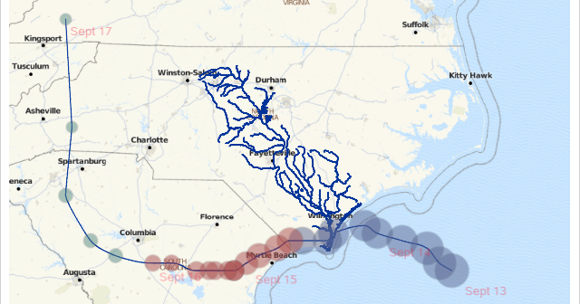
In August 2018, Hurricane Florence came on shore in North Carolina. Much of the damage was from flooding because the storm moved slowly over North and South Carolina. Parts of North Carolina had over 30 inches of rain from the storm, and this caused many of North Carolina’s rivers to
English
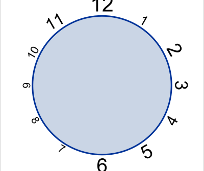
The 6th maintenance release of SAS 9.4 is now available for users. Along with it comes a new SG procedure - the SGPIE procedure (pre-production). The primary audience for the SG procedures has been the analytical user, for creating effective displays of analytical data. However, the rich feature set of these
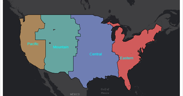
Starting with SAS 9.4M6, procedures that used to be provided with a SAS/GRAPH installation are now available with Base SAS. Using these procedures along with PROC SGMAP can help you create some very nice maps. This blog builds on previous posts and highlights the: MAPSSAS Data Sets GREMOVE procedure %CENTROID
A few days back I published an article on including more subject data in a Waterfall graph. This was motivated by the desire from many users to view more data in the same graph, thus avoiding the need to refer to different graphs for the relevant information. In this case,
Previously, I have written articles on how we could display more subject response data along with the traditional WaterFall graph showing the best "Change from Baseline". This is in response to the desire to see data like treatment duration for each subject in the same graph. Otherwise, investigators have to
The TEXT plot was introduced with SAS 9.4M2 to facilitate placement of text strings in a graph. This replaces the MARKERCHAR feature of the SCATTER plot statement, which is still available, but it is better to use TEXT plot in most cases. The syntax is: text x=column y=column text=column </
Recently a colleague was requested to create a bar chart showing the performance of students in a school compared to county and state wide schools. The solution using SGPLOT was simple as shown below. /*--Create data--*/ data school; input Year Group $ Value; format Value percent5.1; datalines;
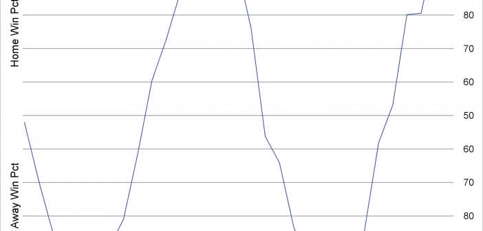
By using a format, you can change the tick values and create values that range from 100 to 50 to 100 to display the probable outcome of a sporting event.
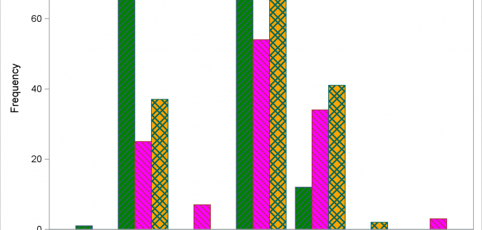
The STYLEATTRS statement in PROC SGPLOT enables you to override colors, markers, line patterns, fill patterns, and axis break patterns in ODS styles, without requiring you to change the ODS style template.
You can use SG annotation to display graphs inside of other graphs.