There are many ways to add more "visual impact" to your maps. Some techniques grab the users' attention, but often don't add anything useful to the message the map is trying to convey (such as 3D tricks, or flashy/gratuitous images and infographics). I encourage you to design maps that have more visual impact, rather than just grabbing the users' attention. Here is an example...
Nuclear Plants
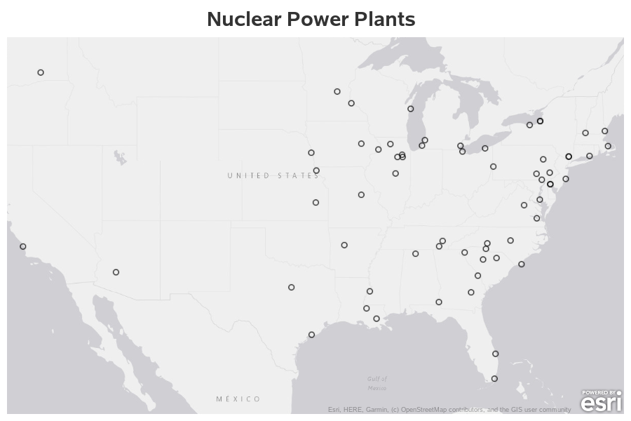
Let's jump right into some nuclear power plant data. I have some 2014 data I downloaded from the Energy Information Administration (EIA) a while back, so I imported that into SAS, and plotted the lat/long coordinates of the nuclear power plants on a map using the following code.
proc sgmap plotdata=all_data noautolegend;
esrimap url="http://services.arcgisonline.com/arcgis/rest/services/Canvas/World_LIght_Gray_Base";
scatter x=long_plant_marker y=lat_plant_marker /
markerattrs=(symbol=circle size=10px color=black);
run;
The above map does a decent job of showing the locations of nuclear power plants, but that information by itself is not very compelling. The map might give an indication of what areas have more, and fewer, nuclear plants. But someone looking at the map might say "So what?"
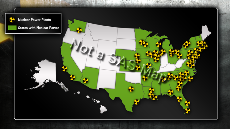
At this point, we could spice the map up by making it jump off the page with 3D tricks, replacing the markers with something eye-catching like little radioactive warning signs, using garish colors, and so on.
Here's an example from ourweekly.com (attributed to CNN News Wire) of a map that's fancier, but doesn't really add much more information than the simple map above. I would recommend you not go this route:
Nuclear Plants and Cities
Instead of making a fancier map, like the one above, I would recommend you enhance your map, and add things that make it more useful and informative to the user - things that make an impact with the user.
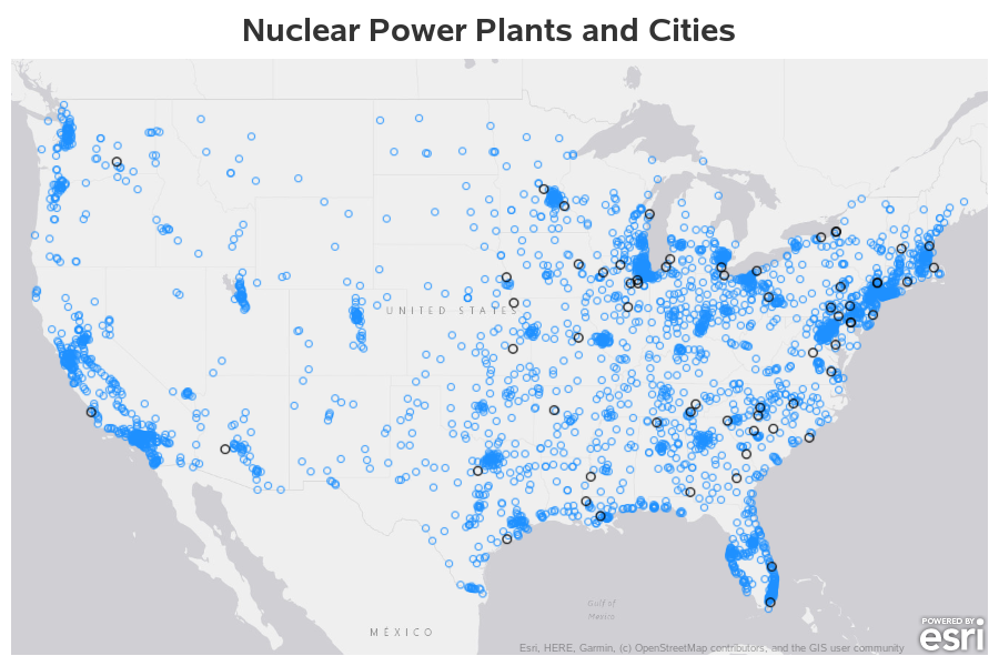
Why might someone be concerned about the locations of nuclear power plants? Well, some people might want to live in an area with nuclear power plants (as opposed to plants fueled by fossil fuels). Other people might be paranoid about possible nuclear accidents (such as Three Mile Island, Chernobyl, and Fukushima) and not want to live near a nuclear power plant. Therefore proximity to cities might be something useful and interesting to add to the map.
We can add some city lat/long locations to our data, and then easily plot them using a second scatter statement in our SGmap.
proc sgmap plotdata=all_data noautolegend;
esrimap url="http://services.arcgisonline.com/arcgis/rest/services/Canvas/World_LIght_Gray_Base";
scatter x=long_city_marker y=lat_city_marker /
markerattrs=(symbol=circle size=8px color=dodgerblue);
scatter x=long_plant_marker y=lat_plant_marker /
markerattrs=(symbol=circle size=10px color=black);
run;
Now the map (above) shows the locations of the cities in addition to the nuclear plants. But it's difficult to tell exactly which nuclear plant is the closest to each city.
Color Coding Cities
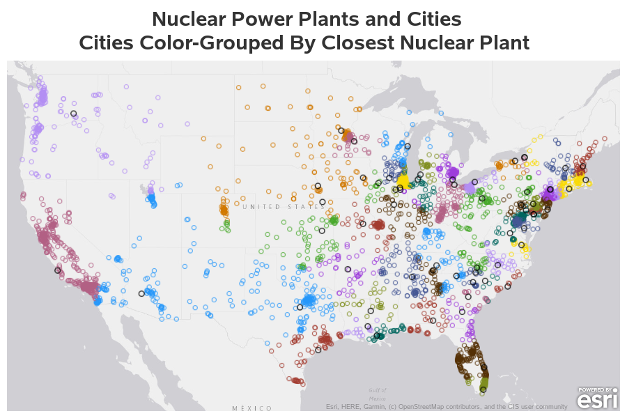
Therefore I added a bit of code to calculate the distance from each city to each nuclear plant (using the geodist function), and determined which nuclear plant was the closed to each city. I then used that plant name as the group= value, to color the city markers based on the nearest plant.
proc sgmap plotdata=all_data noautolegend;
esrimap url="http://services.arcgisonline.com/arcgis/rest/services/Canvas/World_LIght_Gray_Base";
scatter x=long_city_marker y=lat_city_marker /
group=plant_name markerattrs=(symbol=circle size=8px);
scatter x=long_plant_marker y=lat_plant_marker /
markerattrs=(symbol=circle size=10px color=black);
run;
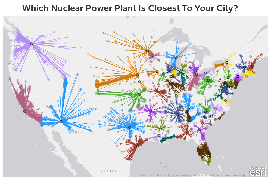
The colors in the above map give you a way to visually group the cities ... but you still have to do a lot of mental work. Let's add a line from each city to the nearest nuclear power plant, to make the map more intuitive and easier to comprehend quickly.
Connecting Plants & Cities with Lines
I add to my data an observation for each nuclear plant, followed by an observation for each city ... and then insert a 'missing value' (where the latitude and longitude = .). The missing value causes the lines to be broken between each city (so each plant/city pair has a discrete line segment). I use group=plant_name again, to color the line segments like I colored the cities.
proc sgmap plotdata=all_data noautolegend;
esrimap url="http://services.arcgisonline.com/arcgis/rest/services/Canvas/World_LIght_Gray_Base";
series x=long y=lat /
group=plant_name lineattrs=(pattern=solid);
scatter x=long_city_marker y=lat_city_marker /
group=plant_name markerattrs=(symbol=circle size=8px);
scatter x=long_plant_marker y=lat_plant_marker /
markerattrs=(symbol=circle size=10px color=black);
run;
Adding these lines makes a big visual impact. Now when someone glances at the map, they can quickly get an idea of what it represents. And if they can quickly understand what the map is about, I think they are much more likely to invest even more of their time studying the map (whereas if a map is initially confusing, a user will probably just ignore it altogether).
Bonus!
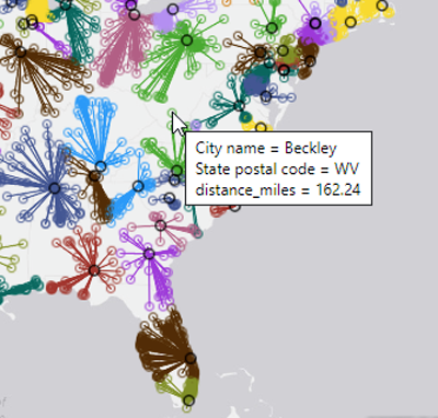
You can create all of the above maps with SAS 9.4m6, but if you have the latest release of Proc SGmap (in Viya 3.5), you can also specify custom mouse-over text and drilldowns. I set up drilldown links so you can click the nuclear power plant markers to launch a Google search for each plant, and I set up mouse-over text for the city markers showing their name and the miles to the closest nuclear plant. Here's an example of what those look like:
If you'd like to try the interactive version of the map with the mouse-overs and drilldown links, click here. And if you'd like to see the complete SAS code used to create the map, click here.



4 Comments
For balance, had you considered plotting with information about electricity consumption? That's why we have power plants.
That could be interesting.
Hi Robert. I was looking to recreate this but can't seem to find the excel file. Do you have a direct link to it?
Hmm ... yes, that spreadsheet is a bit difficult to locate on the EIA website. So here's a direct link to a copy you can download:
https://sascommunities.github.io/graphics-programming/robert/EIA923_Schedules_2_3_4_5_M_12_2014_Final_Revision.xlsx