A few years ago Mandelbrot sets and fractals were all the rage! (Am I showing my age? Hahaha!) I thought creating some plots of this type of data would be a good way to sharpen my SAS programming skills, and it would make a nice/interesting example to help teach people how to use Proc SGplot.
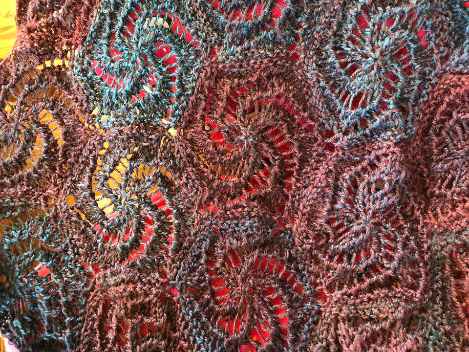
But how about a "random photo" before we get started! I asked my friends if they had anything "in real life" that resembled my Mandelbrot graph. I got several cool/interesting replies, but here's my favorite. This is a shawl that my friend Sara knitted. She spent over a year working on it!
Now, let's create that Mandelbrot graph!
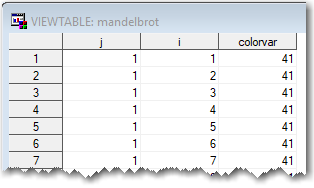
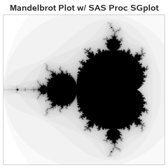
First I needed some Mandelbrot data. I wasn't quite energetic enough to start from scratch, so I did a few web searches and found some Fortran code that seemed like a good starting point. I set up a SAS data step to loop through, and perform the same calculations they had done in Fortran, and in short order I had a dataset containing a Mandelbrot set. The dataset has 480,000 data points - here's what the first few looks like.
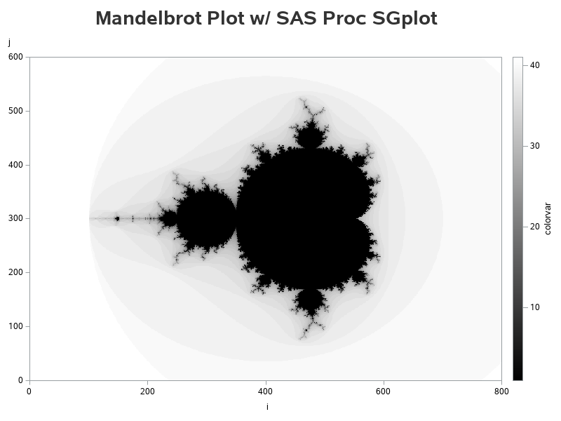
After a bit of playing around, I found the following code produced an aesthetically pleasing plot of the data. At first glance you might think it's a contour/surface plot, but it's just a simple scatter plot, using tiny markers that are 1 pixel in size, and a gradient color scale going from black to white. With 480,000 of these tiny markers in the plot, they touch one another, so it looks like a continuous surface rather than individual markers.
proc sgplot data=mandelbrot;
scatter y=j x=i / markerattrs=(symbol=circlefilled size=1px)
colorresponse=colorvar
colormodel=(black white);
yaxis offsetmin=0 offsetmax=0 labelpos=top;
xaxis offsetmin=0 offsetmax=0;
run;
What about adding some color? Many of the Mandelbrot plots I've seen use several colors, so I tried adding more than just black-to-white in my color gradient. I experimented with several different colors, and found the following to be visually pleasing:
proc sgplot data=mandelbrot;
scatter y=j x=i / markerattrs=(symbol=circlefilled size=1px)
colorresponse=colorvar
colormodel=(
black
CXCC99FF CX9966CC CX663399 CX003366
CXCC99FF CX9966CC CX663399 CX003366
CXCC99FF CX9966CC CX663399 CX003366
CXCC99FF CX9966CC CX663399 CX003366
CXCC99FF CX9966CC CX663399 CX003366
CXFF99CC CXCC6699 CX993366 CX660033
CXFFCC99 CXCC9966 CX996633 CX663300
CXCCFF99 CX99CC66 CX669933 CX336600
CX99FFCC CX66CC99 CX339966 CX006633
CX99CCFF CX6699CC CX336699 CX003366
);
yaxis offsetmin=0 offsetmax=0 labelpos=top;
xaxis offsetmin=0 offsetmax=0;
run;
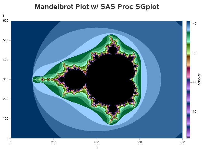
This could almost be artwork, eh? So let's make it look less like a graph, by getting rid of the axes (using display=none) and legend (using noautolegend)! And then also 'zoom in' on the interesting part of the graph (by specifying specific values= ranges on the axis statements). Now you can see more detail, and the focus is just on the beautiful graph (not the axes and legend).
proc sgplot data=mandelbrot noautolegend;
scatter y=j x=i / markerattrs=(symbol=circlefilled size=1px)
colorresponse=colorvar
colormodel=(black white);
yaxis values=(50 to 550 by 50) offsetmin=0 offsetmax=0 display=none;
xaxis values=(100 to 650 by 50) offsetmin=0 offsetmax=0 display=none;
run;
Feel free to download the SAS code, and experiment with changing the colors, etc. Who knows - you might even create something you'd want to frame and hang in your office! 🙂


8 Comments
Cool Graphs; yes fractals and mandlebrot plots were quite the range in the 90's. We were even trying to find oil using fractals. Just saw a blog the other day about using fractals in Stock market analyses. As my previous IT manager said, "What comes around, goes around".
That's pretty cool!
You've outdone yourself, Robert!
Thanks Ed! 🙂
Pingback: Vectorize the computation of the Mandelbrot set in a matrix language - The DO Loop
I remember back in 1987, that we had some art work displayed in the SAS UK office, based on the Mandelbrot Set, that was created in SAS/GRAPH using PROC GANNO and the annotate datasets. I think the inspiration came from this SUGI 12 paper https://support.sas.com/resources/papers/proceedings-archive/SUGI87/Sugi-12-170%20Patalocchi%20Schladenhauffen.pdf
It's nice to see the images brought up to date.
Nice bit of history! - thanks for posting the link!
Pingback: How to draw a Mandelbrot set in SAS Visual Analytics - SAS Users