Cases of the measles have certainly been making headlines in the news recently. And with all the data at our disposal these days, it seems like we should be able to predict which areas in the US are most likely to have measles outbreaks, eh? A group of independent researchers (Lancet) did just that - they identified at-risk counties by "cross-referencing communities with low vaccination rates and high rates of kindergarten vaccine exemptions, with communities whose airline hubs have frequent flights to countries with ongoing measles outbreaks." (FiveThirtyEight)
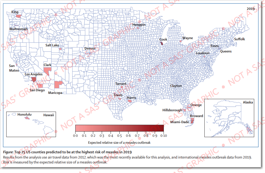
Original Map:
I won't get into the details of their forecasting model (see their paper for details), but here's a screen-capture of their map. They show a county map, shade the 25 counties most at-risk, and place a text label on those counties. The map covers the basics, but I feel it is lacking in really communicating the data.
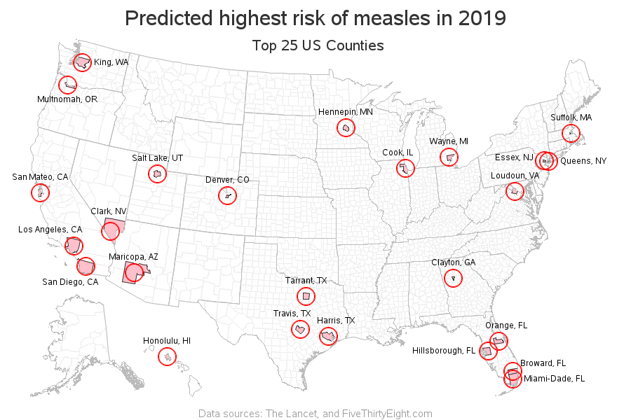
My New/Improved Map:
So of course I decided to create my own version of the map, using SAS Software, and try to make a few improvements. Here's what I came up with (click to see the interactive version with mouse-over text and drilldowns):
List of improvements I made:
- I de-emphasized the counties not at risk, by making their borders a very light shade of gray (this makes the at-risk counties stand out more).
- I added darker gray state outlines, to help put the counties into geographical context.
- Some of the counties with very large populations have a relatively small land area (such as Queens County, NY). Such counties are difficult to 'see' in the map, therefore I added a circle around each county. You can easily see the circle, no matter how small the county.
- The gradient shades of color in the original map were difficult to discern, and your perception of the shades was possibly biased, by the differing sizes of the counties. Therefore I used a single color, rather than gradient shading.
- I added mouse-over text to show the county names & ranks, and you can click each county (or county name) to launch a Google search about measles in that county (click the static map above to see the interactive version).
- I added a descriptive title and footnote.
- Used a more visually pleasing map projection, so the US doesn't look "squished".
- And, in general, I de-emphasized the map (by making the borders lighter gray), and added emphasis to the circles and labels (by making them a more vibrant color that stands out).
See what an improvement you can make with a few small customizations, using flexible mapping software!?! What other changes and improvements might you recommend? Feel free to discuss in the comments section!


6 Comments
Tremendous improvement! All the information is readily discernible and easily digested. Nicely done.
Thanks!
Thanks Robert. Looks good. Where you planning on sharing code?
https://blogs.sas.com/content/graphicallyspeaking/files/2019/06/measles_prediction_2019.txt
Love the new and improved map.
The state borders make a HUGE difference. Before I scrolled down to yours, I was playing "guess the state" with the counties. Some were obvious like LA and San Diego, and others I knew from having lived in TX and VA, but I would have never been able to tell you that one county was in MN.