I have written several blog posts about longevity, and here is another one related to that topic. Cardiovascular disease (cvd) is one of the more common causes of death, and I was wondering how those numbers have changed over time. Are fewer people dying from cvd, or are more people dying from cvd? Am I even asking the right question?!?
I remember seeing some interesting headlines 15+ years ago, showing that the number of males dying from cvd was decreasing, and had actually become lower then the number of females dying from cvd. After a bit of web searching, I found several versions of the graph, such as this one:
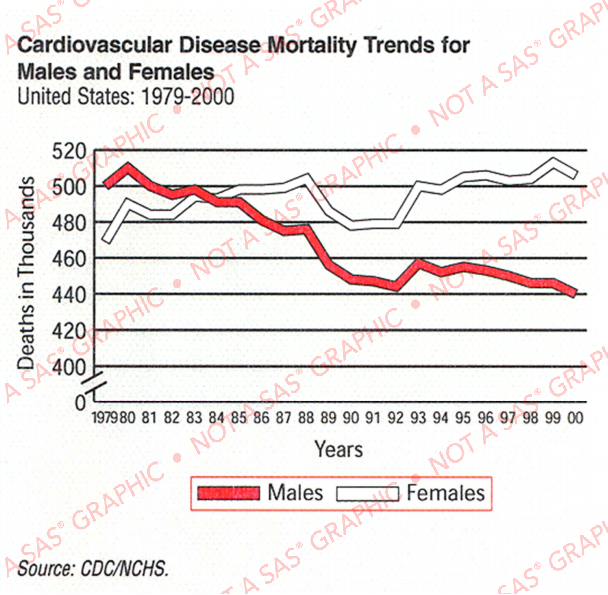
It was a graph that certainly caught my attention (it must have, for me to remember it for 15+ years!) ... but now that I'm looking at it with a more discerning eye, I notice that it's not really a great graph. Here are some problems that jump out at me:
- The legend is very big, and takes a lot of space.
- The data source isn't very specific (which I really noticed, once I tried to look up the actual data!)
- Showing the deaths in thousands made me (mistakenly) think it was the rate.
- The year axis is difficult to read, with a label for each data point.
- The split axis doesn't seem particularly useful.
So, of course, I decided to create a new/improved version of the graph. First I had to find the data ... which took quite a bit of searching, since their 'source' footnote was very vague. I finally found it on the CDC website, downloaded the .txt tab-delimited file, and imported it into SAS using Proc Import.
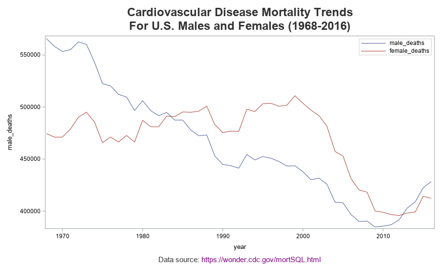
Basic/Default Graph
Now I can create a new graph using the minimal code below. Note that my legend is inside the graph (taking less space), I have a footnote detailing exactly where the data came from, I did not convert the deaths to thousands, the year tick mark labels are every 10 years (rather than each individual year), and I do not have a split axis. Oh, and many additional years of data are now available, that weren't in the original graph.
proc sgplot data=my_data_deaths;
series x=year y=male_deaths;
series x=year y=female_deaths;
keylegend / position=topright location=inside across=1;
run;
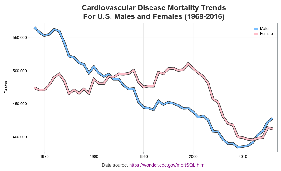
Customized Graph
My graph is off to a good start, but still needs a bit of work. I add a yaxis label, add a comma format to the number of deaths (so they are easier to read 'at a glance'), and remove the year axis label. I liked the way the original graph had thick lines, with a border on the sides of the line, so I simulated that with the code below (first drawing a thick dark line, and then overlaying a slightly less thick colored line).
series x=year y=male_deaths / lineattrs=(color=gray33 thickness=8px);
series x=year y=male_deaths / lineattrs=(color=cx7abfff thickness=5px);
series x=year y=female_deaths / lineattrs=(color=gray33 thickness=8px);
series x=year y=female_deaths / lineattrs=(color=pink thickness=5px);
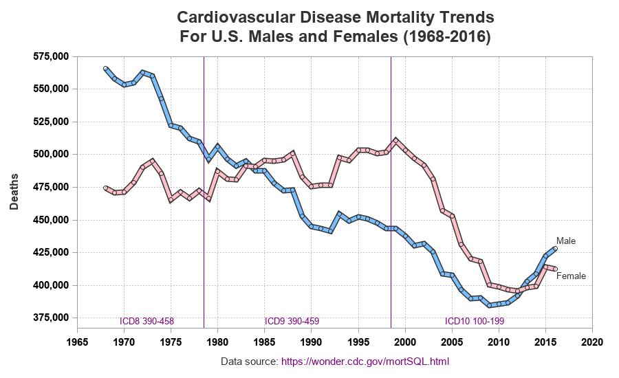
Highly Customized Graph
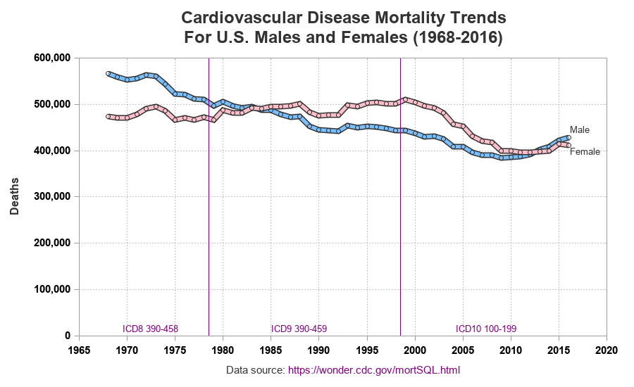
But there's still one thing weighing heavily on my mind ... the data source. The CDC download page mentions that they use three different ICD (International Classification of Diseases) codes for the 3 ranges of years (1968-78, 1979-98, and 1999-2016), and mention that the "ICD revisions differ substantially". And although this particular data looks reasonably consistent when it crosses those year boundaries, I felt it important to indicate that the graph contains data from 3 different ICD revisions. Therefore I added some reference lines, and labeled each time range showing the ICD codes. While I was at it, I customized the grid lines and axes a bit more, added circular markers at each data point, and annotated labels on the lines rather than using a color legend (note that I also could have used curvelabel and curvelabelloc=inside to label the lines, but I chose to use annotate to get a little extra control and place the line labels in the exact positions I wanted).
Starting Axis at Zero
I like the graph pretty well, but there's still one thing bugging me. Any time you scale an axis from the minimum to the maximum data value, there's a chance that you are 'exaggerating' the change. The original graph tried to mitigate this by showing that the yaxis is broken, but I want to actually see the data plotted on a non-broken axis. Therefore I plotted the data again, with the yaxis starting at zero.
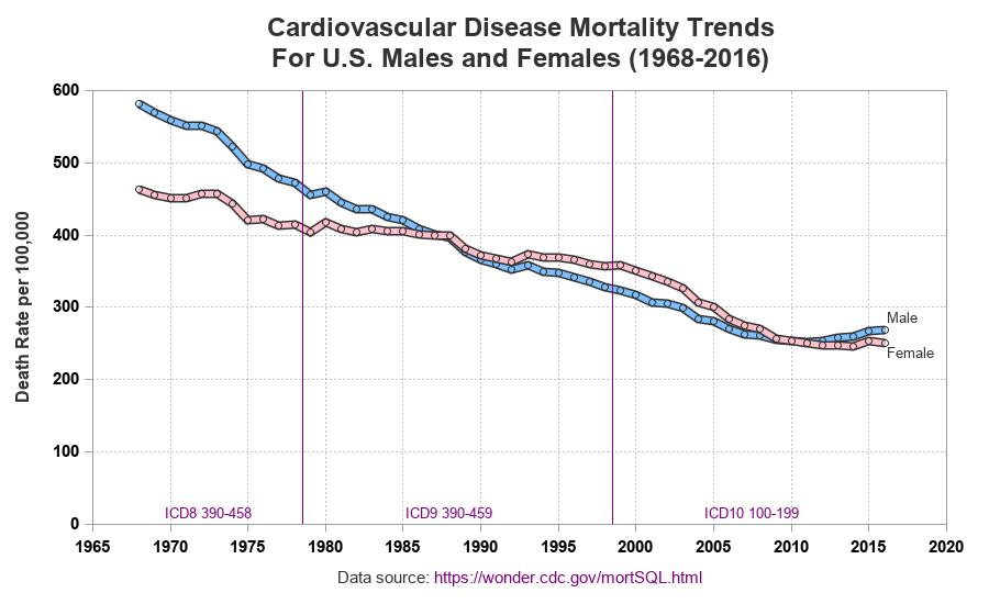
Graphing Rate per 100,000
I was pretty happy with the graph ... but then I read a paper that threw some doubt upon the original graphs I had seen. It called those graphs "perhaps the most widely printed and misunderstood graphic on cardiovascular mortality trends in the United States. As shown, between 1979 and 2000, there were successively fewer deaths from cardiovascular disease among men and successively more deaths from this cause among women. This figure shows numbers, not rates, and therefore is relevant to the health care burden, but not to the preferential application of modern medicine to men. In fact, the incidence and the case-fatality rate of coronary artery disease has declined in both sexes".
1968 to 2016 is quite a long span of time, and the US population has changed (grown) considerably during that time period. And although it's interesting to see the number of deaths, it would be even more interesting to see the cvd death rate (deaths per 100,000). This number was also available in the CDC data, therefore I created yet another plot to show those values:
Questions
Which of these graphs do you prefer, and why? Do you see any interesting trends in the data? Are there any trends you can (or can't) explain? I always recommend plotting the data in several different ways to get a more complete understanding, and I think these plots are a good example! (Here's a copy of the complete SAS code, in case you'd like to see all the details.)


8 Comments
This is great!! Thank you Robert.
This is great! Definitely prefer the last graph. makes more sense to me with the standardized rate rather than actual counts.
The last graph is definitely an improvement and including the rate was a must. However, I am curious to see if the clustering of age at the time of these deaths has changed, ie.. are people also living longer over time with Cvd?
There was no age data in this particular data set, but that would definitely be interesting to analyze!
As a woman, I found the original graph alarming. It makes it look like women are at huge risk of death from cardiovascular disease. Your final graph tells essentially the opposite story which is that we should all be grateful and relieved that deaths are declining for everyone, male and female. This is a great example of how it is possible to mislead with graphs if you aren't careful. Good job!
Well said!
Robert, I like the last one, but the would change the y-axis label to "Deaths per 100,000" as that is the actual definition of the rate.
Pingback: Our top 10 data visualizations of 2019 - SAS Voices