From sports and health data to environmental and policy data, our data visualization experts have used SAS technologies to explore and present analyses on hundreds of topics throughout the year. We've selected some of the best in this end-of-year roundup to showcase their skills and SAS technologies, and to demonstrate the importance of data literacy.
The best data visualizations take data about a popular topic and present it in a compelling way. They simplify complex data sets and make it easier to interpret the data and find interesting themes in the data. As you'll see in these examples, a great data visualization doesn't just present you with answers. It shows you data in a way that often leads to further inquiry.
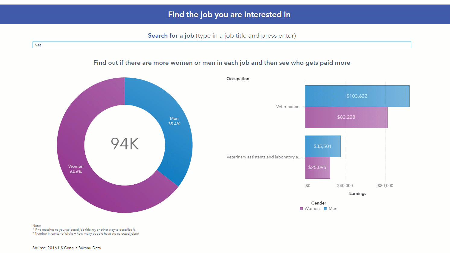
1. Does equal pay exist?
GatherIQ publishes interactive data stories that highlight global statistics and encourage data literacy among learners. These engaging data stories allow you to interact with the data through sliders and other simple features. In this equal pay data story you can explore pay rates for men and women around the world and see how they differ.
2. What is the "greenest" trip possible for attending 12 European Championship games?
Yes, we did the math. In this post from Sertalp Clay, you'll find an explanation for how he optimized this trip to see as many championship football games as possible, in a tournament that takes place all across Europe, with the smallest environmental impact. Separately, he optimized trips for the fastest routes and the cheapest routes. Football fans everywhere are planning vacations already.
3. Who killed the most characters in The Game of Thrones?
This episode and character analysis for The Game of Thrones television series includes a social network map of character connections, including who killed whom. The full infographic from Falko Schulz also shows which characters had the most screen time, how many characters were included each season and which houses have the most members. (Click image to see a full size infographic that is easier to read.)

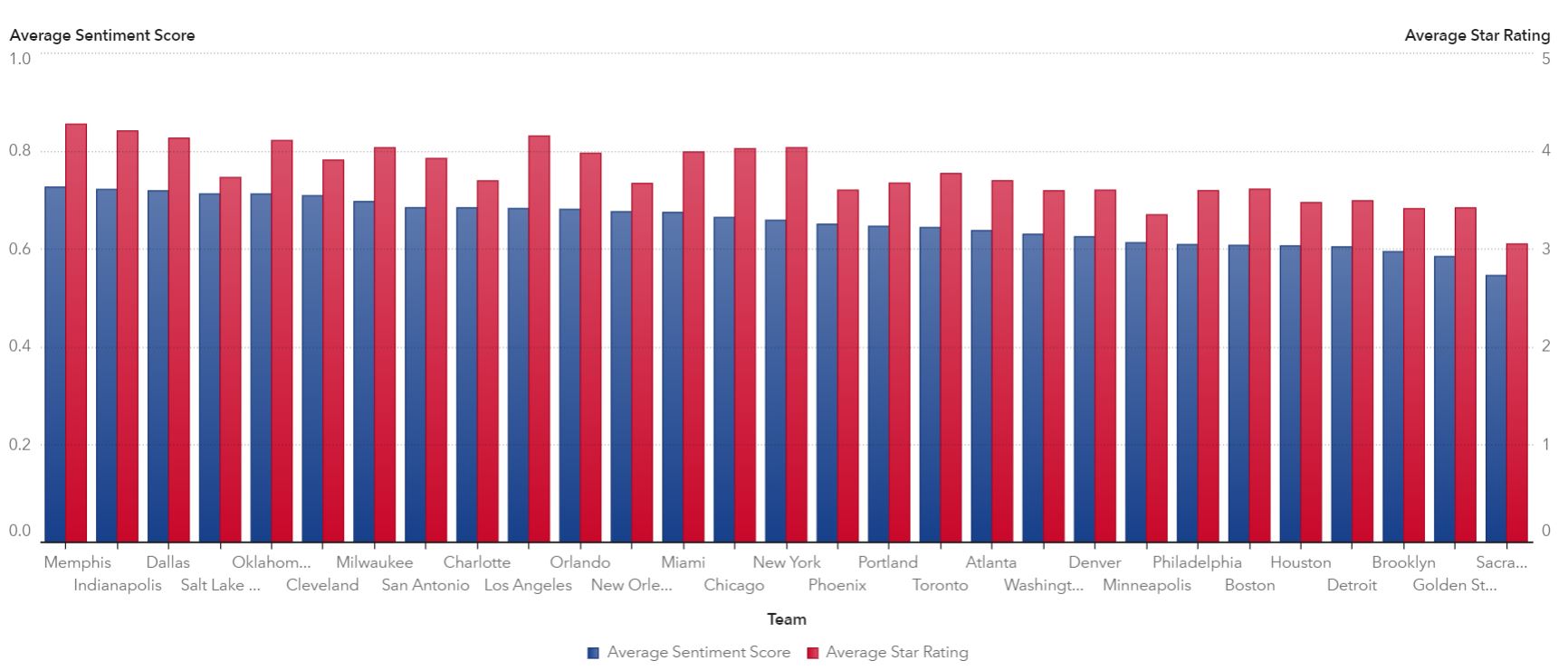
4. Who has the best NBA arena?
According to Frank Silva's analysis of Yelp data, the Memphis Grizzlies have the best NBA arena. Check out the full post for a deeper analysis and more visualizations showcasing fan ratings and sentiment about their favorite NBA venues.
5. Are the bridges in your state safe?
A quick glance at the map below, created by Mike Drutar, shows bridge safety data by US state. What I like about this visualization is that you can interpret the data quickly, and it leads you to ask more questions about the data, which is evidenced in the comments of the post. Don't skip that comment conversation for answers to some of your own questions.

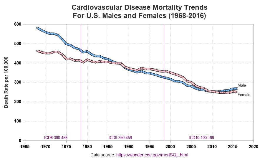
6. Are we dying less from heart disease?
One of the things I like about Robert Allison's work is that he usually creates multiple variations of his visualizations on his way to creating a final version. And he explains his process along the way, so you can see his thinking behind what makes the visualization work. This post about cardiovascular disease mortality rates does exactly that. And it leaves you impressed with the improvements we've made in combating heart disease in the US.
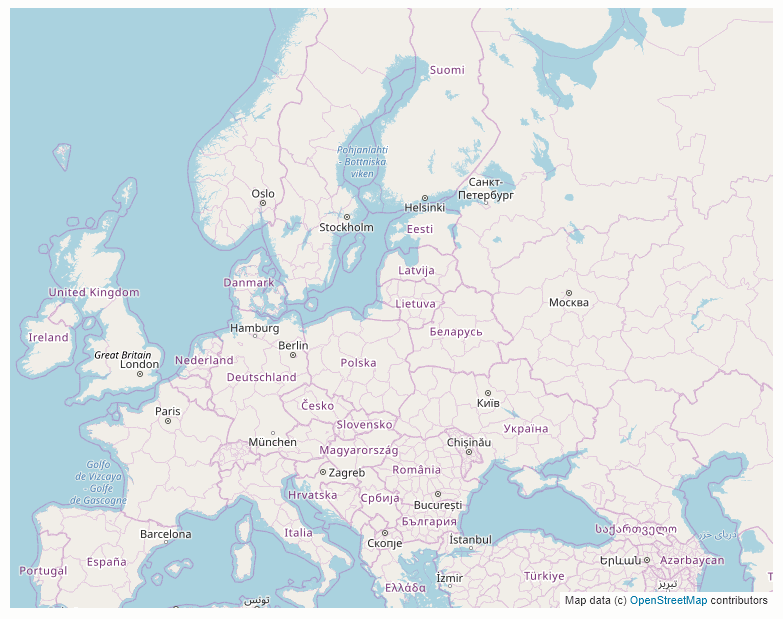
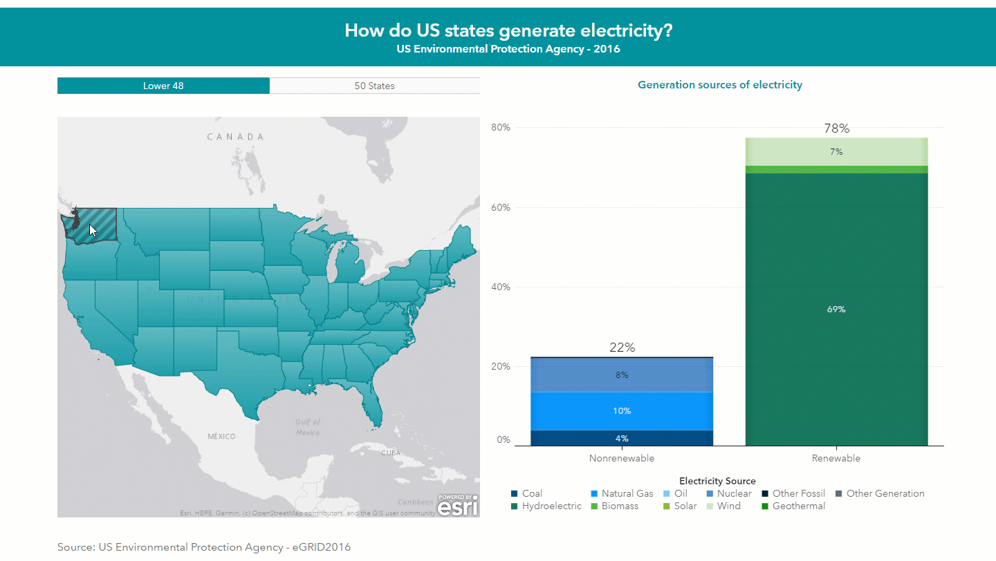
7. How much renewable energy does your state generate?
This data story from GatherIQ lets you explore energy generation around the world. The visualization below shows energy generation for the US but the full data story allows you to also select and explore data from different countries around the world.
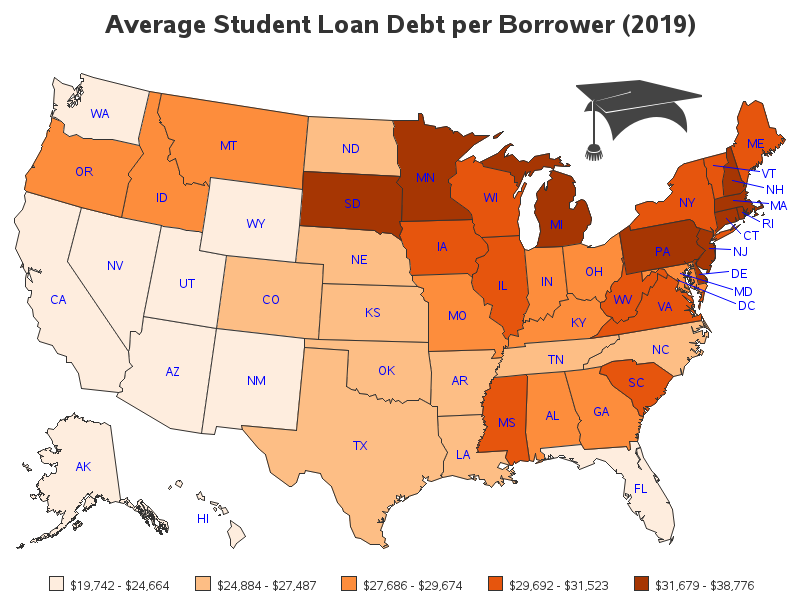
8. Where are the students with the most student loan debt?
In this popular post, Robert Allison explores average student loan debts per borrower in each US state. His easy-to-interpret color coding makes obvious, at a glance, which states have students with higher debts. You can also explore an interactive version of the map that has drill-down capability with debt rates for specific schools in each state.
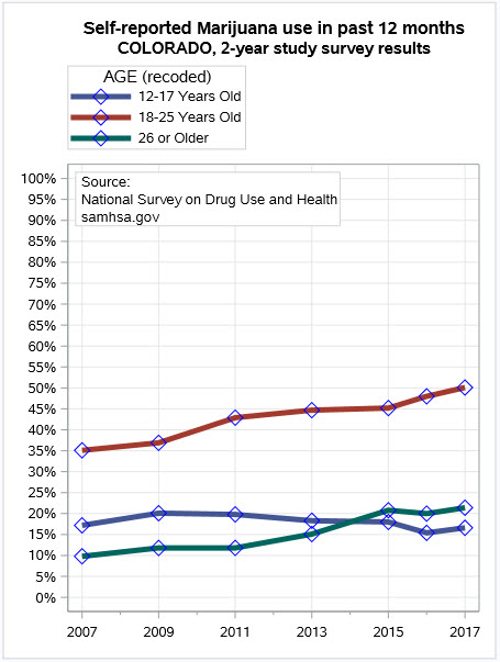
9. Is marijuana use increasing or decreasing in Colorado?
Chris Hemedinger was inspired by a newspaper article to redesign an infographic about marijuana use among different age groups in Colorado. He also compared the marijuana use in Colorado to other states and visualized alcohol use as well. Chris' post also includes a hefty dose of skepticism and a compelling argument about data literacy.
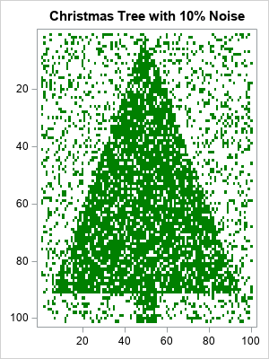
10. How noisy is your Christmas tree?
This one might not be considered a data visualization in the strictest definition of the term, but I wanted to end on a holiday note. Every year, Rick Wicklin creates a holiday themed statistical graph, and they're always popular. This year he shows readers how to de-noise an image using statistics and last year he showed us how to visualize Christmas songs, including Silver Bells and Little Drummer Boy. Don't forget to share this post with the jolliest statisticians on your list.
I tried to pick a good range of topics and styles of data visualizations. But tell me, data viz fans, do you agree with my picks? If you have other favorites from the year, be sure to add them in the comments. Or go explore more from Gather IQ, SAS data visualization blog posts and the SAS Visual Analytics gallery.

2 Comments
What a fun list! - It's like going to the eye-candy store, for data visualization! 🙂
It's an eye-catching story. thanks Alison and SAS.