I'm old enough to remember when USA Today began publication in the early 1980s. As a teenager who was not particularly interested in current events, I remember scanning each edition for the USA Today Snapshots, a mini infographic feature that presented some statistic in a fun and interesting way. Back then, I felt that these stats made me a little bit smarter for the day. I had no reason to question the numbers I saw, nor did I have the tools, skill or data access to check their work.
Today I still enjoy the USA Today Snapshots feature, but for a different reason. An interesting infographic will spark curiosity. And provided that I have time and interest, I can use the tools of data science (SAS, in my case) and public data to pursue more answers.
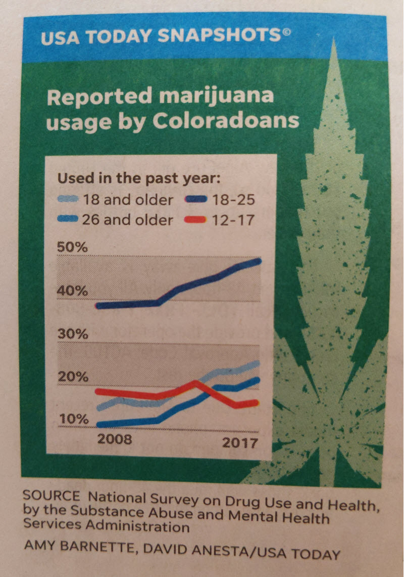
In the August 7, 2019 issue, USA Today published this graphic about marijuana use in Colorado. Before reading on, I encourage you to study the graphic for a moment and see what questions arise for you.
I have some notes
For me, as I studied this graphic, several questions came to mind immediately.
- Why did they publish this graphic? USA Today Snapshots are usually offered without explanation or context -- that's sort of their thing. So why did the editors choose to share these survey results about marijuana use in Colorado? As readers, we must supply our own context. Most of us know that Colorado recently legalized marijuana for recreational use. The graphic seems to answer the question, "Has marijuana use among certain age groups increased since the law changed?" And a much greater leap: "Has marijuana use increased because of the legal change?"
- Just Colorado? We see trend lines here for Colorado, but there are other states that have legalized marijuana. How does this compare to Maine or Alaska or California? And what about those states where it's not yet legal, like North Carolina?
- People '26 and older' are also '18 and older' The reported age categories overlap. '18 and older' includes '18 to 25' and '26 and older'. I believe that the editors added this combined category by aggregating the other two. Why did they do that?
- Isn't '26 and older' a wide category? '12 to 17' is a 6-year span, and '18 to 25' is an 8-year span. But '26 and older' covers what? 60-plus years?
- "Coloradoans?" Is that really how people from Colorado refer to themselves? Turns out that's a matter of style preference.
The vagaries of survey results
To its credit, the infographic cites the source for the original data: the National Survey on Drug Use and Health (NSDUH). The organization that conducts the annual survey is the Substance Abuse and Mental Health Services Administration (SAMHSA), which is under the US Department of Health and Human Services. From the survey description: The data provides estimates of substance use and mental illness at the national, state, and sub-state levels. NSDUH data also help to identify the extent of substance use and mental illness among different sub-groups, estimate trends over time, and determine the need for treatment services.
This provides some insight into the purpose of the survey: to help policy makers plan for mental health and substance abuse services. "How many more people are using marijuana for fun?" -- the question I've inferred from the infographic choices -- is perhaps tangential to that charter.
Due to privacy concerns, SAMHSA does not provide the raw survey responses for us to analyze. The survey collects details about the respondent's drug use and mental health treatment, as well as demographic information about gender, age, income level, education level, and place of residence. For a deep dive into the questions and survey flow, you can review the 2019 questionnaire here. SAMHSA uses the survey responses to extrapolate to the overall population, producing weighted counts for each response across recoded categories, and imputing counts and percentages for each aspect of substance use (which drugs, how often, how recent).
SAMHSA provides these survey data in two channels: the Public-use Data Analysis System and the Restricted-use Data Analysis System. The "Public-use" data provides annualized statistics about the substance use, mental health, and demographics responses across the entire country. If you want data that includes locale information (such as the US state of residence), then you have to settle for the "Restricted-use" system -- which does not provide annual data, but instead provides data summarized across multi-year study periods. In short, if you want more detail about one aspect of the survey responses, you must sacrifice detail across other facets of the data.
My version of the infographic
I spent hours reviewing the available survey reports and data, and here's what I learned: I am an amateur when it comes to understanding health survey reports. However, I believe that I successfully reverse-engineered the USA Today Snapshot data source so that I could produce my own version of the chart. I used the "Restricted-use" version of the survey reports, which allowed access to imputed data values across two-year study periods. My version shows the same data points, but with these formatting changes:
- I set the Y axis range as 0% to 100%, which provides a less-exaggerated slope of the trend lines.
- I did not compute the "18 and over" data point.
- I added markers (blue diamonds) to indicate the end of each two-year study period for which I have data points. (Thanks to Rick Wicklin for this suggestion.) Note that the frequency of these published studies seems to have increased since 2015.
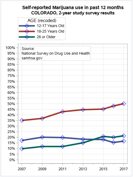
Here's one additional data point that's not in the survey or in the USA Today graphic. Colorado legalized marijuana for recreational use in 2012. In my chart, you can see that marijuana use was on the rise (especially among 18-25 years old) well before that, especially since 2009. Medical use was already permitted then (see Robert Allison's chart of the timeline), and we can presume that Coloradoans (!) were warming up to the idea of recreational use before the law was passed. But the health survey measures only reported use, and does not measure the user's purpose (recreational, medical, or otherwise) or attitudes toward the substance.
Limitations of the survey data and this chart
Like the USA Today version, my graph has some limitations.
- My chart shows the same three broad age categories as the original. These are recoded age values from the study data. For some of the studies it was possible to get more granular age categories (5 or 6 bins instead of 3), but I could not get this for all years. Again, when you push for more detail on one aspect, the "Restricted-use" version of the data pushes back.
- The "used in the past 12 months" indicators is computed. The survey report doesn't offer this as a binary value. Instead it offers "Used in the past 30 days" and "Used more than 30 days ago but less than 12 months." So, I added those columns together, and I assume that the USA Today editors did the same.
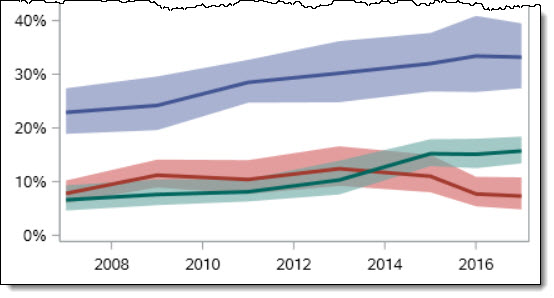
- I'm not showing the confidence intervals for the imputed survey responses. Since this is survey data, the data values are not absolute but instead are estimates accompanied by a percent-confidence that the true values fall in this certain range. The editors probably decided that this is too complex to convey in your standard USA Today Snapshot -- and it might blunt the potential drama of the graphic. Here's what it would look like for the "Used marijuana in past 30 days" response, with the colored band indicating the 95% confidence interval.
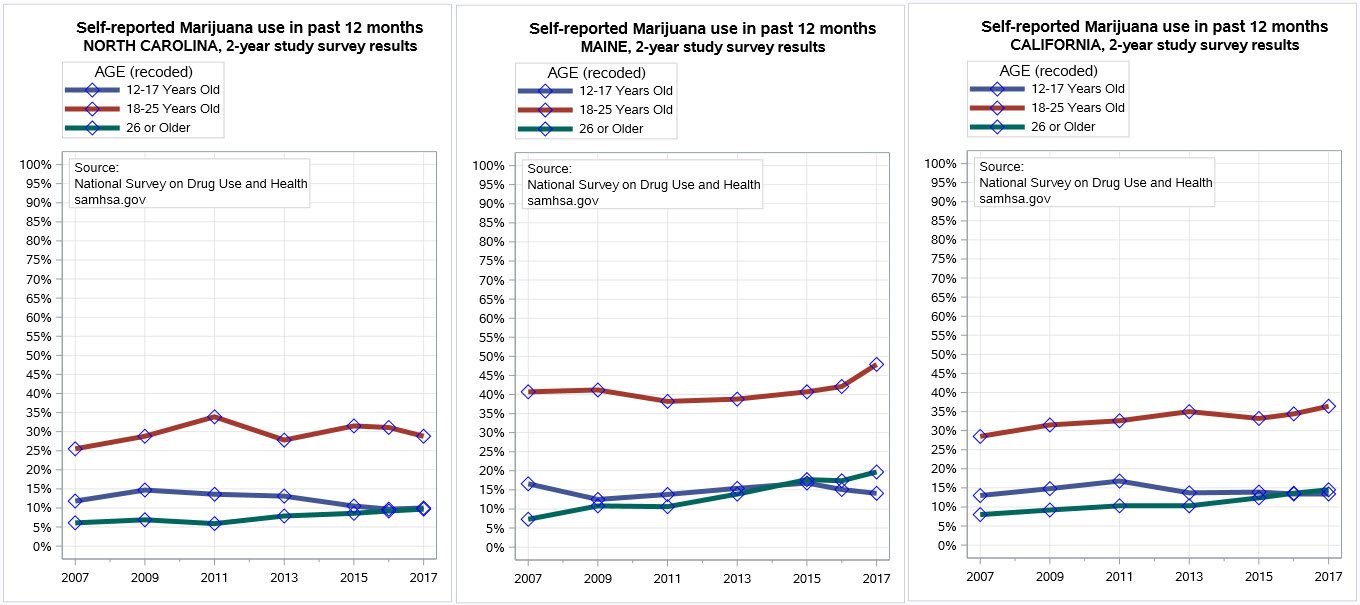
Beyond Colorado: what about other states?
Having done the work to fetch the survey data for Colorado, it was simple to gather and plot the same data for other states. Here's the same graph with data from North Carolina (where marijuana use is illegal) and Maine and California.
While I was limited to the two-year study reports for data at the state level, I was able to get the corresponding data points for every year for the country as a whole:
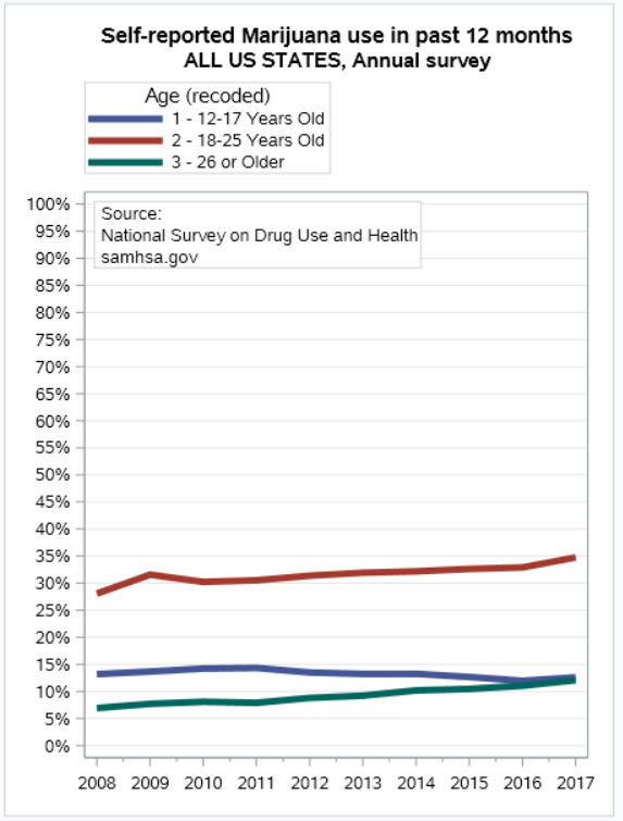
I noticed that the reported use among those 12-17 years old declined slightly across most states, as well as across the entire country. I don't know what the logistics are for administering such a comprehensive survey to young people, but this made me wonder if something about the survey process had changed over time.
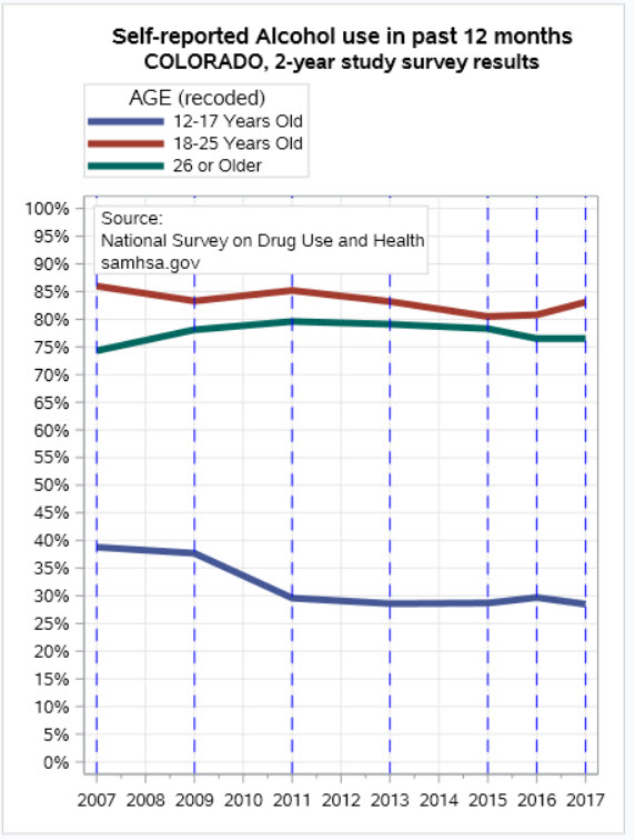
The survey data also provides results for other drugs, like alcohol, tobacco, cocaine, and more. Alcohol has been legal for much longer and is certainly widely used. Here are the results for Alcohol use (imputed 12 months recency) in Colorado. Again I see a decline in the self-reported use among those 12-17 years old. Are fewer young people using alcohol? If true, we don't usually hear about that. Or has something changed in the survey methods regarding minors?
SAS programs to access NSDUH survey data
On my GitHub repo, you can find my SAS programs to fetch and chart the NSDUH data. The website offers a point-and-click method to select your dimensions: a row, column, and control variable (like a BY group).
I used the interactive report tool to navigate to the data I wanted. After some experimentation, I settled on the "Imputed Marijuana Use Recency" (IRMJRC) value for the report column -- I think that's what USA Today used. Also, I found other public reports that referenced it for similar purposes. The report tool generates a crosstab report and an optional chart, but it also then offers a download option for the CSV version of the data.
I was able to capture that download directive as a URL, and then used PROC HTTP to download the data for each study period. This made it possible to write SAS code to automate the process -- much less tedious than clicking through reports for each study year.
%macro fetchStudy(state=,year=); filename study "&workloc./&state._&year..csv"; proc http method="GET" url="https://rdas.samhsa.gov/api/surveys/NSDUH-&year.-RD02YR/crosstab.csv/?" || "row=CATAG2%str(&)column=IRMJRC%str(&)control=STNAME%str(&)weight=DASWT_1" || "%str(&)run_chisq=false%str(&)filter=STNAME%nrstr(%3D)&state." out=study; run; %mend; %let state=COLORADO; /* Download data for each 2-year study period */ %fetchStudy(state=&state., year=2016-2017); %fetchStudy(state=&state., year=2015-2016); %fetchStudy(state=&state., year=2014-2015); %fetchStudy(state=&state., year=2012-2013); %fetchStudy(state=&state., year=2010-2011); %fetchStudy(state=&state., year=2008-2009); %fetchStudy(state=&state., year=2006-2007); |
Each data file represents one two-year study period. To combine these into a single SAS data set, I use the INFILE-with-a-wildcard technique that I've shared here.
INFILE "&workloc./&state._*.csv" filename=fname LRECL=32767 FIRSTOBS=2 ENCODING="UTF-8" DLM='2c'x MISSOVER DSD; INPUT state_name recency age_cat /* and so on */ |
The complete programs are in GitHub -- one version for the state-level two-year study data, and one version for the annual data for the entire country. These programs should work as-is within SAS Enterprise Guide or SAS Studio, including in SAS University Edition. Grab the code and change the STATE macro variable to find the results for your favorite US state.
Conclusion: maintain healthy skepticism
News articles and editorial pieces often use simplified statistics to convey a message or support an argument. There is just something about including numbers that lends credibility to reporting and arguments. Citing statistics is a time-honored and effective method to inform the public and persuade an audience. Responsible journalists will always cite their data sources, so that those with time and interest can fact-check and find additional context beyond what the media might share.
I enjoy features like the USA Today Snapshot, even when they send me down a rabbit hole as this one did. As I tell my children often (and they are weary of hearing it), statistics in the media should not be accepted at face value. But if they make you curious about a topic so that you want to learn more, then I think the editors should be proud of a job well done. It's on the rest of us to follow through to find the deeper answers.

10 Comments
What a great read. Thank you for that!
Excellent piece, thank you good sir.
Chris,
Thank you, again, for an interesting post. What caught my eye, and hopefully, I did not peruse your comments too quickly, is that (many?) more people "26 and older" than "18-25" responded to the survey (the combined light blue line shadows the trend of the "26 and older" blue line and is not markedly elevated, despite the ratio of the first point being close to four (~38% to ~10%, respectively).
Kind regards,
Kevin
Good question. The chart shows the percent of respondents in each category who say they used marijuana in the prior 12 months. The actual number of respondents for each category (yes or no) is available only in some of the report data. At the national level, I can get the unweighted and weighted counts for each of these 3 age groups. Here's the counts for 2017:
So yes, many more actual respondents in the '26 and older' age group, but even more interesting is how the sample size of that group compares to the size of the weighted population.
Hi Chris,
This is a great post!
I run your SAS code for "one version for the annual data for the entire country"
but notice that three macro variables are not resolved shown below.
Could you shed some lights here?
Thanks,
Ethan
WARNING: Apparent symbolic reference COLUMN not resolved.
WARNING: Apparent symbolic reference WEIGHT not resolved.
WARNING: Apparent symbolic reference RUN_CHISQ not resolved.
Thanks Ethan, and good for you on trying the code!
The SAS macro processor is trying to interpret the URL params that are set off with ampersands. These aren't macro vars though -- just part of the URL. So the WARNING is fine, no worries. The workaround to avoid the warning is to add wrap each ampersand in the URL with %nrstr(&). Makes the URL less readable, but SAS will stop trying to interpret those.
Pingback: Why we need to learn how to "speak data" in a data-driven future - SAS Users
Pingback: Why you should care about data literacy - SAS Voices
Pingback: Our top 10 data visualizations of 2019 - SAS Voices
Just FYI: NSDUH does publish the "Last 12 Months" statistic directly. They just call it "Past Year" and it sits with the recoded use variables so you might have missed it.
MRJYR - Rc-Marijuana - Past Year Use
The recoded variables are what they usually use in the published summary tables and give you a clean % yes and % no.