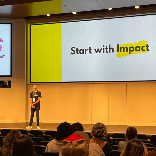
Uncategorized

Analytics | SAS Events
0
Our conference lineup for 2012

Here at SAS Publishing, we’ve started the new year off with a bang, particularly when it comes to conferences. We’re attending a number of new shows in addition to the usual lineup this year. Visit our booth, meet our authors, check out our new and forthcoming titles, and talk with

Rick Wicklin 0
Reading ALL variables INTO a matrix

The SAS/IML READ statement has a few convenient features for reading data from SAS data sets. One is that you can read all variables into vectors of the same names by using the _ALL_ keyword. The following DATA steps create a data set called Mixed that contains three numeric and

Rick Wicklin 0
Overlay density estimates on a plot

A recent question on a SAS Discussion Forum was "how can you overlay multiple kernel density estimates on a single plot?" There are three ways to do this, depending on your goals and objectives. Overlay different estimates of the same variable Sometimes you have a single variable and want to

Rick Wicklin 0
How to lie with a simulation

In my article on Buffon's needle experiment, I showed a graph that converges fairly nicely and regularly to the value π, which is the value that the simulation is trying to estimate. This graph is, indeed, a typical graph, as you can verify by running the simulation yourself. However, notice

Mike Gilliland 0
Myers-Briggs Type Indicator for forecasters

Have you taken the Myers-Briggs Type Indicator (MBTI) assessment?  It is a psychological test wherefrom you are classified on Extraversion vs. Introversion, Sensing vs. Intuition, Thinking vs. Feeling, and Judging vs. Perceiving.  I, along with roughly 15% of the population, come out an ISTJ or "Guardian Inspector" (the single largest

Data Visualization
Sanjay Matange 0
In good company

A recent post on the SAS website shows the SAS Annual Revenue History.  It would be interesting to see how we could create such a graph using SG procedures, and how we could add more information and interest in the presentation.  So, I started with the basic informaiton on the annual revenues provided,

Rick Wicklin 0
Simulation of Buffon's needle in SAS

Buffon's needle experiment for estimating π is a classical example of using an experiment (or a simulation) to estimate a probability. This example is presented in many books on statistical simulation and is famous enough that Brian Ripley in his book Stochastic Simulation states that the problem is "well known

Data Visualization
Sanjay Matange 0
Simply useful

Let us ring in the new year with something simple and useful. A recent question by a user over the holidays motivated this article on what is likely a commonly used graph.  We want to compare the preformance of two categories along with a third measure.  This could be something like "How

Rick Wicklin 0
New 2012 resolutions for my blog

Hello, 2012! It's a New Year and I'm flushed with ideas for new blog articles. (You can also read about The DO Loop's most popular posts of 2011.) The fundamental purpose of my blog is to present tips and techniques for writing efficient statistical programs in SAS. I pledge to

Shelly Goodin 0
An unforgettable customer interaction

Bad customer service experiences burn into our brains, creating permanent recall. And although we rightfully expect good customer service across the board, truly exceptional customer care is also unforgettable. This month, I featured an interview with SAS Publishing sales representative Sharon Brandon in the new issue of SAS Publishing News.

0
The graphs you could create: if only you knew how

You’ve got your raw data visualized, you need a graph that shows the results of a custom analysis, you have a mental image of the graph you want to create, but…you don’t know the procedure needed to create what you want. Sanjay Matange and Dan Heath have written a book

Data Visualization
Sanjay Matange 0
Map overlays

In Simple maps can go a long way, we discussed some techniques to create simple outline maps from map datasets in the MAPS library using GTL.  Now, let us take this a step further to do something more useful with this feature. For some graphs, the map information is an essential part of the

1 232 233 234 235 236 259