All Posts


In this Flipcam video by SAS' Steve Polilli, Don Kros and Jon Boase discuss the methodology they developed to help SAS users in their organization advance their SAS skills. Kros and Boase submitted a poster, which you'll see in the video, and a paper "The Path to Developing Your Organization's SAS Skills,"
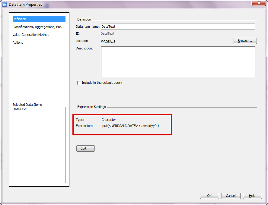

The date prompt from SAS Prompt Framework provides the options of single selection or a range, however what if you need to select multiple individual dates such as Monday (May 28), Wednesday (May 30), and Friday (June 1) of last week? There are a few alternatives to accomplishing this. Option
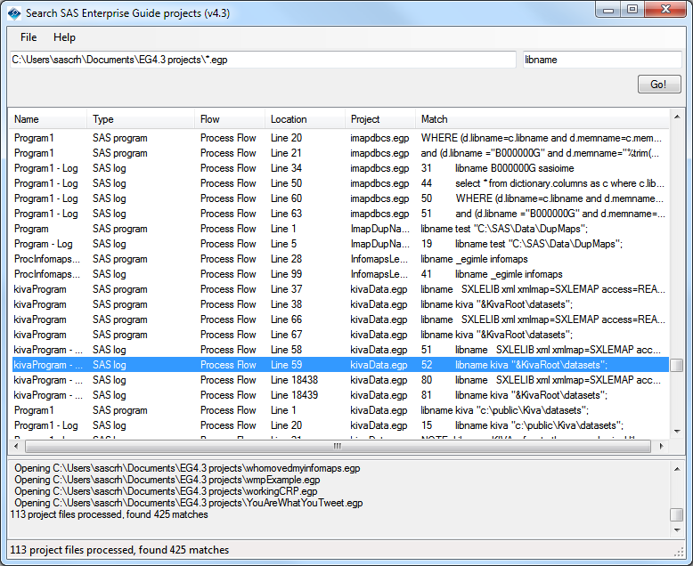

If you are like many SAS Enterprise Guide users, you've amassed a large collection of project files (EGP files) that contain important content: programs, logs, notes, results, and more. However, to most tools and processes, the EGP file is opaque. That is, you can't see what's inside of it unless

A graph in a recent article in Fortune magazine caught my eye. The graph shows the cost of hosting the Summer Olympics over the past eight events. Here is what I termed the "Medal" graph. Now, practitioners of the art of Effective Graphics would likely find some shortcomings in the graph. Clearly


This week's %NLINMIX macro tips come from the esteemed authors of SAS for Mixed Models, Second Edition. Ramon C. Littell, George A. Milliken, Walter W. Stroup, Russell D. Wolfinger, and Oliver Schabenberger combined their expertise to write this indispensable guide. This 800 page book has made a big impact in the user community
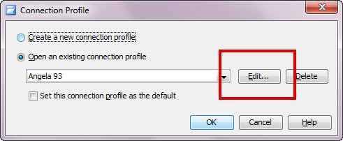
Did you change your LinkedIn password yesterday? (If you didn’t, you should!) But did it happen to be the same as your corporate password? First, tisk tisk. Second, change your corporate password NOW! Ok, now that this is done ~ don’t let your saved connection profile for SAS applications lock


It’s going to be a busy summer with a lot of travel. I’ve been invited to several user conferences so I’m really excited to get to meet even more SAS users, pick up some great tips for others, and wear myself out chatting.
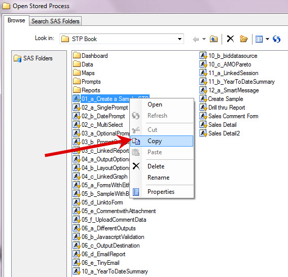
What if you would like to make a copy of an existing stored process to test out your changes before making them live? The copy command is available from within SAS Management Console or from the SAS Enterprise Guide Open Stored Process GUI as seen below (note you can only


"Help! My simulation is taking too long to run! How can I make it go faster?" I frequently talk with statistical programmers who claim that their "simulations are too slow" (by which they mean, "they take too long"). They suspect that their program is inefficient, but they aren't sure why.
In the previous post on Broken Y-Axis, I reviewed different ways to display data as a Bar Chart, where the response values for some categories are many orders of magnitude larger than the other values. These tall bars force the display of other values to be squeezed down thus making it harder to compare

If you live anywhere in the Midwestern United States (you know who I'm talking about, those of you in the 12 states in the map to the right), you must be breathing a sigh of relief right about now. Why? Because the MWSUG (MidWest SAS Users Group) Call for Papers deadline

One of the coolest things that I saw at SAS Global Forum was Dr. Goodnight dissecting a hologram of a SAS high-performance server and describing how the technology works with analytics. This is the height of innovation. You have got to watch this! Here are a few great
Often we want to display data as a bar chart where a few observations have large values compared to the rest. Comparison between the smaller values becomes hard as the small bars are squeezed by the tall bars. Here is an example data, and a bar chart showing the data. The large values


In the summer of 2010, the LA Times made national waves by publishing Los Angeles Unified School District’s teacher names and value-added estimates. The New York Times followed suit in February, 2012, ranking New York City’s teachers based on their value-added ratings. While these bold actions may satisfy some parents


I am part of a 'virtual team from SAS Technical Support' who provide the suggestions for the Tips & Techiques section for the SAS Tech Report each month. A couple of days ago, Bill Gibson, Chief Technology Officer from SAS Australia, sent us an email saying that like him, many