All Posts

SAS Integration Technologies provides a flexible platform to create all types of apps, from simple utilities to full-blown applications. As part of the research for my SAS Global Forum 2013 paper (Create Your Own Client Apps Using SAS Integration Technologies), I've been trying to invent some useful examples that you
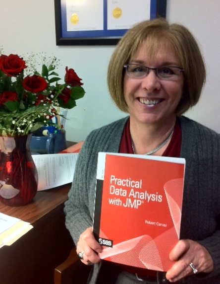

This week's tip is from Robert Carver and his book Practical Data Analysis with JMP. If you're a JMP user, be sure to take a look at additional bonus content from the book. The following excerpt is from SAS Press author Robert Carver and his book "Practical Data Analysis with JMP". Copyright © 2010, SAS
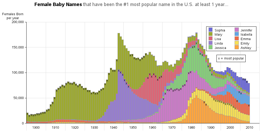

I'm sure that most of you have seen the really cool interactive Baby Name Voyager, right? If not, go have a look and try it out (be sure to plug in your name, and the names in your family, and so on). Here's a screen-capture: That's a pretty cool application! ...


So your paper abstract has been accepted to present at SAS Global Forum? Better get to writing it! Do not put it off or delay. Remember you have a paper AND a presentation to put together. Depending on how you plan to write the paper, you may have some SAS
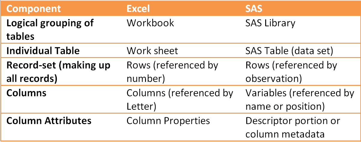

So let’s get down to it, what exactly do we mean by data in SAS? We hear all about “big data”, tiny data, datasets, metadata, OLAP, relational data, but what do I really need to know when it comes to SAS?


~ contributed by Debbie Buck for the SAS Global Users Group Executive Board The SAS Global Users Group Executive Board is currently soliciting applications from individuals interested in applying for the position of Conference Chair for SAS Global Forum 2015 to be held in Dallas, TX, April 26-29. The deadline

Suppose that you have a SAS/IML matrix and you want to set each element of a submatrix to zero (or any other value). There is a simple syntax that accomplishes this task. If you subscript a matrix and do not specify a row, it means "use all rows." So, for
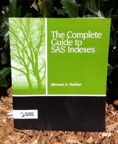
This week's tip is from Michael Raithel and his classic book The Complete Guide to SAS Indexes. Michael has a wealth of SAS experience and is a frequent and sought-out speaker at SAS Global Forum and regional user group conferences. If you get the opportunity to hear him speak, don't

Yes, it’s February 15 and plenty of people celebrated yesterday for obvious reasons; Valentine’s Day. But today, SAS Global Forum is celebrating for other reasons. It’s not about flowers, candy and love notes for us this week– it’s about content, content and more content. That’s right – we’re celebrating today


Recently, I was having lunch with a city council member who shared a litany of comments about the outstanding job the city and its staff does in all areas of city operations. She remarked on how little the public understands about all the city does and how efficiently it’s done.
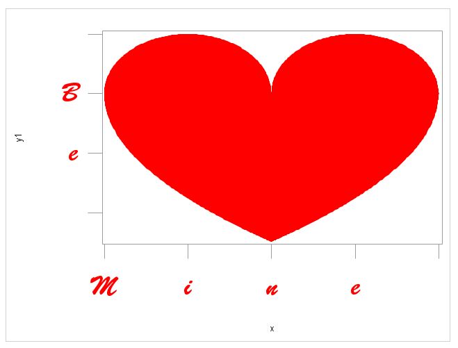

SAS Code for your Valentine - just in case you forgot to get flowers, chocolate or other tokens of affection for the big day yesterday.
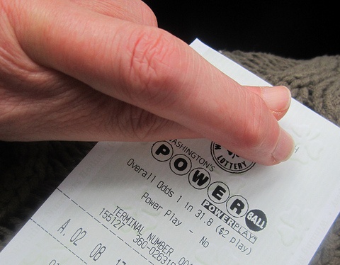
What are the odds of winning the lottery? This seems like a simple question (and yes, there is a simple answer), but there are a few technical details to work out first... Which lottery? Let's say the Powerball Lottery. When? The number of balls used in the Powerball lottery has
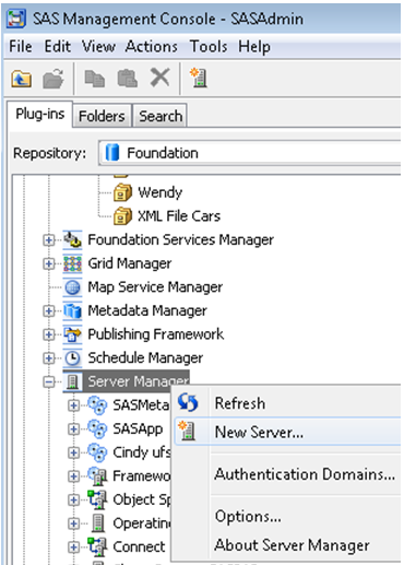

I am a big fan of SAS Management Console. This is the central location where you can perform many of your SAS administration tasks. One of the most important tasks of a SAS Administrator is making sure data is available to the right people when they need it. Most of
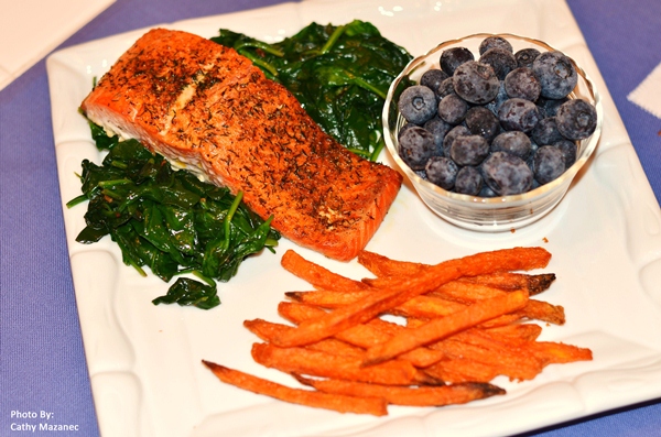
February is Heart Month First the bad news, heart disease is the number one killer of both men and women. Now the good news, heart disease is preventable and controllable. Chews Strategically will focus on the health of your heart for the month of February so tune in and learn

If you are like me, you've experienced the following frustration. You are reading the SAS/STAT documentation, trying to understand some procedure or option, when you find an example that is very similar to what you need. "Great," you think, "this example will help me understand how the SAS procedure works!"