All Posts

A big part of "winning" these days (be it sports or a business) is performing analytics better than your competition. This is demonstrated in awe-inspiring fashion in the book (and movie) "Moneyball." And on that topic, I'd like to show you a few ways SAS can be used to analyze sports data


Personally, I love studies. They help put things into context, and when done well, provide an independent and hopefully unbiased view of the forces that shape our lives. They are also a great way to see government funds used in strange ways. For example, the new NIOSH (National Institute for
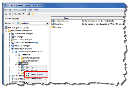

You can create SAS publication channels based on topics (3rd Quarter Results), organization (Business Unit X), user audience (new product release), or any other category. Once defined, authorized users can subscribe to the channels and automatically receive information whenever it is published.

Someone recently asked a question on the SAS Support Communities about estimating parameters in ridge regression. I answered the question by pointing to a matrix formula in the SAS documentation. One of the advantages of the SAS/IML language is that you can implement matrix formulas in a natural way. The

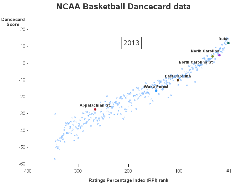
SG procedures and GTL use a collision avoidance algorithm to position data labels for a scatter or series plot. This is enabled by default. The label is preferably placed at the top right corner of the marker. The label is moved to one of the eight locations around the marker to
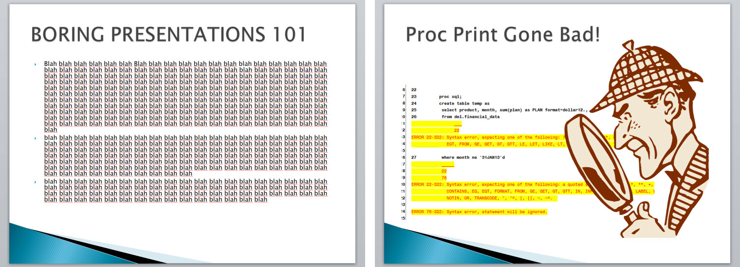
Garr Reynolds, author of Presentation Zen, has excellent ideas on organizing your information so it is effective and interesting. One tip is “Start with the End in Mind” – what is the purpose of your presentation? What do you want the audience to walk away knowing?
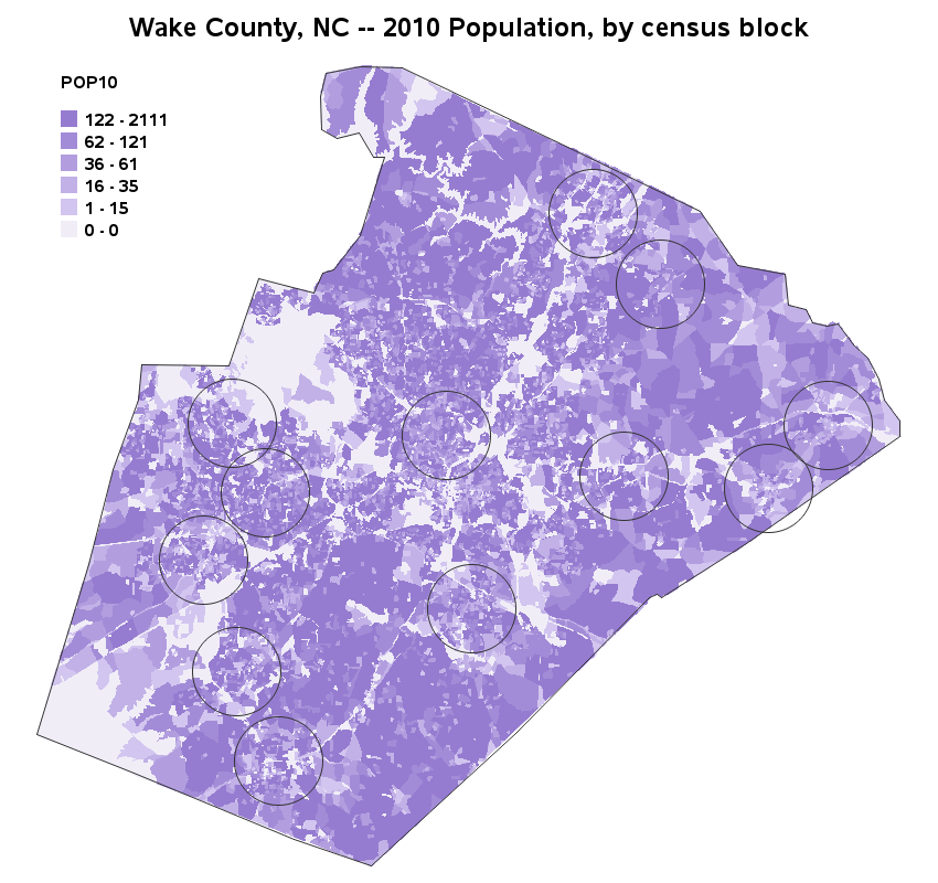
I've heard many customers ask "Can SAS do/use/handle census block maps?" My answer was "of course!" ... but I never really had any examples to show/prove that. Well, now I do! :) First, you need to locate & download the shape files for the census blocks you're interested in plotting. For
A common request we have been often hearing is for display of the distribution of data as a box plot, along with some detailed information overlaid. For example, one may have ratings data of all the hospitals in a region by different specialty, and you want to view this distribution

In the past five years, value-added models have been increasingly adopted by states to support various teaching effectiveness policies. As educators make the paradigm shift from looking at only achievement data to incorporating growth data, many misconceptions have developed. Compounding this issue is the fact that not all value-added and


My wife rescued a dog a couple of years ago from a rural North Carolina rest stop . We named her "DOTi" in honor of the Department of Transportation. It took a while for us to get into the swing of being responsible owners; sometimes the first to leave for


One of the roles my team enjoys is working with SAS customers on performance issues along with testing SAS software on selected hardware configurations. We also work closely with other groups within SAS who work with SAS partners to test the latest and greatest features. My team then takes what


March is National Nutrition Month! This year's theme, "Eat Right, Your Way, Every Day," encourages personalized healthy eating choices. All of us are different and, therefore, have unique food preferences that have been influenced by friends and family, lifestyle, culture, health status, and ethnic and religious traditions. None of us
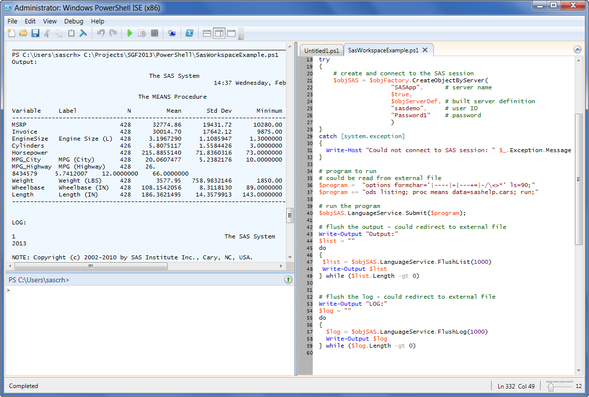

This post is another in my series about creating apps with SAS Integration Technologies, a topic that I'm preparing for SAS Global Forum 2013. In this article, I'll describe how to use Windows PowerShell to connect to a remote SAS Workspace, run a SAS program, and retrieve the results. This
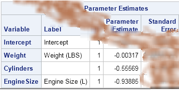
Argh! I've just spilled coffee on output that shows the least squares coefficients for a regression model that I was investigating. Now the parameter estimate for the intercept is completely obscured, although I can still see the parameter estimates for the coefficients of the continuous explanatory variable. What can I


In my previous post, I began a discussion of lists by explaining that big problems can be solved by breaking the problem into smaller pieces. The solutions to those smaller problems can then be used in combination to solve other problems. In this post, I will talk about formatting and