All Posts


This is a continuing topic of the SAS Administration and Performance blog series. In the last edition, I discussed why you need to do a technical assessment prior to planning your SAS deployment. Yes, this step takes time, but you’ll find it far easier to implement the suggested tuning guidelines


The holiday season is here, and you're probably wondering how to shop for that picky SAS Enterprise Guide user on your gift list. I've got a few ideas for you, and the price is right! Here are links to 11 custom tasks that are free to download, easy to install,

. . . getting to know all about you! Everyone says it—getting to know other SAS users is the best part of a SAS conference. The other “best part” are the resources available in the exhibits and demo areas. I’d have to agree. Well, this year’s organizers at the 2013


What's your favorite part of attending SAS Global Forum? With the many presentations, networking event and valuable SAS knowledge available, many attendees may find it difficult to pick just one thing. I asked the Best Contributed Paper winners from SAS Global Forum 2013 to share both their most memorable moment from


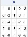
For several years, there has been interest in calling R from SAS software, primarily because of the large number of special-purpose R packages. The ability to call R from SAS has been available in SAS/IML since 2009. Previous blog posts about R include a video on how to call R


Wavelet analysis is an exciting and relatively new field of study that enables one to extract underlying patterns either from spatially varying or temporally varying data. Pixel values representing the relative brightness and color that constitute an image are an example of spatially varying data, and daily variations of financial

In reference to a previous article on Violin Plots, a reader asked about creating comparative mirrored histograms to compare propensity scores. While I had my own understanding of "Mirrored Histograms", I also looked this up on the web. Google showed many cases of two histograms back to back, either horizontally or vertically.


With the others, I filed into the school gymnasium, my super zoom camera lens at the ready and a nervous smile on my face. Across the room, I caught a glimpse of my unsmiling daughter, and my apprehension grew about how this awards day program would play out for her.

If you’re not an expert on encryption, have no fear! SAS 9.4 has introduced ways to bring stronger encryption to your SAS deployment. The good news is that SAS/SECURE is now a part of Base SAS when you upgrade to SAS 9.4 and is not a separately licensed product anymore.


The holidays are upon us! As you may have experienced, Thanksgiving often serves as the starter pistol for the holiday weight gain marathon. Don’t let holiday collateral damage be the impetus for your New Year’s resolutions this year. A little planning and mindfulness can keep the joy in your season
When I call R from within the SAS/IML language, I often pass parameters from SAS into R. This feature enables me to write general-purpose, reusable, modules that can analyze data from many different data sets. I've previously blogged about how to pass values to SAS procedures from PROC IML by
In using a vector-matrix language such as SAS/IML, MATLAB, or R, one of the challenges for programmers is learning how to vectorize computations. Often it is not intuitive how to program a computation so that you avoid looping over the rows and columns of a matrix. However, there are a
In the first article on Getting Started with GTL, we discussed the basics on how to create a graph using the Graph Template Language. This involved the creation of a "statgraph" template using the TEMPLATE procedure, and then associating data with the template to create the graph using the SGRENDER

Did you submit content for SAS Global Forum 2014? We know content is king, which is why we wanted to get a sampling of the content out on the SAS Global Forum website as soon as possible. However, don't be alarmed if you don't see your presentation listed. You
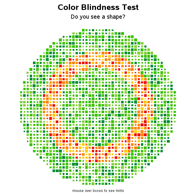

I'm always trying to find new uses for SAS - this time I've written a proof-of-concept that shows how you might use SAS to create charts that test for color blindness. If nothing else, I think it's a fun example :) First, I did a Google search, and looked at several