Graphically Speaking
Data Visualization with a focus on SAS ODS Graphics
Last week I posted an article on creating Infographics using SAS. The interest shown by the SAS community in this topic came as a surprise. Also, it so happened by coincidence, a SAS users also called into Tech Support just about the same time with a query about creating Infographics type graph

Last week a question was posted on the communities page about creating Box Plots where the width of each box is proportional to the frequency for the category. The comment was that PROC BOXPLOT can create such a graph, but there seems no way to do this using the SGPLOT
Infographics are all the rage today. Open any magazine or newspaper and we see data and numbers everywhere. Often, such information is displayed by adding some graphical information to add context to the data. A couple of good examples are Communicating numeric information, and Facts about Hot Dogs. Riley Benson, our UX

In the previous article on managing legends, I described the way to include items in a legend that may not exist in the data. This is done by defining a Discrete Attribute Map, and then requesting that all the values defined in the map should be displayed in the legend. In

Entries in a legend are populated automatically based on the data. When creating a graph with group classification, the display attributes for each bar are derived from the GraphData1-12 style elements from the active style. The graph on the right shows you the result of creating an adverse event timeline
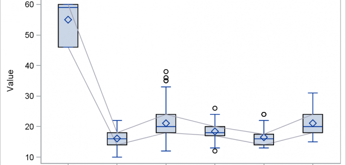
Last month I wrote an article on connecting multiple statistics by category in a box plot using SGPLOT. In the first article I described the way you can do this using overlaid SERIES on a VBOX using SAS 9.4, which allows such a combination. However, if you have SAS 9.3,
